A wordless future? What Mastercard’s new logo tells us about the modern brand.

Mastercard made waves earlier this month when it announced that it will drop the word “Mastercard” from its logo. But is this decision a sign of broader trends in the ways brands represent themselves, or simply Mastercard grappling with a changing marketplace?
The big picture
The disappearance of letters from logos is of obvious interest to us here at Monotype. (Letters are kind of our thing, if you haven’t noticed.) So when a global brand like Mastercard decides to eliminate or reduce the use of its wordmark, we definitely pay attention.
Mastercard is certainly not the first brand to do this—Apple, McDonald’s, Starbucks and Nike are some prominent examples—and you can bet it won’t be the last. As companies adapt to the rapid digitization of their business and their customer relationships, we’ve seen a trend toward streamlined branding focused on that digital experience. In the specific case of Mastercard, that digitization includes a future where physical credit cards—the root of its name—may not even exist.

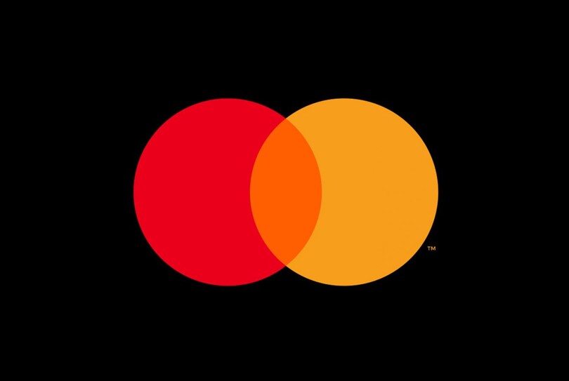
The new logo relies on simple shapes and colors (and decades of familiarity) to connect with customers.
“I don’t think any of this is about eliminating the wordmark,” says Monotype CMO Brett Zucker. “It’s really about efficiently conveying a brand within all the new environments like mobile, AR/VR, kiosks, ATM screens, gas station video screens, and so on. Real estate is at a premium and resolution can make legibility of words difficult in these types of environments.”
However, none of this means fonts are going anywhere. To the contrary, fonts play a crucial role in delivering a cohesive customer experience across a brand’s entire ecosystem. The Monotype Studio helps companies solve for this all the time, guiding them toward fonts that capture the essence of their brand, ensure legibility in all environments, and deliver an optimized customer experience everywhere.
But as companies explore ways to simplify their branding, will we see others following the Mastercard path? And is it the right decision for every brand?
Maturity comes not with age
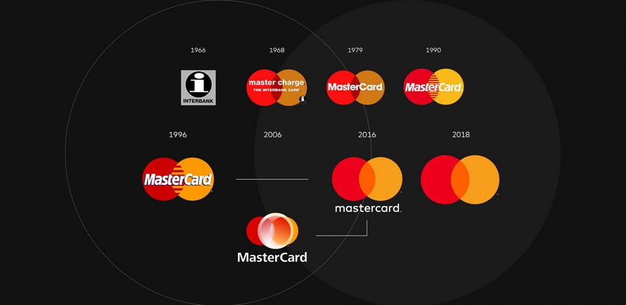
Mastercard did not arrive at this decision overnight. A 2016 rebrand laid the groundwork by decoupling the wordmark and the interlocking red and yellow circles.
“When we separated those two elements with our major redesign several years ago, [we] anticipated circumstances when the symbol could be used alone,” says Pentagram partner Michael Bierut, who led the Mastercard rebrand in 2016. Monotype provided the font for that rebrand, FF Mark, which Mastercard continues to use. “Given that their logo appears in smaller and smaller sizes, particularly in the digital world, allowing it to be used without the ten-letter Mastercard name seemed like both an opportunity and a necessity.”
It also doesn’t hurt to have near universal brand recognition, established over more than 50-plus years in the public consciousness.
“Mastercard cited an eighty percent recognition success rate just through their symbol and color,” said Monotype Creative Director James Fooks-Bale, “but it has taken them several decades to get to that level. Similarly, in the case of McDonald’s, the founders were using the arches right from the get-go in their restaurants, which gave them plenty of time to establish awareness. Nike, too, underwent a 25-year journey before they went purely to the swoosh.”
In many ways, dropping the wordmark is as much a status symbol as anything else, a way for brands to claim membership in an elite group of global names. Mastercard acknowledged as much in its release announcing the new logo, saying the company is “proud of our rich brand heritage and excited to see the iconic circles standing on their own.”
But while legacy brands like Mastercard and McDonald’s spent generations building up that recognition, brands born and raised during the digital age can achieve similar levels of visibility in a matter of years.
“Facebook and Twitter became fairly synonymous with their symbol/icon right from the start,” Fooks-Bale points out. Other digital companies—AirBnB, for example—have quickly moved to an identity system that relies less on words and more on unique, simple logos purpose-built for a mobile-first lifestyle.
“Ultimately, I think it all boils down to the maturity of the brand and whether the logo works,” says Zucker. And “mature” is not necessarily synonymous with “old,” as those younger brands demonstrate. In our era of global connectivity, brands can skyrocket from anonymity to ubiquity seemingly overnight.
That’s the easy part, relatively. Making the logo work is a whole other story.
Use a scalpel, not a sledgehammer
It’s worth pointing out that in the Mastercard example, the wordmark isn’t going away completely. Just … almost completely.
In its release, Mastercard says the interlocking red and yellow circles will appear alone in “select contexts,” specifically, “cards using the red and yellow brand mark, acceptance marks at retail locations (those stickers on shop doors and cash registers) both in the physical and digital worlds, and major sponsorship properties.” It’s difficult to imagine what isn’t included under those criteria, but it’s telling that Mastercard leaves open the possibility of using the wordmark in some cases.
“This approach is for areas of their brand system where a shorthand is needed,” says Fooks-Bale. “I think it’s clear the decision is for a facet of their brand system and not one and done yet. Instead, I think you’ll see the brand implementing it in phases across touchpoints and markets.”

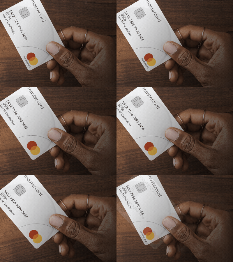
Now you see it, now you don’t: the wordmark will disappear from many prominent touchpoints, notably the physical cards themselves.
This brings up a crucial question: How do companies determine where they can safely remove the wordmark without disrupting the customer experience or risking a loss of brand recognition?
“At some point there’s got to be a leap of faith,” says Fooks-Bale. “There’s only so much research and testing you can do. You can’t predict how successful the logo will be with every use case or audience, now and into the future. Remember how global this brand is—it needs to work with countless third parties and supply chains, not to mention millions upon millions of customers.”
For a brand like Mastercard, the sheer number of use cases to consider is staggering. “What happens when they can’t use color in that symbol and it defaults to black and white?” says Fooks-Bale. “How do the recognition tests play out when you sew onto a soccer shirt, emboss into a material, print a bitmapped black-and-white customer receipt? What about an outdated or low-res screen? A quick glance at a billboard?”
“You can’t just flip the switch everywhere,” adds Zucker. “It’s essential to be comfortable with your existing brand equity and go slow in key places first.”
About that ‘wordless future’
So, should we expect more and more brands to run out and drop their wordmark? Not yet, says Zucker.
“I still think the wordmark matters,” he says. “Look at the Interbrand 100. I think it’s telling that only seven of the top 100 don’t have a wordmark in their logo.”
This is a good moment to point out that Mastercard faces specific circumstances other brands might not. Yes, it has broad global recognition other companies can only dream of, and yes it wants to claim its place among the world’s elite brands. But this change is as much about the future as the present or the past.
As more and more purchases take place online, and customers eschew physical credit and debit cards in favor of their devices in physical retail spaces, Mastercard is saddled with a name from a bygone era. Will kids born today even have plastic cards in their wallet—if they even carry a wallet—in twenty years? It’s difficult to imagine Mastercard ever changing its name, but de-emphasizing that name puts the focus on the service it provides in a way that embraces the future.
Mastercard isn’t the only brand staring down an unpredictable future, of course. “It’s exciting to watch major brands confront the challenges and opportunities of our digital future,” says Fooks-Bale. “And while I’m sure more companies will follow brands like Mastercard, achieving simplicity and creating a future-ready brand does require getting rid of the wordmark.”
“The bottom line for every brand is this: How will you convey your brand efficiently?” asks Zucker. “Each brand is going to have a slightly different answer to that question, and that’s the challenge for us here at Monotype—not just helping brands choose the right font, but helping them understand how to best use it in their broader visual identity.”


