Five Minutes with Phil Garnham, Transform magazine.

Phil Garnham, Creative Type Director at Monotype.
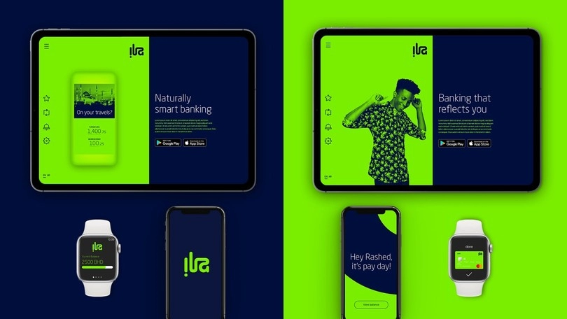
Phil Garnham, Creative Type Director at Monotype, speaks to Transform magazine about the importance of typeface in branding and the growing significance within the mobile platform. Phil discusses Monotype’s recent collaboration with creative agency Superunion for Arabic Bank ABC, which revealed an emerging typography design trend in mobile banking.
Why is it essential for designers to use a distinctive typeface especially in mobile branding?
If you think back 10-15 years ago, we entered a time that was really the birth of type as a pure digital experience. WOFF files and @font-face enabled us to use any font online, designers and brands started to break away from the restrictive system norms. However, in mobile brand terms that break looked like an unexpected co-ordinated shift towards normality where geometric fonts like Avenir, Gotham, Proxima Nova… were rolled out in just about every rebrand. Geometric type had become the de-facto mobile aesthetic and it felt like a trend that would never break. But ‘digital’ shouldn’t instinctively mean the demise of typographic personality or distinction. We live in a digitally accelerated world where search bars are replacing physical spaces. Unique brand typography, type that sets brands apart and enables them to speak more authentically has never been more essential. At the Monotype Studio we are seeing a shift towards more human, emotive, ‘touchable’ iterations of type with a digital focus.
Is mobile user experience redefining brand?
All interactions with brand redefine brand. Brand isn’t only a look and feel. It’s an interactive experience with the brand’s employees, their customer services. What happens in all instances of brand engagement needs to translate to gestural swipes in apps. We are in a pivotal era where start-ups are challenging established institutions. Interactions need to be simple, easy and memorable. Typography is a big part of that memorable experience. The mobile experience is often flat, and I think that plays into the flatness of typography too but by harnessing the soft-power of type, the subtle subliminal details that exist within letter shapes, brands are able to deliver a more unique experience.
What were the main lessons coming out of the recent collaboration between Monotype and Superunion?
Collaboration is key to executing the best ideas and at Monotype we really see ourselves as an extension to the creative studio. When Superunion began unearthing this idea of a reflective logo for both ILA’s Latin and Arabic markets we were keen to see how our expertise in type could inform and reinforce the idea. In the end, the key aspect for us was the craft, the smoothness of the line, the flow and balance of letterspace, the process. This back and forth dialogue between type and graphic designers is where the magic happens. It’s this cross-fertilisation of thinking that leads to new ideas and stronger executions of type. So for me collaboration is key to unlocking strong typographic identities.

What role does typography play in rebranding apps, particularly in the banking sector?
The digital experience is a reading experience and so with ILA, being able to find this clever way to unify the brand across geographies with typography was a huge win. Type is so important to creating this unique atmosphere and feeling around a brand. The words we read have a tone, type speaks for it’s brand, and it needs to have the strength to do that across a broad variety of environments. So as well as conveying a personality, type also needs to work big and small, in pixels and print, a brand’s words must be readable and for banking brands with a broad customer base that also means using a typeface that is as widely accessible and legible as possible. This is why our Santander type family included type styles for logos, headlines, text sizes and micro size use. Think of all of the typography a bank creates, the range of expression is vast. For ING we created headline fonts, text fonts and monospaced fonts for exclusive use in bank statements. Every brand comes with its own unique set of visual and typographic problems. In finance, creating a sense of trust and reliability is also hugely important. The mobile banking experience demands continuity to meet with customer expectations that confirm peace of mind, a certitude. Typography can create this sense of security on mobile platforms.
So a distinctive typeface in banking apps can help position a brand, it can become this unique identifier, solve specific creative problems, become a tool for reaching new customers and with consistent use it can provide peace of mind.
How does typography change when working within the digital sphere?
For decades digital type has been shrouded by this idea that you must create complex bitmaps and expensive pixel perfect ‘hinting’ for it to function at acceptable standards. Today that is no longer the case, unless you are creating type for very niche screen environments. The rasterization of type across devices has improved hugely. However optical principles still apply. The typeface must still be formed to its use, its designed environment, it has to be appropriate. It’s true that we have become conditioned to thinking that sans are more legible on devices, that open letter shapes are more understandable. Type in digital is RGB colour space, contrast has become a bigger factor too. ‘Digital’ also brings with it this idea of flatness and therefore type often has to fit and harmonise within design systems that enforce that idea, relate to symbols and icons of similar flatness. As a type designer the most exciting development in digital type is variable fonts. These are fonts that can adapt and respond to data or sensory input. Fonts that offer unlimited levels of creativity and ways to improve and tailor function. Imagine a typeface that responds to light or the proximity of your face to the screen… Virtual reality is also an area we are keeping a close eye on and expect to see some really exciting work here soon.
First published on Transform Magazine here.


