Ionic No5 Pairings
Curated by The Monotype Studio
Ionic No5 is a refresh of a classic Linotype Clarendon-style serif, another restored classic from the Monotype library, much like the recent updates to Walbaum and Helvetica Now. The original typeface was designed to be printed and read at small sizes, popular with newspapers in the 20th Century at its birth. The restoration and refinement of this typeface has bestowed a greater sense of clarity and directness, resulting in a smartly stylish, utterly captivating appeal.
These styles were quite popular for books and newspapers for a long time, so we think of them as editorial or bookish. Not dull, but thoughtful. Designers today can use that association to their advantage as a visual shortcut to convey similar meaning and tone. More attention was given to modernizing the typeface with the introduction of sharp edges & finishes.
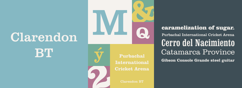
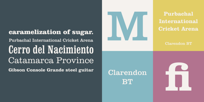
The Clarendon serif is the good-looking genre neighbor of the slab serif. If a slab serif like Rockwell is too plain-looking, and the thin serifs of a Bodoni or Didot are too delicate, a Clarendon might be the Goldilocks in the middle.
The thinnest weights can give a dancing typewriter aesthetic, thanks to the low stroke contrast, while the heavier weights have an unquestionable presence on the page. Overall, the typeface has a richness and almost illustrative quality about it. Take the swooping figures for example, like the 2 and 7. Each one could be a poster by itself.
The italics in Ionic No. 5 are juicy and quite active. They can offer a more complex texture to a line or body of text, and are simply dazzling for headlines. The available small caps also add to the palette of possibilities and hierarchy. Let’s take a look at what pairings could accompany this aesthetic.


