Latinotype foundry highlights.
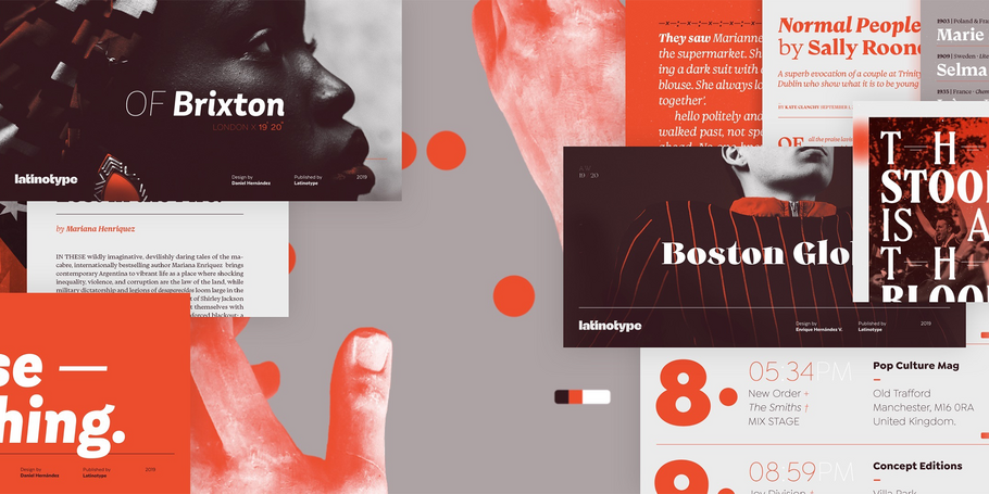
Curated by the Monotype Studio.
Latinotype.
As Chile’s first digital foundry, Latinotype’s goal is “to design new typefaces remixing diverse influences related to our South American identity with high quality products for the contemporary design industry.” And the two founders have been doing just that since their foundry’s creation in 2007. Luciano Vergara and Daniel Hernández have created a rapidly growing collection of typefaces in a wide array of genres. Specializing in colorful display and script faces, the group’s name “Latinotype” emphasizes the strong tie they feel to their cultural identity.
Mixta
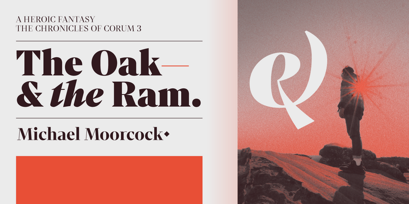
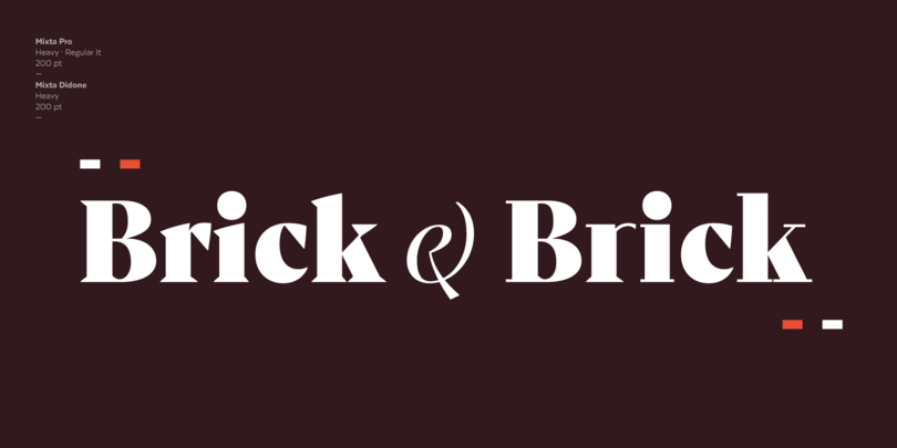
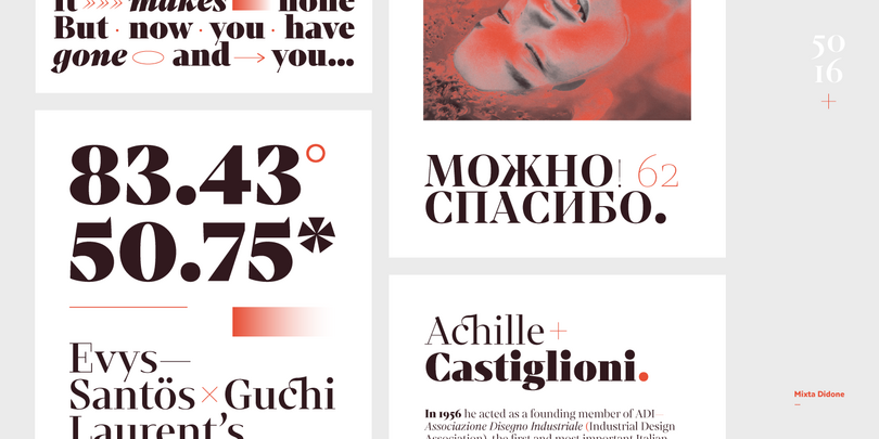
Mixta is a contemporary sans-serif typeface, inspired by the idea of mixing different kinds of terminals in order to give the font a singular appearance - from historical didones to contemporary sans. Mixta comes with a set of 1,200 characters that support over 200 Latin-based languages. This font was especially designed for branding, advertising, editorial design, and use on TV and social media.
Recoleta

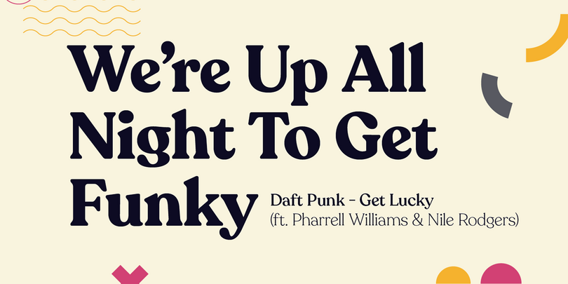
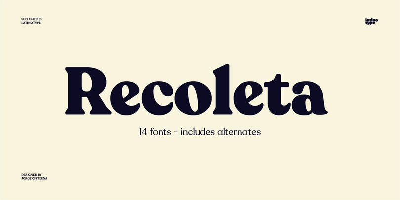
Just like Grandma’s cooking, Recoleta combines a variety of ingredients — from various popular 1970s typefaces — such as the soft and gentle shapes found in Cooper or the fluid, angled strokes in Windsor — mixed into one single design that features familiar, yet fresh, modern flavors.
Corporative Slab
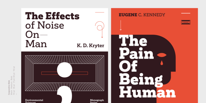
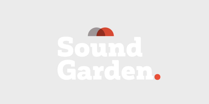
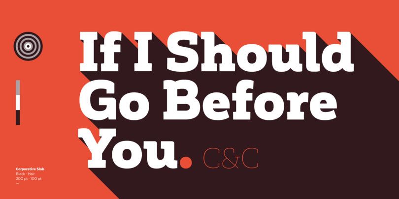
Corporative Slab’s thick serifs give it a strong personality. Its fundamental architecture and rounded edges make it balance perfectly with the original sans Corporative. Corporative Slab is great for large-scale display use and it is also suitable for use at small sizes.
Branding
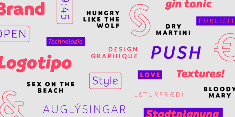
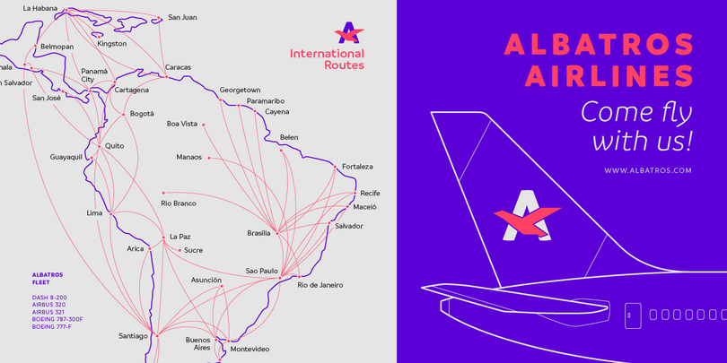
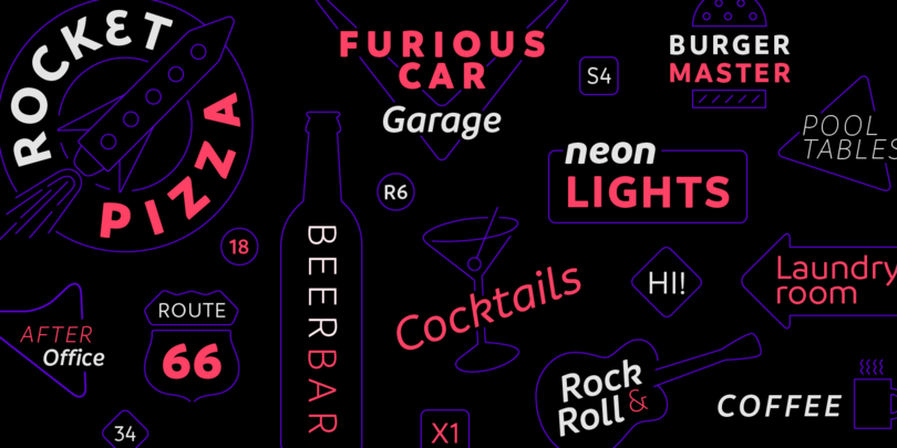
Branding, a modern typeface for modern needs! It has been especially designed for meeting contemporary aesthetic and functional needs; the interpretation of a modern typeface from the designer’s own perspective. This font is well-suited for logotypes, isotypes, short text, etc. Branding comes in 7 weights—ranging from Thin to Black—with matching italics and includes a set of 544 characters that supports 128 different languages. European accents, old style numbers, and multiple alternates are also included.
Galeana
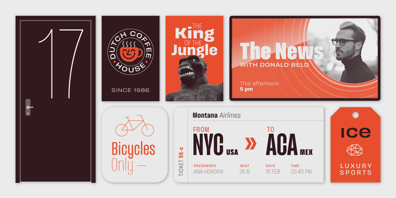
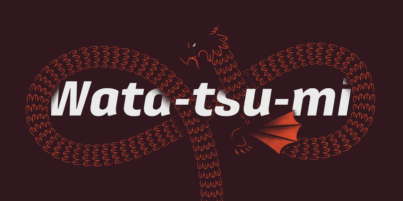
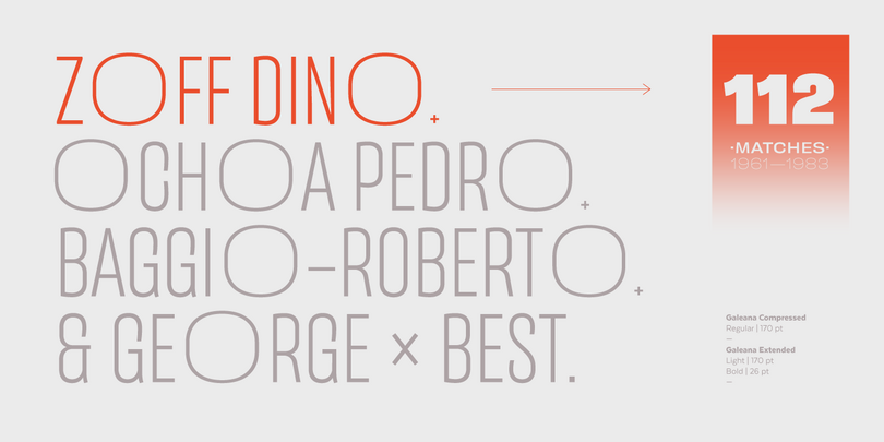
Galeana is a reinterpretation of Latin American flavored typefaces used for European editorial designs such as Plastique and Zembla magazines. This superfamily consists of 4 sub-families: Compressed, Condensed, Standard, and Extended. The heaviest and narrowest variants—created at the early stage of the design process—resemble the slender trunks of the Galenas (African tulip trees). The other variants have an extended width, which evokes the broad crown shape of these trees.
Trenda
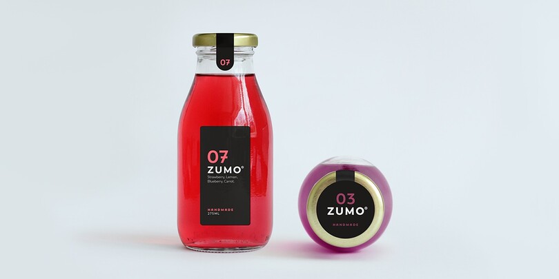
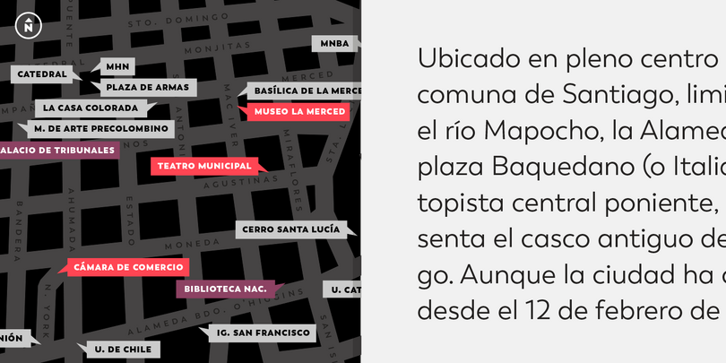
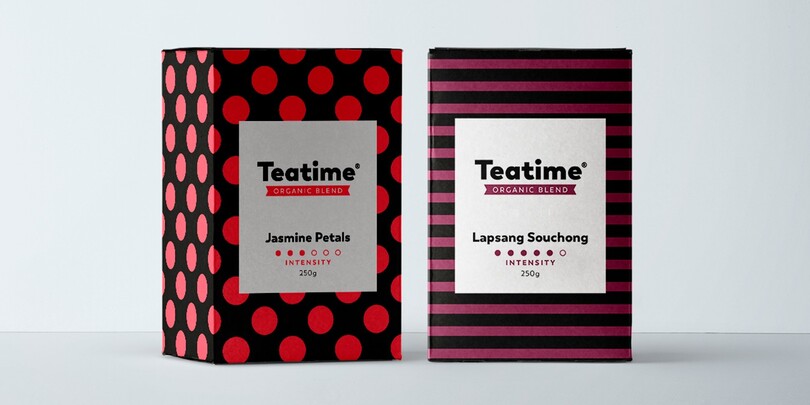
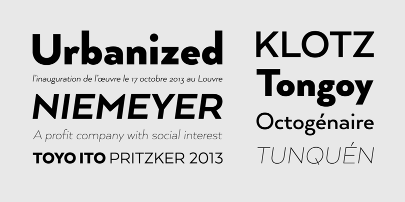
Trenda is a geometric sans-serif typeface based on the uppercase of Trend—a popular Latinotype font, released in 2013. Trenda’s lightest and heaviest variants are ideal for display use while its middle weights work well with short and mid-length texts. This typeface has been designed especially for corporate projects, logotypes, and publishing.
Arquitecta
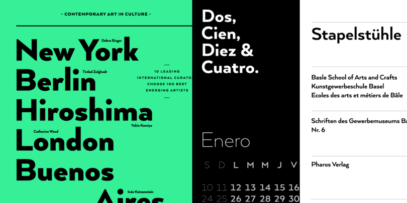
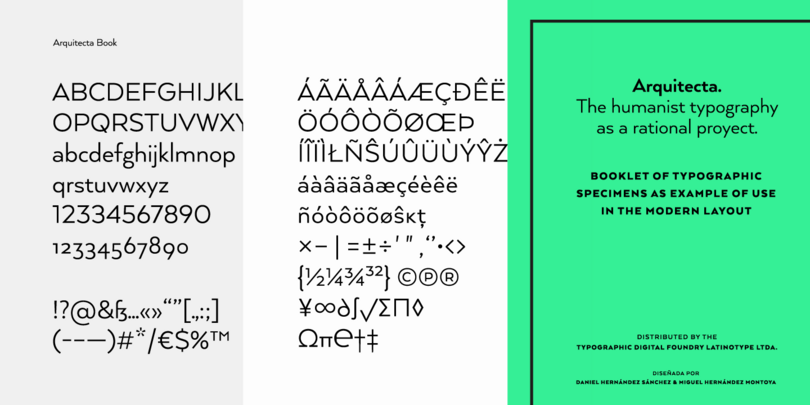
Arquitecta—humanist typography as a rational project. Inspired by American & European hand lettering from the first half of the past century, Arquitecta finds its own space as a great alternative for paragraphs in front of classics like Futura, Kabel or Avant Garde. Based on the experimentation during the Bauhaus and modern sans history, Latinotype was inspired to construct a rational geometric typeface with humanist proportions suitable for text layout and continuous reading.
Andes Neue
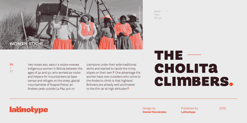
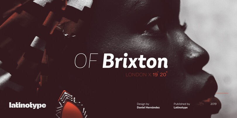
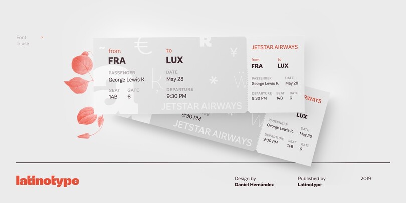
Friendly, neutral, and happy, this typeface is perfect for branding projects. Andes Neue is a redesigned version of Andes, with a larger character set of 759 glyphs that supports 219 Latin-based languages from 212 countries, with small caps too!
Mohr
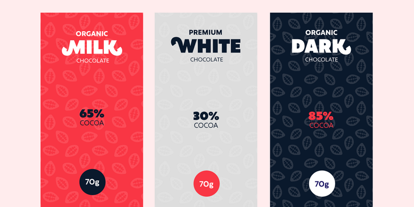
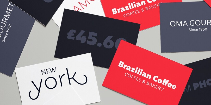
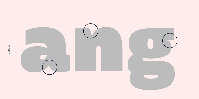
Mohr is suitable for a wide range of applications, from display use to small text. The Mohr family comes in three versions: normal, alt and italic, each with 9 font weights, from Thin to Heavy, resulting in a total of 27 fonts. Mohr also includes initial and terminal swashes in most of the uppercase and lowercase characters. This gives the font a unique personality and provides a greater range of uses such as branding and packaging.
Moranga
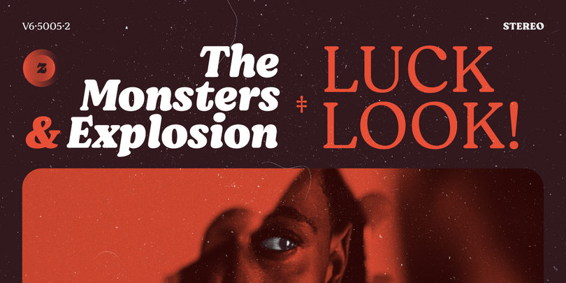
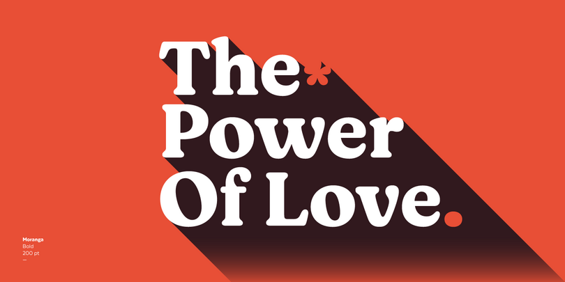

Moranga is a contemporary, serif, retro-style typeface with a strong personality. Its design is a mixture between Café Brasil’s flowing, organic shapes and elements from 70’s popular fonts such as Cooper and Souvenir.
Jazmin
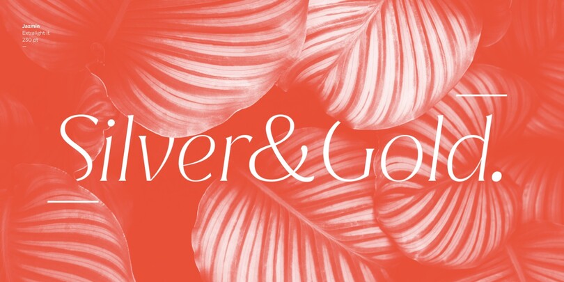
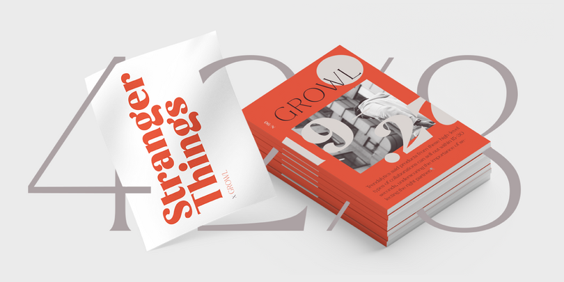
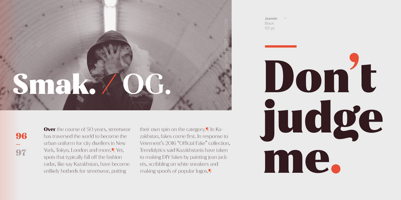
Jazmín is inspired by “Globe Gothic” design yet features different proportions, curves, serif shapes and contrast, which give it a classy, playful and a more contemporary look. The family comes in two versions: an elegant font of 8 weights ranging from Thin to Black with matching italics, and an alternate, more playful counterpart with the same number of weights and italics.
Texta
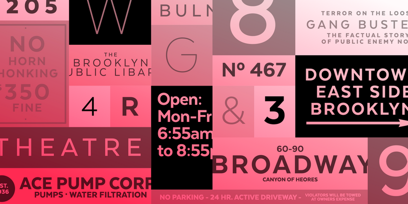
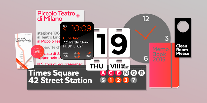
Texta. A Sans for All. Through studying humanists’ models from Edward Johnston to Adrian Frutiger and the Gothic Alphabet made by sign painters comes Texta, a contemporary, rational, transparent and useful sans to compose all kind of texts. Latinotype developed an Alt version that replaces lower cases like a-g-y with geometric constructions to provide more versatility.