Understanding DIN.

Curated by The Monotype Studio
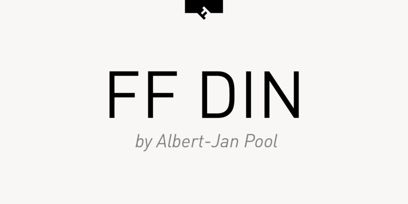
DIN is an acronym for Deutsches Institut für Normung, which translates to the German Institute for Standardization, a national organization for standardizations. They specify thousands of technical standards for mechanical things like nuts and bolts, screws, and beams. Typefaces and technology have a long relationship together, and the DIN typefaces are no exception.
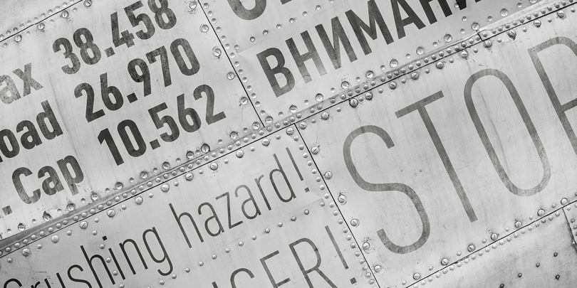
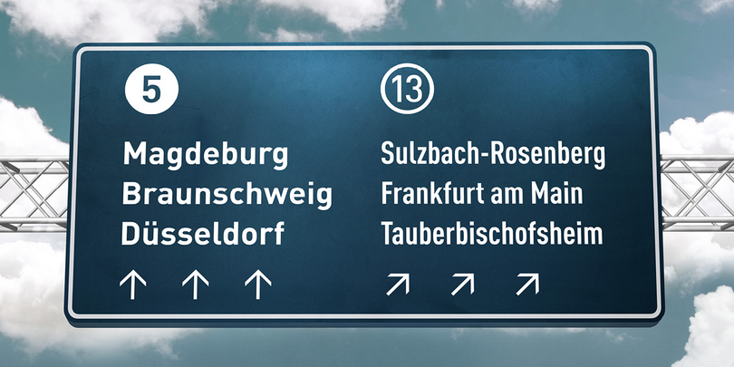
The German government needed a way to unify labels for the railway in the early 20th Century, so they released a lettering template of sorts, which was then adapted to a typeface by Stempel in 1923. The DIN organization numbers all of their standards, so the typeface was labeled DIN 1451. After it became a standard for road signs and license plates, it was adopted by graphic designers for its purity of geometric forms and precise, efficient looks.
How to tell them apart
At first glance, FF DIN and DIN Next can look very similar, but these details often inform a preference.
- DIN Next has a slight rounding effect on the corners, softening the appearance a bit. Sometimes the sharp edges of FF DIN are preferred.
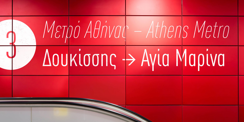
- The FF DIN also has flat, horizontal terminals on the condensed styles, where the DIN Next has angled terminals that make a more open aperture.
