Rough & Rusty

Curated by The Monotype Studio
One of the most popular type decorations in recent years has been distressing. You’ll recognise it right away—often little flecks and imperfections that simulate analog printing methods or artificial aging.
While letterpress printing inherently makes these textures, using distressed fonts became a visual shortcut to represent things that are crafted, hand made, natural, or just down to Earth and relatable. It became desirable once digital reproductions dominated the landscape and we longed for something handmade. Essentially, a reaction to the dominance of sleek and perfect digital design. With any decoration, a little bit often goes a long way, but if your content supports it, you can go all out. If you’re looking for even more options, try keyword searches like: rust, rough, distressed, printed, or stamp.
Intro Rust
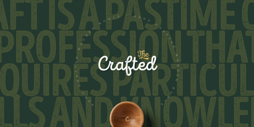
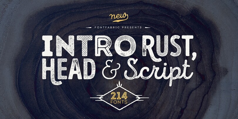
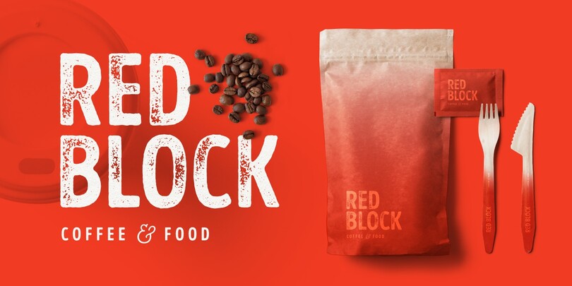
The gigantic Intro Rust family of 214 fonts can be used to create almost any type of project in print or web design. The serifed I and curved K give this one away, just use your imagination and your project will become more alive and vivid than ever with one of the Intro Rust fonts.
You want to make a greeting card or a package design, or even a brand identity? Feel free to play with all the patterns and shapes, scripts, or those cool fonts with the dots and that will lead you to your next successful project.
Nexa Rust
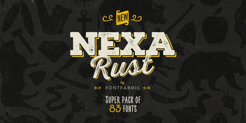
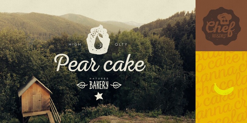
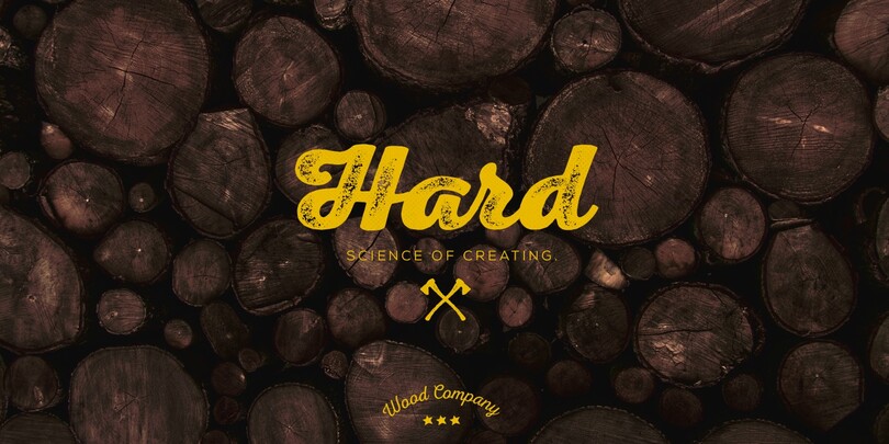
Nexa Rust from Fontfabric Type Foundry is a multifaceted font system consisting of five subfamilies: Sans, Slab, Script, Handmade, and Extras. Each of these sub-families contains a number of font weights that have a characteristic warm, rough look and display a few degrees of saturation.
Nexa Rust is a rough version of the already popular Nexa and Nexa Slab families with added new matching Nexa Script and Nexa Handmade fonts. In addition, the family includes groups of extras that could serve as a foundation or add an extra “cherry on top” to each unique design.
Trade Gothic Next Rust
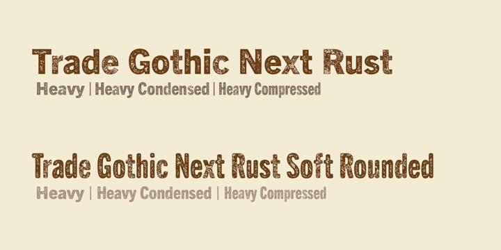
The distressing works best on heavy styles, so this tidy palette keeps it simple with options for width or rounding.
Handelson
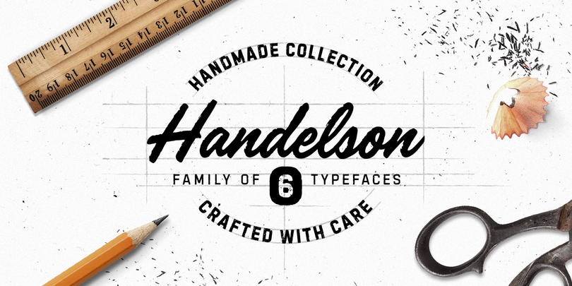
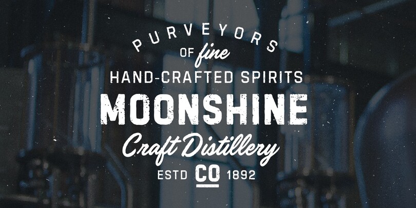
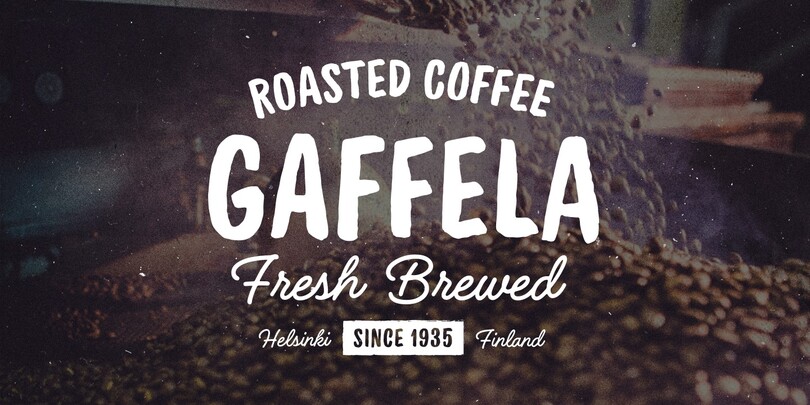
Handelson is a collection of 6 handmade typefaces with an authentic and organic feel. It contains three scripts, one non-connected script and two all caps geometric sans serifs. Textures and rough edges simulate handwritten and printed looks. By combining these fonts you can make diverse typographic solutions and elements with a unified style.
DIN Next Decorative.
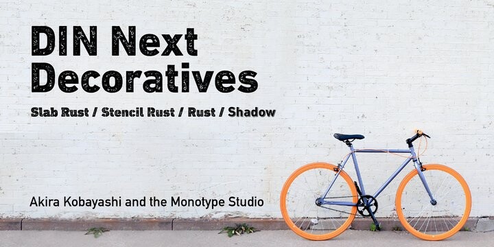
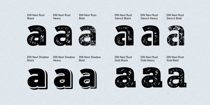
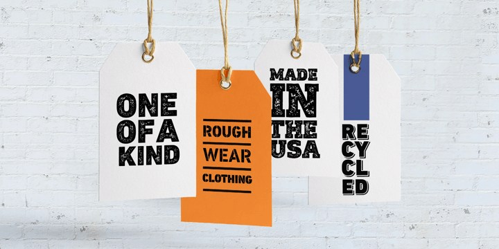
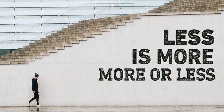
The famously, crisp, clean and precise typeface has been given a textured update that’s reminiscent of rusted metal, or rubber stamps. Underneath this lies the same sturdy, geometric shapes that have allowed DIN to stand the test of time, but with a new sense of tangibility. The rust effect on DIN Next Decorative comes on the sans, slab serif and the stencil forms. An old favorite with new clothes, you can pair it easily with other DIN fonts.
Zing Rust
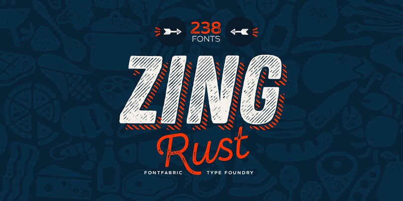
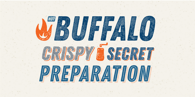
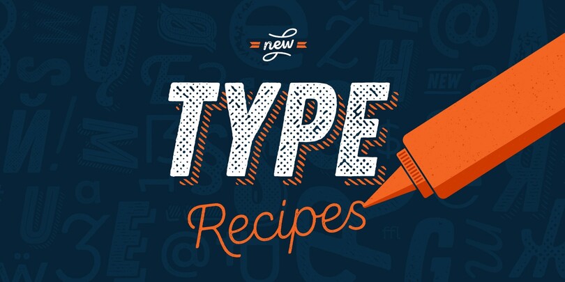
Always bold, always italic, always condensed make Zing Rust ready to tackle loud headlines. It is a truly handmade type system consisting of 238 fonts. This incredible font family is based on layer combinations and gives endless possibilities to mix and make various designs. Each style could be used separately or merged in order to achieve all the creative designs you can imagine.
The font is based entirely on handwriting, which brings an aesthetic that can’t be imitated with any computer filters, scripts or plugins.
Schmutz
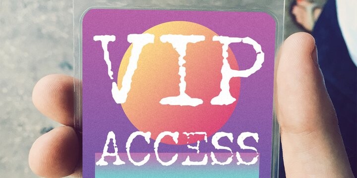
A great example of a printed typewriter style available in 3 inky states: a Light, Regular, and Bold packaged as Corroded, Cleaned, or Clogged.
Trend Rough.
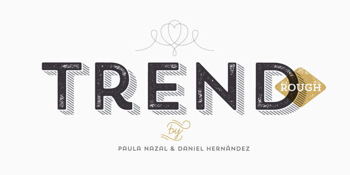

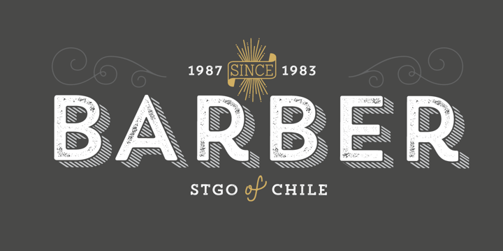
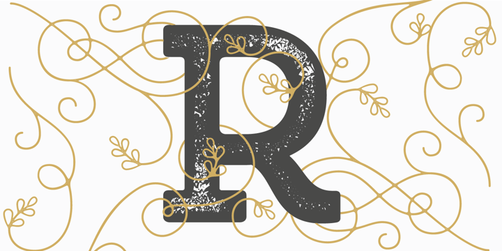
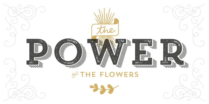
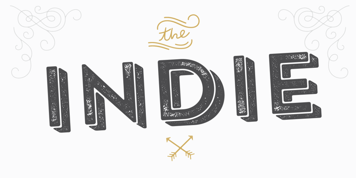
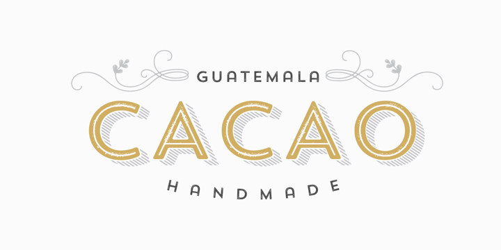
Another sans and slab serif combo. The sans has a round apex on the A, and a curved leg on the R that give it an Art Deco signage appeal.
Nelson
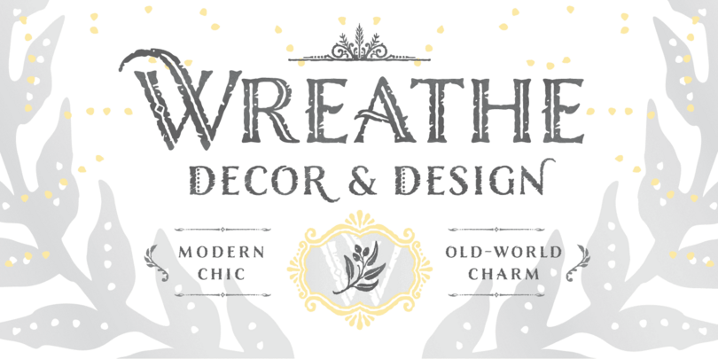
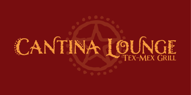
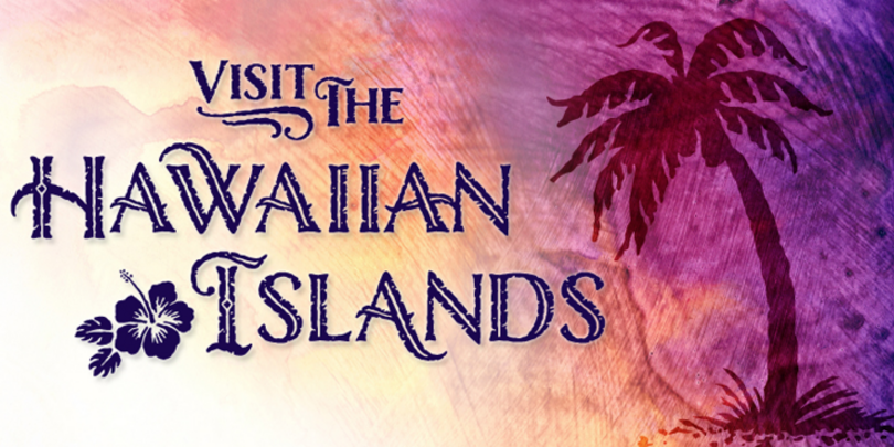
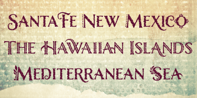
Evocative of paint on weathered wood, Nelson’s engraved capital letters are as rustic and confident as the Old West. Designers can combine the engraved face with bold and rough versions to create handsome wordmarks, or use the display font for food packaging, restaurant menus, and roadside attractions. You’ll likely want to pair it with a quieter sans or serif, like Mundo Sans or Sabon Next.
Roadkill

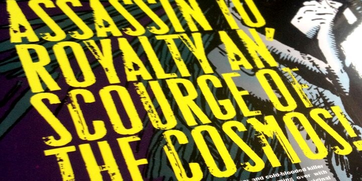


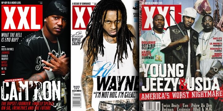
Sometimes you need something that is a bit more crude, and the Roadkill typeface could fill that void. There are plenty of one-off display typefaces that are quite rough, but look for one that has alternate letters to help simulate the lettering effect.