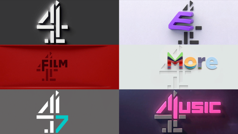
7 Typographic rebrands that worked wonders.
7 Typographic rebrands that worked wonders.
Branding
Marque
Today’s brands must keep up with a fast-paced digital world and navigate a “new normal” that’s still emerging from the worst of the pandemic. The last few years shifted everyone’s digital expectations, how brands operate, and in some cases, impacted their business models.
Moreover, issues like biodiversity, sustainability, diversity and equity, and brand activism are all booming. So how does this all impact brand building? These macro shifts are greatly influencing how companies position themselves, the services they offer, and how they communicate with their customers.
“We’ve never faced such a relentless phase of growth,” says Monotype Senior Director, Creative, James Fooks-Bale. “Brands have to evolve at a rapid and continual rate, whether that’s a technological shift, new audience or way of segmenting, a new market or localization.”
We spoke with our Brand Designer, Marie Boulanger, who works at the intersection of type and branding on a daily basis, for a collection of successful rebrands, and how to choose fonts when rebranding your business.
