Trajan Alternatives

Curated by Monotype Fonts
Trajan, 1989, from Carol Twombly at Adobe, has become a sort of default, go-to design that gives a classical, formal, or majestic feel to layouts. It's even become a cliche in the design of movie posters, initially conveying gravitas and nobility, but lately sliding more into the esthetic of horror movies.
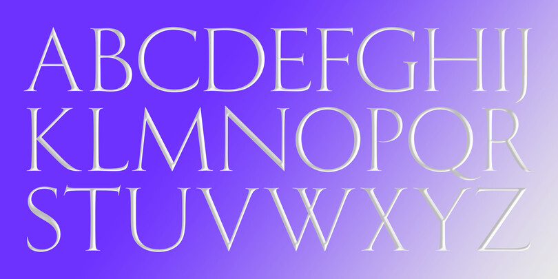
Trajan is closely modeled on one specific inscription, which is the source of its name: The renowned carved letters at the base of the column commemorating the Roman emperor Trajanus. But it isn't the only example of classic capital stone inscriptions in Rome, or in the world. There are designs that could convey more sensuality, fluidity, even swing.
The Monotype Studio has curated a few suggestions on alternatives that may suit your project better without loosing the design essence found in Trajan.
