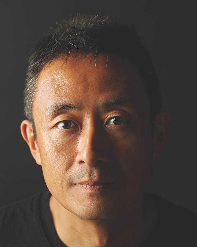
Akira Kobayashi.
Creative Type Director.
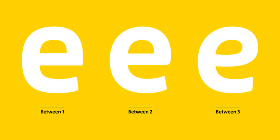
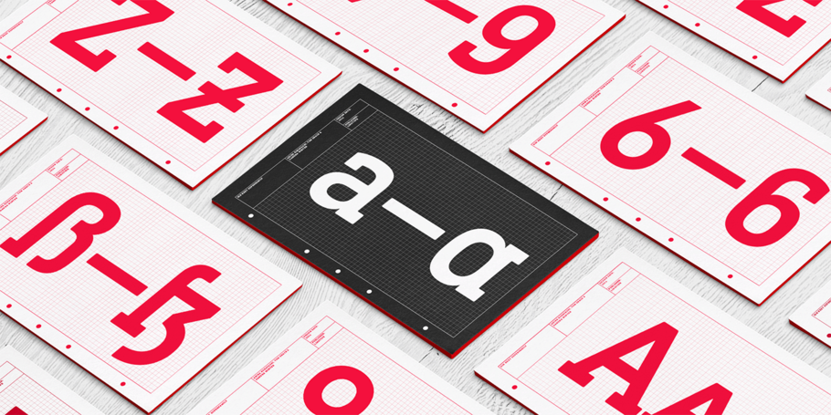
Between™ comes in three main states. While different from each other, they all offer human-centered design to ensure that copy set in them is affable and approachable.
With its technical and neutral character, DIN Next has earned a permanent place in contemporary typography. Now, DIN Next Slab expands the font family further, offering new design potential.
In his words.
Creative Type Director Akira Kobayashi has three decades of experience, with an extensive background in Japanese typeface design and a deep understanding of calligraphy. After studying at Musashino Art University in Tokyo for four years, Akira Kobayashi accepted his first job at phototypesetting manufacturer Sha-Ken Co., where he was involved in the lengthy and intricate process of designing Japanese fonts.
After leaving this role he studied calligraphy at the London College of Printing, worked as a freelance type designer. In 2002 Kobayashi released Optima Nova – a modernization of Hermann Zapf’s Optima design – and in 2009 he partnered with Adrian Frutiger to update his eponymous typeface family. More recently, Akira directed the development of Tazugane Gothic, Monotype’s first original Japanese typeface. Over the course of his career, Akira has designed more than 50 font families including DIN Next, Akko Pro and Neue Frutiger, and worked with major brands including Sony, UBS and Panasonic.
Studio releases.
Between
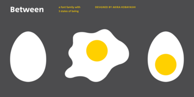
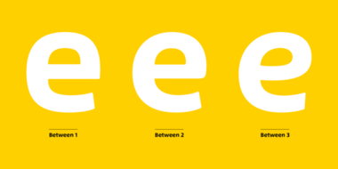
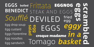
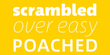
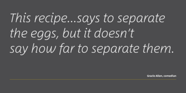
Akira Kobayashi’s Between™ typeface comes in three main states. While different from each other, they all offer human-centered design to ensure that copy set in them is affable and approachable. An added benefit is the ability to transition “between” font designs, choosing different styles – or even individual characters – to create hierarchy, contrast or emphasis.
DIN Next Slab

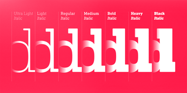
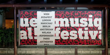

DIN Next Slab, also produced under the direction of Akira Kobayashi, the typeface is a variant based on the optimized shapes of DIN Next. The expansion will make the popular font all the more flexible and versatile. Apart from that, the geometric slab serifs underline the technical and formal nature of the font and emphasize a central design element of DIN Next.
Akko
Picture an industrial strength typeface like the Isonorm™ design. Now blend this with an organic design like the Cooper Black™ typeface. It was the idea of the fusion of these two design concepts that inspired Kobayashi to draw Akko.
“My initial idea was to create a san serif type with a ‘soft-focus’ effect”, says Kobayashi. “From here, the design evolved into two families, the robust and structured san serif Akko, and soft and friendly, Akko Rounded.”
Related content.
SST: a font for everywhere.
The SST font tackles a central challenge of branding – universality. The SST superfamily supports more than 90 languages including Japanese, Thai and Arabic.
One typeface, 93 languages for Sony.
Monotype’s Akira Kobayashi worked closely with Sony’s Chief Art Director Hiroshige Fukuhara to create an original typeface ready for nearly 100 languages.
Alibaba Groupʼs new typeface brings beauty and simplicity to company’s ecosystem.
This custom-designed font family, Alibaba Sans, will help partners and customers power on-brand designs.
