Times Modern and the modern Times
Times Modern and the modern Times

Tipografia

Design de marca

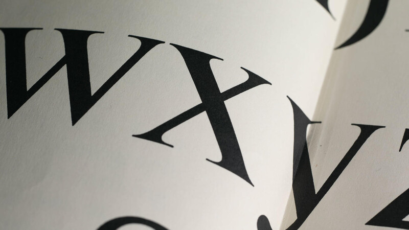
When your business is the printed word, your use of type is serious business. From the introduction of the Times New Roman® typeface in 1932 through to its Times Modern fonts today, The Times newspaper’s use of type has been a critical and iconic aspect of its brand.

There’s a tendency when talking about typefaces to focus on the little details. However, this is a story about the life cycle of typefaces, specifically the way typefaces have been a crucial part of the life cycle of The Times of London, a trusted brand that has carefully cultivated its use of typography for decades.

The Times has evolved over time and has periodically felt the need to update its type to address the changing production methods and context.

Background

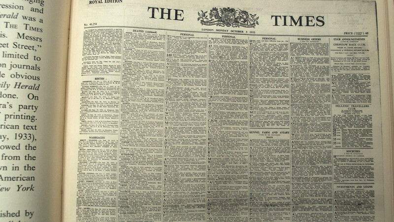
This story begins in 1930, when Stanley Morison wrote a stern critique to the publishers of The Times about the way they used typography in the newspaper. Morison, the typographic advisor for British Monotype, warned that the authority and respectability of the newspaper was being betrayed by its use of a variety of typical Caslon styles. These didn’t show off the fine print quality of the paper, and they were a little old-fashioned for a paper that respected its history but also took pride in being contemporary. Morison described typographic qualities that could instead enhance what the paper was about, so they could convey the spirit of the paper visually as well as editorially. This was the real start of the conscious typographic branding of The Times.

This combination of history and modernity is as true for The Times today as it was in 1930. The paper has been around for a very, very long time—since 1785, when it was known as The Daily Universal Register—and it prides itself on being the newspaper of record for the U.K. Oct. 3, 1932 was the day that The Times’ old look was swept aside for a crisp, modern banner and a brand new type family created by Monotype under Morison’s direction. This desire for a connection to history while being crisp and modern resulted in the Times New Roman typeface, which many people—particularly those outside the U.K.—do not realize gets its name from being the new typeface for The Times.

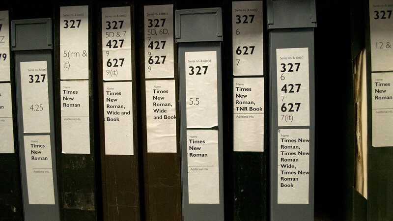
Times New Roman was a success for The Times for the brief period when it was its exclusive property, and once Monotype introduced it for other customers and type manufacturers, it became wildly successful for everyone else, too. It can now be argued that the ubiquity of the Times New Roman typeface today—in its many forms for many uses in many media—is a brand that is bigger than even The Times itself. In the highly regarded book Anatomy of a Typeface, Alexander S. Lawson wrote, “Of all the typefaces developed during the past 70 years, Times Roman is the one most frequently singled out as typifying the twentieth century.”

The challenge

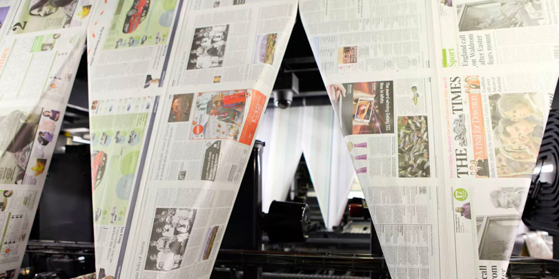
The Times has evolved over time and has periodically felt the need to update its type to address the changing production methods and context. For all these changes in the type families, all the designs share a “DNA,” a certain crispness and authority that remains true to what The Times is about. This brings us to the current family—Times Modern, originally designed by Neville Brody’s Research Studios in 2006 (with a variety of new weights and styles later designed by Monotype). Times Modern proved to be another success for The Times, and after a few months of working with this new design and discovering how it behaved and what the ongoing challenges were, The Times asked Monotype to expand the family. Since then, Monotype has also been asked to maintain the continuity between print and pixel for its readers, online and off.

The solution

Robin Nicholas, Patrick Giasson, and Alice Savoie at Monotype took the family in new directions, particularly with an extreme range of weights for display work, and the addition of italic styles, which were not included in the original set. Times Classic, the family introduced in 2002, is still used for the body text, but the sharper, streamlined Times Modern family sets the tone.

Typography has allowed The Times to carry its brand into other media, too. Moving past print, its digital versions are becoming a bigger part of what they offer. In the iPad edition of The Times, the typography is once again a key element of the experience. The look and content of the print paper is carefully curated, and The Times does not wish to abandon that effort and ask its readers to figure out a new experience in its app. To ensure the fidelity and quality of the typography, the iPad app uses real fonts rather than JPEG or PDF images of its pages. The text reflows when the orientation switches from vertical to horizontal, and the type remains crisp and legible. By having its own fonts embedded in the app, the screen rendering feels consistent with other iPad apps, yet the typographic detailing is undeniably that of The Times.