Mark Simonson foundry highlights.
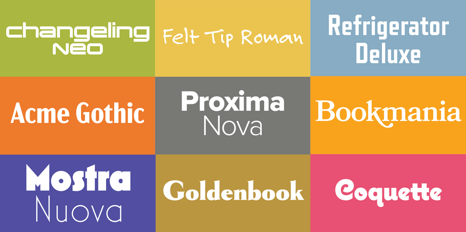
Curated by the Monotype Studio.
Mark Simonson.
Mark Simonson grew up with an interest in letters and a passion for art, both forming his initial career path as a magazine art director and graphic designer. Mark tinkered with type design throughout the years, eventually releasing his first font, Felt Tip Roman, in 1992. However, he didn’t pursue the field full-time until 2000, when he founded Mark Simonson Studio in St. Paul, Minnesota. Since then, this one-man foundry has seen great success with well-known, best-selling fonts like Mostra Nuova, Coquette, and Proxima Nova, which is used on thousands of websites across the globe.
Proxima Nova
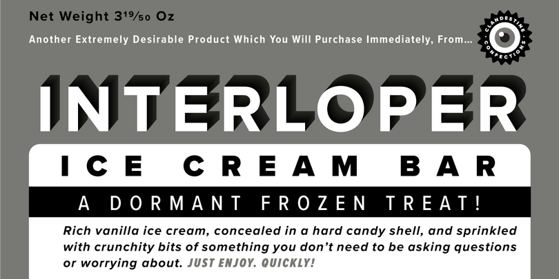
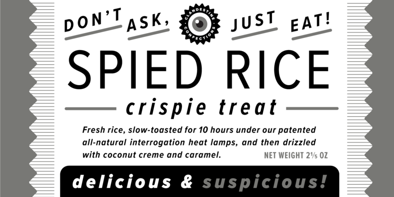
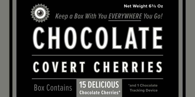
The Proxima Nova family is a complete reworking of Proxima Sans (1994). The original six fonts (three weights with italics) have been expanded to 48 full-featured OpenType fonts. There are three widths: Proxima Nova, Proxima Nova Condensed, and Proxima Nova Extra Condensed. Each width consists of 16 fonts—seven weights with matching italics. Stylistically, Proxima Nova straddles the gap between typefaces like Futura and classic sans faces. The result is a hybrid combining modern, humanistic proportions with a somewhat geometric appearance. Proxima Nova is on the MyFonts top 50 best-selling fonts list and is a popular web font, in use on thousands of websites around the world.
Felt Tip Roman

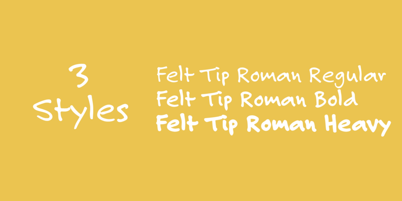
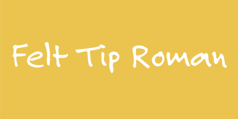
Felt Tip Roman, the designer’s first font, was originally created in 1989 as an experiment, and eventually became one of his most popular typefaces. The font was a straight adaptation of his handwriting, and was expanded in 2003 to include Bold and Heavy weights that broadened the usefulness of the typeface.
Mostra Nuova

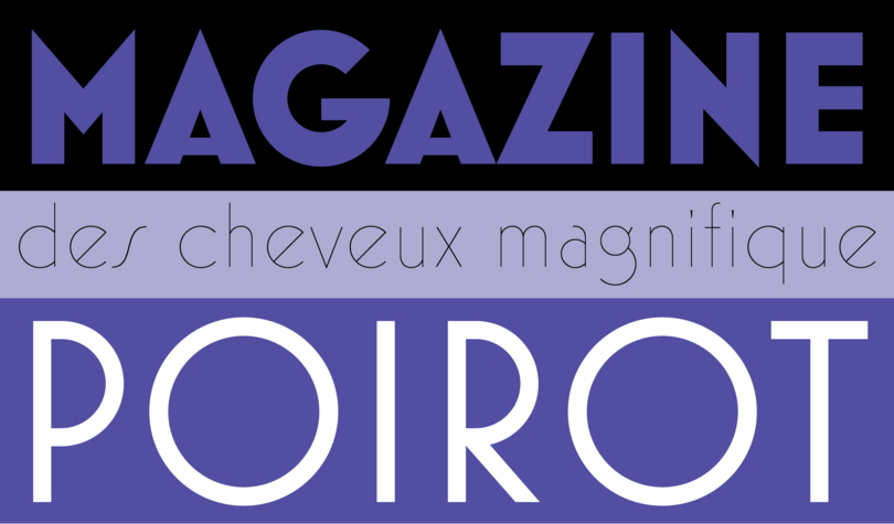
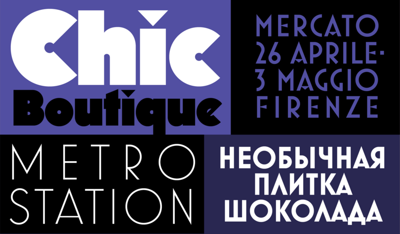
Mostra Nuova is based on a style of lettering often seen on Italian Art Deco posters and advertising of the 1930s. The geometric font has subtle optical adjustments to give it a softer appearance. Mostra Nuova contains many alternate characters, representing commonly-found variations in Italian Art Deco lettering. They can be used in endless combinations to capture a particular mood or style. The family includes nine weights, and features an extended Latin character set (most Western and Eastern European Latin-based languages supported) and support for Cyrillic (including local variants for Bulgarian, Serbian, and Macedonian).
Goldenbook
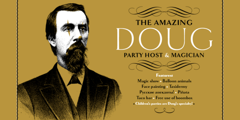
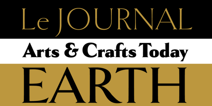
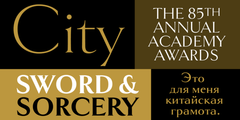
Goldenbook is based on the logotype of a literary magazine from the late 1920s called The Golden Book Magazine. An art deco take on the classic Roman letterforms, this lowercase font is meant to be used in a large size and is often seen on book covers. Goldenbook includes fonts with both old style and lining numerals in each weight and provides support for Cyrillic, as well as other interesting typographic features such as an alternate ampersand and a long-tailed capital R.
Coquette
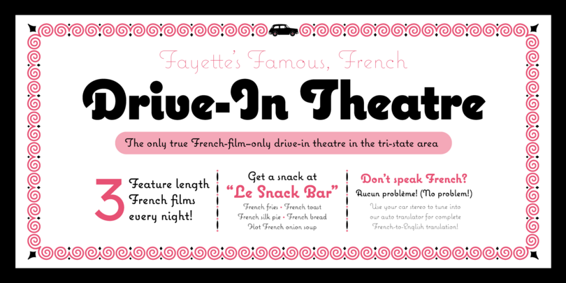
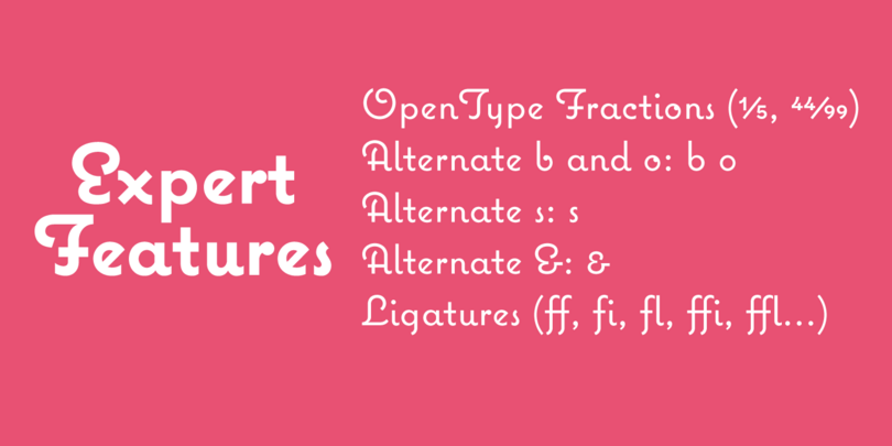
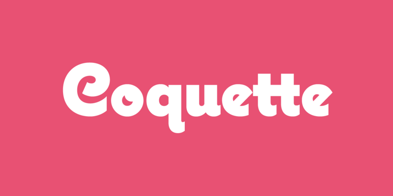
Coquette is an unconnected, upright script combining elements of the traditional French script and geometric sans serif styles. The result is at once novel and familiar, evoking both vernacular and commercial lettering of the mid-20th Century without being derived from any specific existing source. First released in 2001 in three styles (Light, Regular, and Bold), the font family was updated in 2017 to add three new styles (Thin, ExtraBold, and Black) and several new features including alternate characters, OpenType fractions, superscript, f-ligatures and math characters. Coquette has been adopted for a wide range of uses, including packaging, shop displays and book covers.
Refrigerator Deluxe
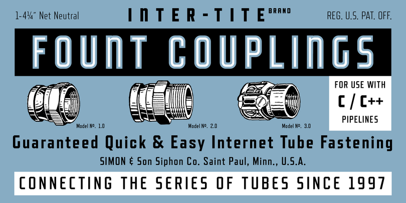
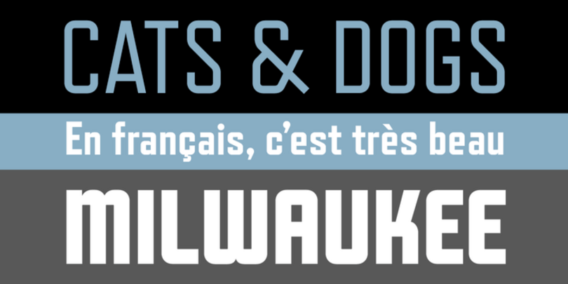
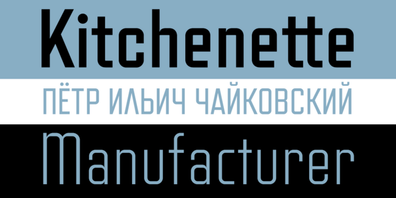
Refrigerator Deluxe is an expanded and enhanced version of Refrigerator, a condensed, geometric sans serif inspired by the generic block-style lettering typical of the mid-20th century and often seen in old lettering manuals. Refrigerator Deluxe features many alternate characters that can be used to achieve endless variations from basic “block letter” to high style Art Deco through the magic of OpenType. Refrigerator Deluxe is perfect for evoking the era that produced huge, humming fridges, but also graces the covers of books on contemporary politics or urban culture.
Changeling Neo

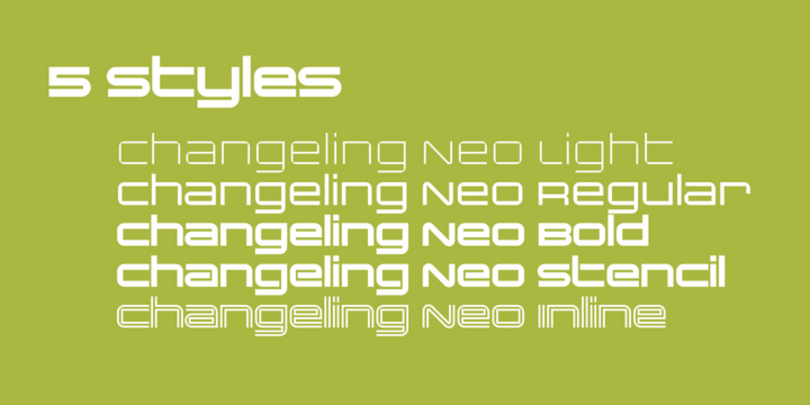

Changeling Neo is an expanded and enhanced version of Changeling (2003) which in turn was a redesign and expansion of China, a Visual Graphics Corporation typeface from the mid 1970s designed by M. Mitchell. Changeling Neo provides more weights and styles than the original family, redesigned characters for better type color, and a complete set of lowercase-style variants, providing endless “unicase” combinations.
Acme Gothic
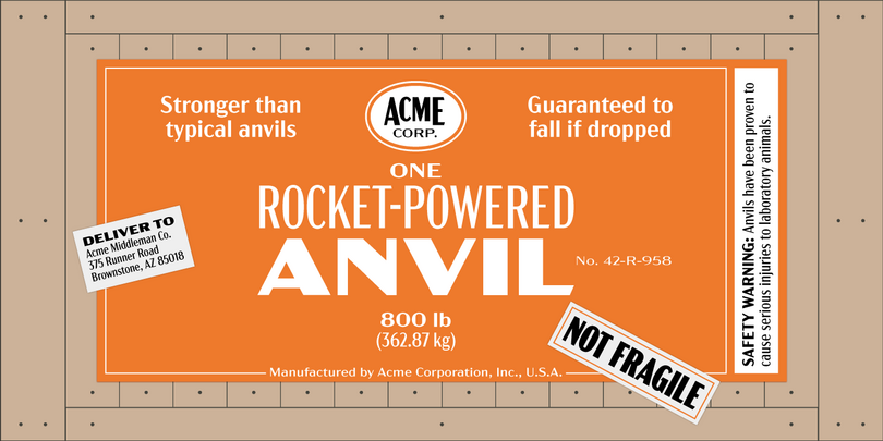
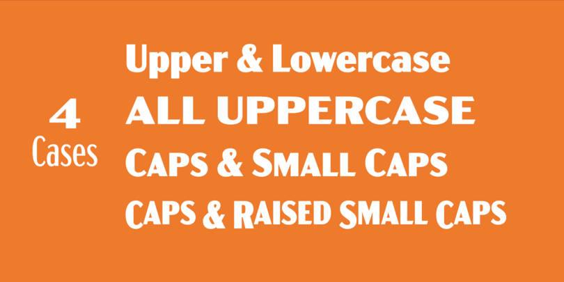
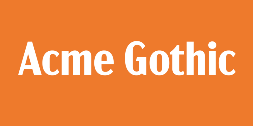
Acme Gothic (2018) is based on the thick-and-thin gothic lettering style popular in the U.S. in the first half of the twentieth century. There have been typefaces in this genre before, but they were either too quirky (Globe Gothic), too English (Britannic), too Art Deco (Koloss), too modern (Radiant), or too Art Nouveau (Panache). None captures the plain, workman-like, vernacular style of Acme Gothic. The font family offers 25 different styles and extensive language support that covers most Latin-based writing systems. Acme Gothic also includes both small caps and raised small caps (accessed through an OpenType stylistic set) both of which can be found in vintage examples of this lettering style.
Grad
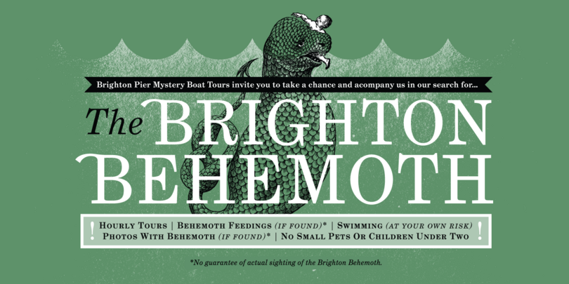
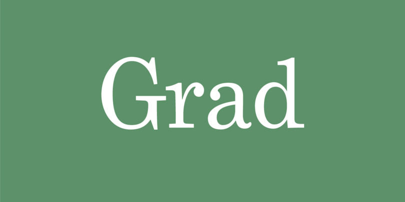
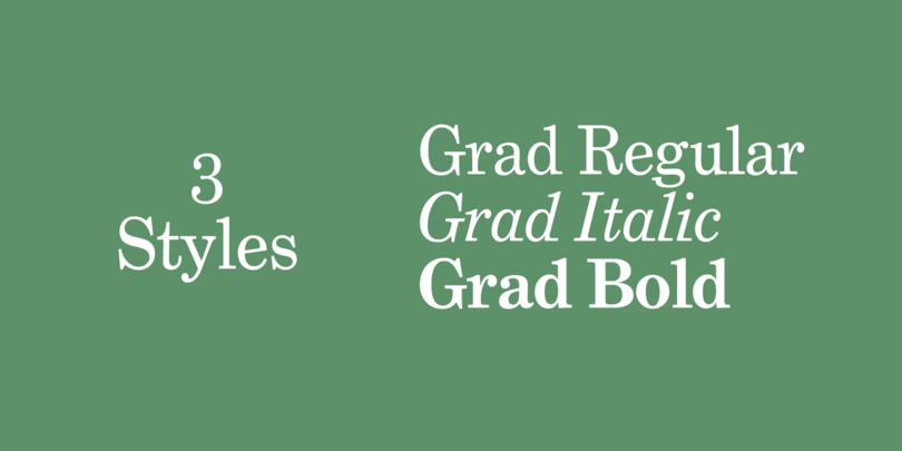
Phil Martin, creator of over 400 typefaces from the late ’60s through the ’80s, originally designed Grad as a redesign of the classic Century Schoolbook for his personal use in the early ’90s. Editing bitmapped fonts on a DOS PC, he made many design changes, some subtle and some obvious, and added new features including small caps, old style figures, ligatures, and swash capitals. However, for ten years, Grad was trapped inside Phil’s old DOS computer in an obsolete format. Working from laserprints provided by Phil and specimens of the original ATF Century Schoolbook, Mark Simonson has brought this typeface into the 21st century as a family of three feature-rich OpenType fonts.
Bookmania
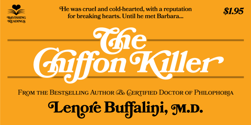
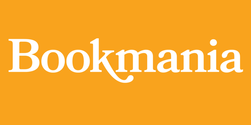
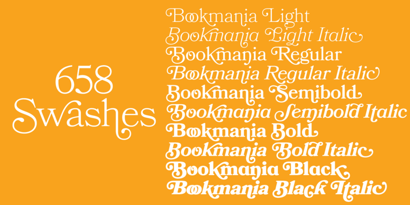
Bookmania (2011) combines the sturdy elegance of the original Bookman Oldstyle (1901) with the swashy exuberance of the Bookmans of the 1960s, but adds all the features you would expect in a modern digital font family. With over 680 swash characters, more than any previous Bookman, the possibilities are endless. The broad range of weights make it great for display use, but it also works well for text. Unlike some Bookman revivals, it retains the original classic sloped roman for the italic.