Juan Villanueva.
Type Designer.


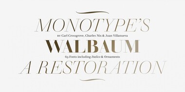
Walbaum has been fully restored for this expansive family, which includes 32 weights including ornaments and two decorative cuts.
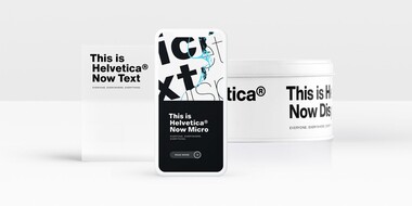
Helvetica Now preserves the typeface’s Swiss mantra of clarity, simplicity and neutrality, while updating it for the demands of contemporary design and branding.
Juan Villanueva is a Type Designer at the Monotype Studio in New York City. His contributions to the Monotype Library include designs such as Walbaum and Sagrantino. He’s worked on custom typefaces for clients including Tencent Sans, Ricky Zoom, and multiple Google Noto fonts.
Born in Peru, he grew up in Lima and spent his teenage years in Clifton, New Jersey. His heart is in both places and his work reflects the best of both languages and cultures.
Outside of work, Juan practices lettering, calligraphy, typography and graphic design, and loves sharing his knowledge on these subjects through teaching classes, workshops, and giving lectures. He’s taught graphic design at the Cooper Union Summer Art Intensive Program and currently teaches typography at the City College of New York.
More than anything else, Juan loves being a type nerd in New York City. He’s a proud graduate of the Type@Cooper program and is an active member of AIGA NY. He serves on the board of directors for the Society of Scribes and the Type Directors Club, where he organizes talks and events bringing together users, makers and lovers of type.
Studio releases.
Helvetica Now
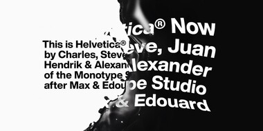

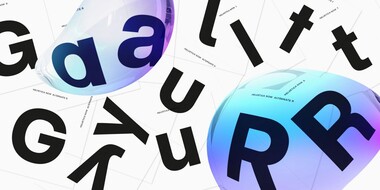
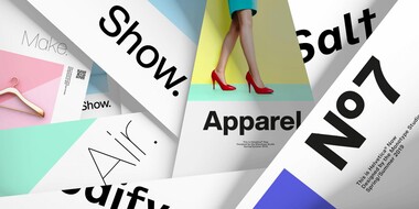
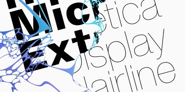
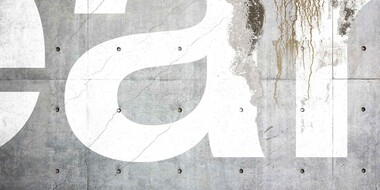
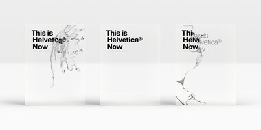
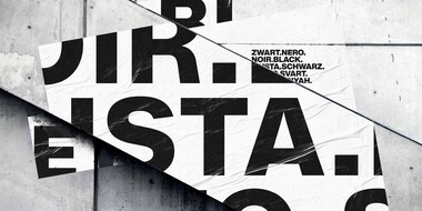
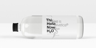
Helvetica® Now is a new chapter in the story of perhaps the best-known typeface of all time. Available in three optical sizes—Micro, Text, and Display—every character in Helvetica Now has been redrawn and refit; with a variety of useful alternates added.
Walbaum
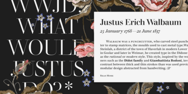
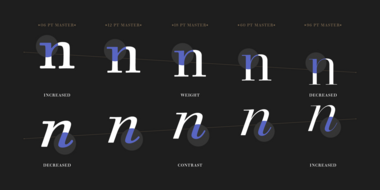
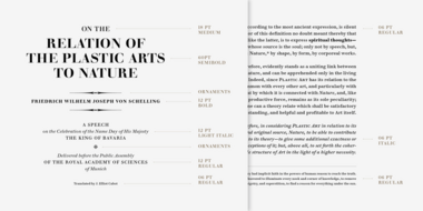
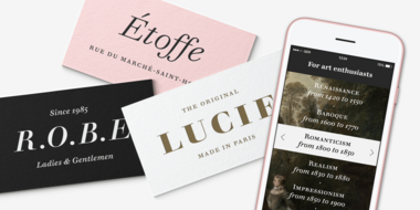
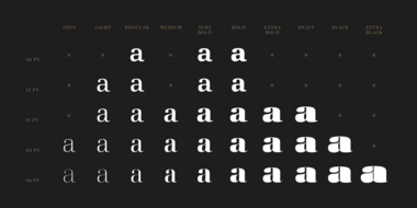
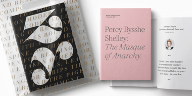
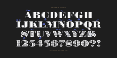
The Walbaum family, designed by Charles Nix, Carl Crossgrove, and Juan Villanueva, is a modern serif design that can be used in a wide variety of placements from micro caption text to massive headlines. Where other moderns preach austerity, Walbaum projects warmth—making it ideal for brands seeking a large type family that blends high style and approachability.
Custom typefaces.
Tencent Sans
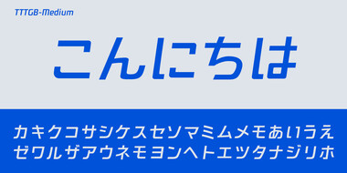
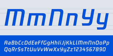
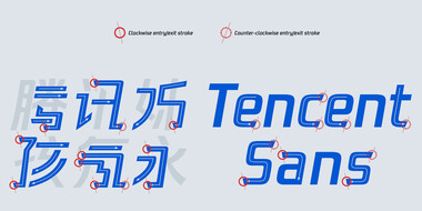

Monotype developed a global typeface family for Tencent, a leading provider of Internet-based services in China. The forward-thinking design embodies Tencent’s commitment to technology and the future. Monotype Type Designer Julius Hui led the creation of the slanting, futuristic typeface which focused on creating a perfect harmony between Chinese, Japanese and Latin characters— allowing Tencent to deliver a consistent, recognizable brand voice, worldwide.

Related content.
Meet Walbaum.
Monotype’s Walbaum typeface is the modern serif font to beat all modern serifs. Freshly restored by Monotype, this updated family oozes charm.
From Neue to Now: How Helvetica evolved for the 21st century.
Designers and studios might be deeply familiar with Neue Helvetica, but it’s the product of a pre-digital era. Here are four reasons why it’s time to switch.
