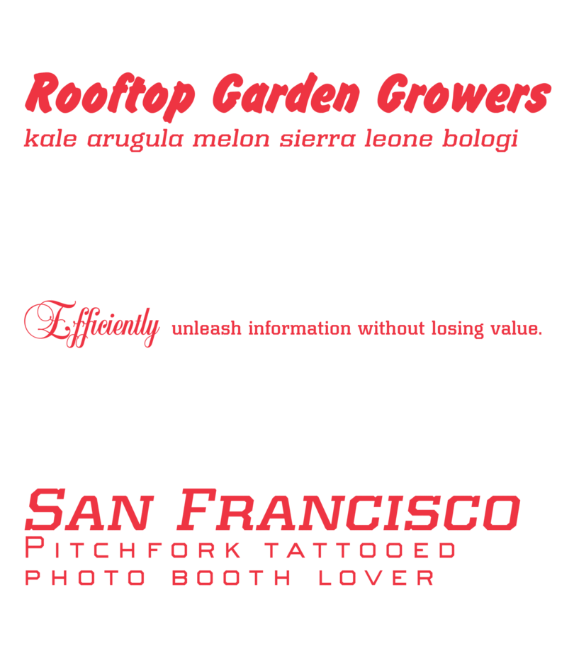
More than just words: How a smart typography strategy helps your bottom line.

Brands are always looking for ways to improve their return on investment. We’ve all heard the catchphrases a million times: Synergy. Efficiency. And on and on.
But typography is part of that equation too. Each element of your typography strategy has a role in streamlining your workflow and helping your designers produce higher quality work on deadline.
It helps to have type experts
Expert typographers can confidently recommend a typeface based on the personality of a project, the user environment, or how it compliments other typefaces already in use. Experts possess a wealth of knowledge and can extract the perfect typeface from their mental library in an instant.
Most graphic designers are versed in typography, but sometimes matching the right typeface with a given project can be challenging. That challenge can lead designers on a long search through endless lists hoping the perfect option appears. It can be a long process, and a frustrating one for the design team, even if the outcome is strong.

Many typography providers (including Monotype, for the record) make it easy for designers to find the perfect typeface. Comprehensive, intuitive programs allow your designers to test different typefaces in their design and enable them to present stronger mock-ups during the review phase. The obvious benefit here is stronger design (and happier designers), but simplifying the process pays dividends in other ways, too.
Cut back on time-consuming tasks
Those long searches through lists of fonts aren’t just frustrating, they’re tedious and waste time. Every minute a designer spends scrolling through fonts is a minute not spent designing. And that tedium doesn’t stop once the right font is found.
Fonts are files like any other. Once the font is chosen, it has to be downloaded for use, and individual weights or styles are usually downloaded as individual files. Now, what if designers need to share these files?
Finding the right one to share—properly licensed for the relevant use case, in the right weight, etc—is often tricky. Maybe only one designer has it. Maybe someone thinks they have it, but has the wrong one. Either way, people have to stop what they’re doing, dig into the files on their computer, find the right one, and send it along. And hopefully it is the right one.
The solution is to provide all your designers with access to a single, unified font library. This allows designers to log in, quickly grab the font they need, and continue working, while also eliminating any risk of the wrong font being used in the wrong place. This model simplifies the process and saves time without significantly disrupting the design process.
Speaking of designing, libraries like this can help speed up that initial typeface discovery process. A comprehensive typeface library that comes equipped with helpful search and recommendation tools can streamline the search, further focusing your team’s time on designing rather than searching for fonts.
A penny saved …
Companies are paying their design teams to spend untold hours searching for typefaces, digging through files, and double-checking that they’re using the correct fonts. That’s a lot of time and money spent tangled up in type. Of course, this is not what designers care about or what they were hired to do.
Equipping your team with better fonts and centralizing the font library eliminates these bottlenecks and allows your team to focus on being creative. More work gets done, and the streamlined process means that work gets done on time. Short-term deadlines are more achievable since the font-finding process is less of a hurdle. Long-term projects can be executed with greater artistry because your designers have the tools they need to experiment.
Every brand’s outcomes will be different, but good things happen when you make your designers’ lives a little bit easier.