
Type resources for designers and brand owners
A talk with Tom Foley on trends, the possible decline of Sans Serif, and what makes a type timeless.

Talking shop with David Berlow, type hero and font technology pioneer.

Making the Monotype Type Trends report with Terrance Weinzierl and Emilios Theofanous.

In Episode 16, we talk with Tyler Haughey, a photographer whose work highlights otherwise unseen details of Jersey shore beach towns in the off-season. He discusses the creative influence of having a father who was a sign painter, as well as the nature of memory and how signage and décor help anchor experiences in our minds.

Each element of your typography strategy has a role in streamlining your workflow and helping your designers produce higher quality work on deadline.
Monotype unveiled a new glyph design for its popular Tazugane Gothic and Tazugane Info typefaces that commemorates the new emperor of Japan.

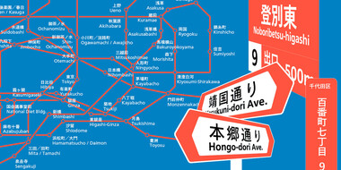
The first Japanese typeface from Monotype is a humanist sans serif, designed to work in partnership with Neue Frutiger. Tazugane Gothic sets out to introduce a new typographic standard, allowing designers to comfortably set Latin and Japanese characters alongside one another while maintaining visual harmony.
In many ways the idea that Helvetica is a ‘neutral’ typeface has become a self-fulfilling prophecy. That’s not to say it isn’t, but the neutrality narrative is only half the story.

Behind the font highlights the people and process behind the fonts you love and use. This installment features Carl Crossgrove of the Monotype Studio.

Tom Rickner, veteran type designer, shares his personal role in the beginnings of type’s most exciting development in decades.

You know what they say, “classics never go out of style.” Maybe this is true, maybe it isn’t. But one thing is certain: When sans serifs took over typography in the early 1900s, they weren’t just a fad. They came to stay.

Finding the right brand font requires a deep understanding of who you are as a brand, and how you want to present that identity to the world.

Consumers are increasingly demanding connectivity in their vehicles, and are prioritizing in-car technology that enhances the driving experience.
Optical sizing has long been part of the type designer’s toolbox, but for many people the term may not be familiar. Here’s why that should change.

The SST font tackles a central challenge of branding – universality. The SST superfamily supports more than 90 languages including Japanese, Thai and Arabic.
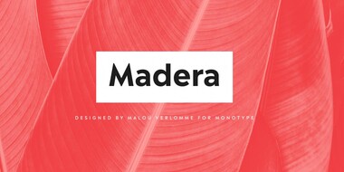
Malou Verlomme’s Madera is a fresh addition to the popular geometric sans serif font genre, intended as a go-to typeface for branding and visual communication.
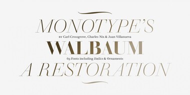
Monotype’s Walbaum typeface is the modern serif font to beat all modern serifs. Freshly restored by Monotype, this updated family oozes charm.
