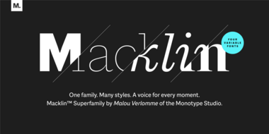
Meet Macklin.
Malou Verlomme’s Macklin superfamily is a gently irreverent take on the display type of the late 19th century, with an elegant twist that updates these letterforms for modern use. Choose one style, or use the entire variable family as a type toolbox.

Neue Kabel: reshaping a lost classic.
Neue Kabel brings back the liveliness of the original’s strikingly quirky characters, while adding in the long-lost italics and missing glyphs needed for it to address a wide range of editorial and branding purposes.

Meet Placard Next.
Placard Next is a reimagined version of a 1930s poster design, that takes all the original quirky details and refines them for digital use. Its condensed versions pack an instant typographic punch when used at large sizes, introducing some unusual flavor to posters, headlines and anywhere else designers need to make a statement.

A digital-ready Chinese sans-serif is born.
Many Chinese typefaces have a reputation for looking dated and not reading easily on small screens— not M Ying Hei. It checks all the boxes that it’s forefathers can’t.

Tazugane Gothic.
The first Japanese typeface from Monotype is a humanist sans serif, designed to work in partnership with Neue Frutiger. Tazugane Gothic sets out to introduce a new typographic standard, allowing designers to comfortably set Latin and Japanese characters alongside one another while maintaining visual harmony.
Embrace Ambiguity.
Monotype introduces Ambiguity, a typeface designed to effectively express a range of attitudes and beliefs.
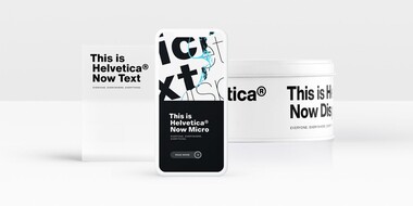
From Neue to Now: How Helvetica evolved for the 21st century.
Designers and studios might be deeply familiar with Neue Helvetica, but it’s the product of a pre-digital era. Here are four reasons why it’s time to switch.
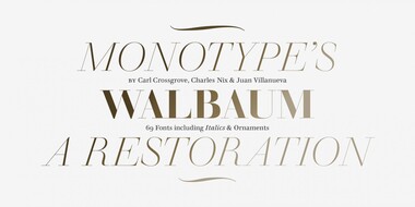
Meet Walbaum.
Monotype’s Walbaum typeface is the modern serif font to beat all modern serifs. Freshly restored by Monotype, this updated family oozes charm.
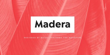
Meet Madera.
Malou Verlomme’s Madera is a fresh addition to the popular geometric sans serif font genre, intended as a go-to typeface for branding and visual communication.

SST: a font for everywhere.
The SST font tackles a central challenge of branding – universality. The SST superfamily supports more than 90 languages including Japanese, Thai and Arabic.