Creative Characters Ep. 10: Hannelore Ocampo.
Hannelore Ocampo.
On Creative Characters, we meet the people and personalities behind the brands, campaigns, and designs we love. You can listen to the podcast on Apple, Spotify, Google Podcasts, and wherever quality podcasts are available.
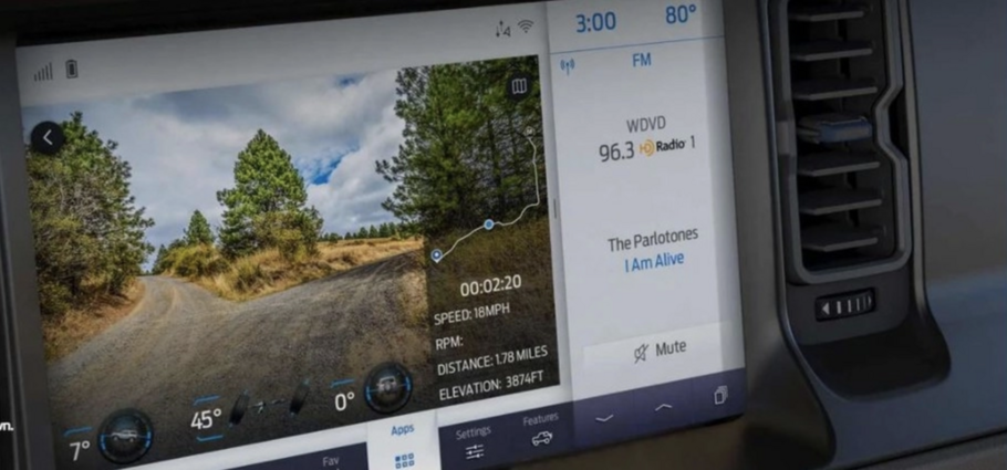
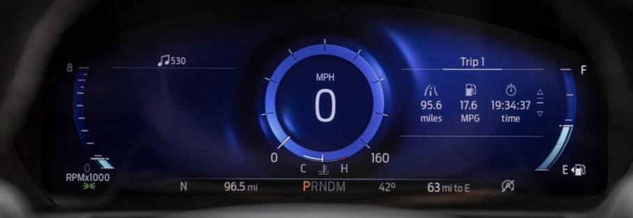
Type is not often a matter of life and death, but that changes when you’re cruising down the highway at 80 mph or following GPS directions through unfamiliar city streets. Clear legibility in those quick-glance situations is essential, and with modern cars evolving to be glorified tablets on wheels, type has become a central component of the driving experience and key to ensuring driver safety.
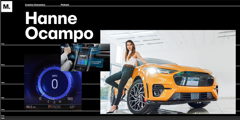
This week’s guest knows a thing or two about this: Hannelore Ocampo, Fonts Lead and Type Specialist at Ford Motor Company. Hanne’s role focuses on the deployment of fonts in Ford’s HMI (Human-machine interface) applications, both from a functional and aesthetic perspective.
And therein lies the challenge for all modern automakers: How do you use tech and type to create an in-car experience that looks great and reflects the brand without compromising the driver’s ability to quickly read important information? And how do you develop a cohesive experience across a range of languages, some of have vastly different needs when it comes to rendering and physical space on the screen.
“I bet [most people] have never just sat in their car, looking at their screens and thought, somebody made this—the design, the colors, the details, the size of the screen,” Ocampo says, “But there are lots of people working so that you can just sit down and be safe.”
This week’s host couldn’t be a better match: Michigan native and admitted car fan Creative Type Director Terrance Weinzierl. “What I love about cars is that they are a masterpiece of industrial design,” Weinzierl says. ”They are this combination of thousands of sculptures and engineering and so much design and it takes forever to develop them. And I see this correlation between vehicle design and typeface design, with a typeface being hundreds of drawings that need to fit together in a similar way.”
