Charles Nix.
Creative Type Director.


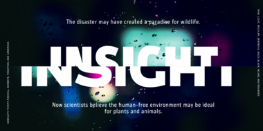
Hope Sans™ takes the jaunty style of 1950s and 60s lettering and melds it with the jubilant 1970s swashes of Bookman.
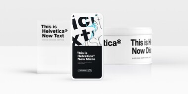
Helvetica Now preserves the typeface’s Swiss mantra of clarity, simplicity and neutrality, while updating it for the demands of contemporary design and branding.
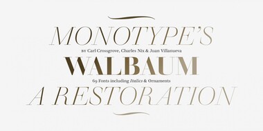
Walbaum has been fully restored for this expansive family, which includes 32 weights including ornaments and two decorative cuts.
In his words.
Charles Nix is a Creative Type Director, designer, typographer and educator. He designed a number of popular typefaces in the Monotype Library, including Walbaum and Hope Sans, which received a Certificate of Typographic Excellence in the 22nd Annual Type Directors Club Typeface Design Competition. He’s also designed custom typefaces for Google Noto, Progressive Insurance and the Philadelphia Museum of Art.
Prior to his position at Monotype, Charles co-owned a small publishing firm, where he designed hundreds of books, while also orchestrating all aspects of book production, from writing proposals to supervising printing. His experience in marketing, publicity and advertising gives him a unique perspective into the importance of type in branding.
Charles is also an educator, having chaired the Communication Design departments at the Center for Advanced Design in Malaysia and the Parsons School of Design in New York. He has taught dozens of courses in graphic design, typography and publication design, and recorded a number of type design courses for LinkedIn Learning. Charles is also chairman emeritus of the board of the Type Directors Club, an international organization dedicated to furthering typographic excellence.
Studio releases.
Helvetica Now
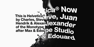
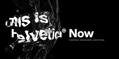
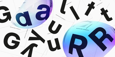
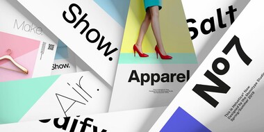
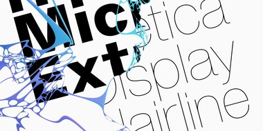
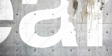
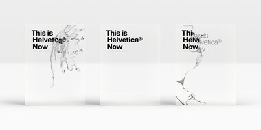
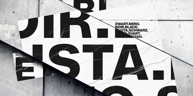
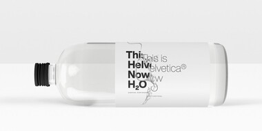
Helvetica® Now is a new chapter in the story of perhaps the best-known typeface of all time. Available in three optical sizes—Micro, Text, and Display—every character in Helvetica Now has been redrawn and refit; with a variety of useful alternates added.
Hope Sans
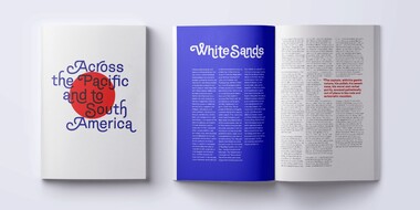
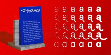
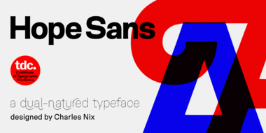
Hope Sans™ takes the jaunty style of 1950s and 60s lettering and melds it with the jubilant 1970s swashes of Bookman. The result is a sans serif family that is lively, inviting and deeply customizable. Its basic sans serif forms create engaging text, while a roaring collection of swash designs, alternate characters and ligatures make it a natural for attention-grabbing display typography.
Walbaum
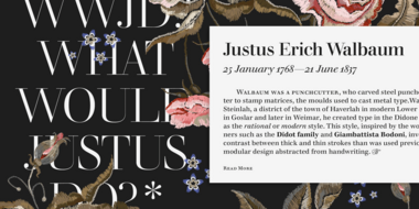
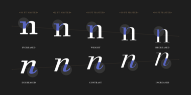
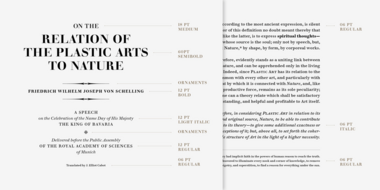
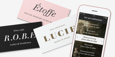
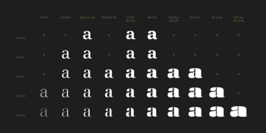
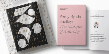
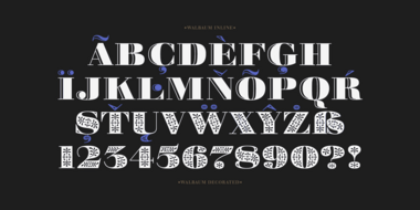
The Walbaum family, designed by Charles Nix, Carl Crossgrove, and Juan Villanueva, is a modern serif design that can be used in a wide variety of placements from micro caption text to massive headlines. Where other moderns preach austerity, Walbaum projects warmth—making it ideal for brands seeking a large type family that blends high style and approachability.
Thought leadership.
The state of Ambiguity.

Related content.
Embrace Ambiguity.
Monotype introduces Ambiguity, a typeface designed to effectively express a range of attitudes and beliefs.
From Neue to Now: How Helvetica evolved for the 21st century.
Designers and studios might be deeply familiar with Neue Helvetica, but it’s the product of a pre-digital era. Here are four reasons why it’s time to switch.
Meet Walbaum.
Monotype’s Walbaum typeface is the modern serif font to beat all modern serifs. Freshly restored by Monotype, this updated family oozes charm.
