Condensed Contenders

Curated by The Monotype Studio
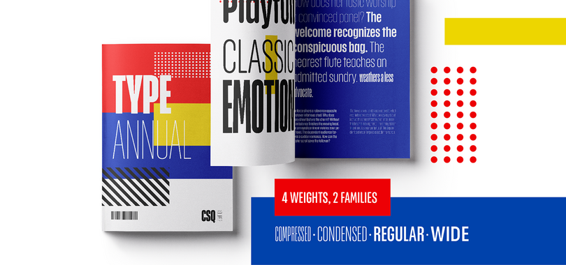
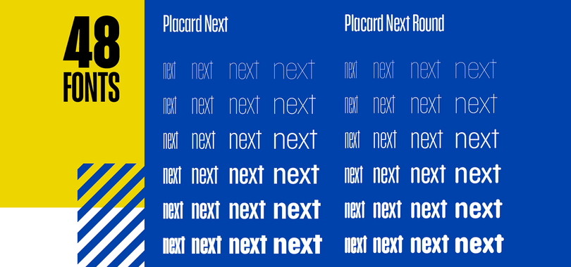
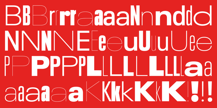
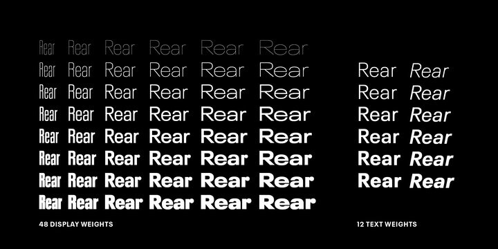
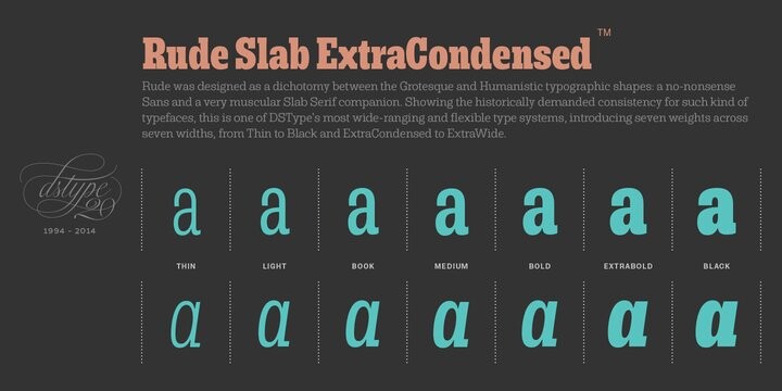
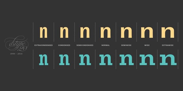
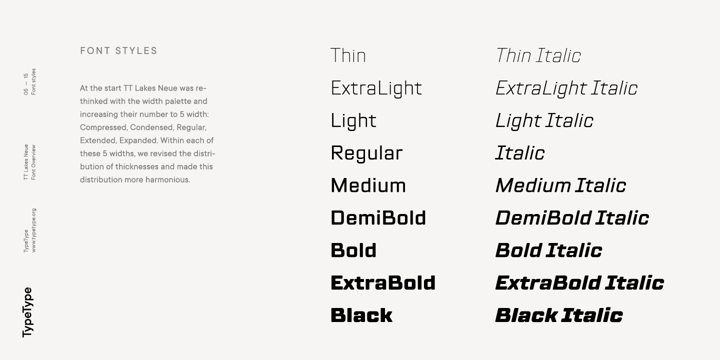
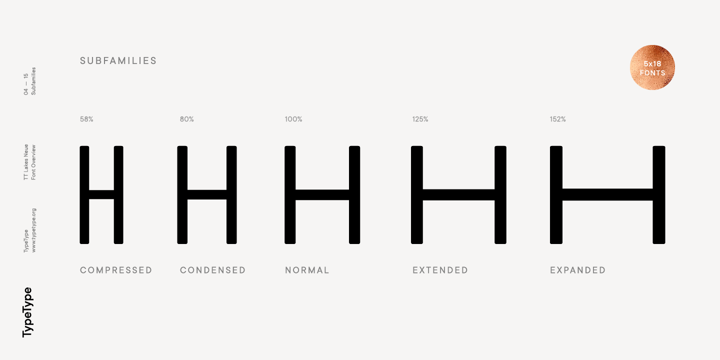
Many large typeface families have condensed styles, but it’s not a given. Some typefaces drawn specifically for headline use might only come in condensed proportions, but be packaged as a ‘regular’ style. The name doesn’t matter, just the design matters and how it suits your work. You might also see the term compressed in font names which is typically even narrower than a condensed style. On the other end of the spectrum, you may see terms like wide or extended to describe something that has wider proportions than the regular-width. Again, it varies from design to design. Some variable fonts include a width axis that may stretch from condensed all the way to extended—this is one aspect of the variable speed trend we’ve been reporting. Variable fonts with a width axis can really dance when animated. Using various weights and widths of the same typeface helps build harmony and hierarchy in your designs.
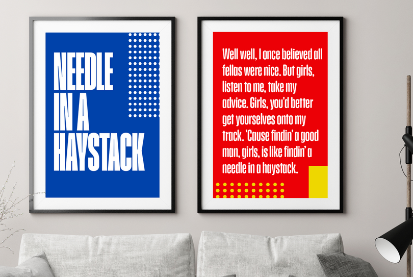
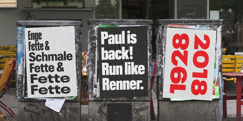
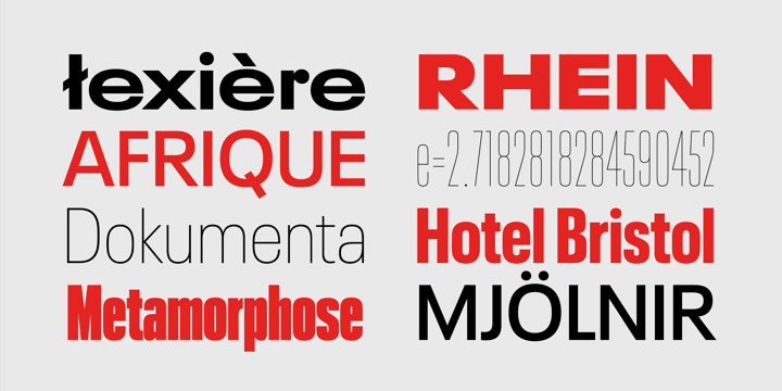
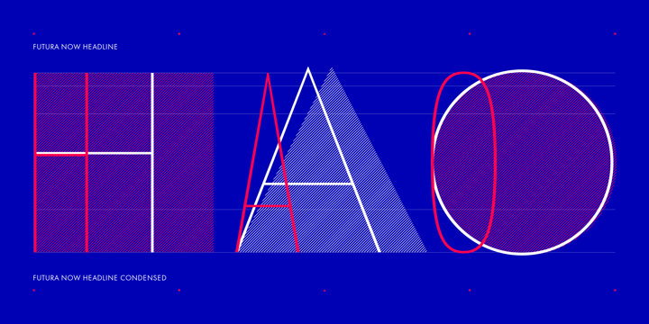
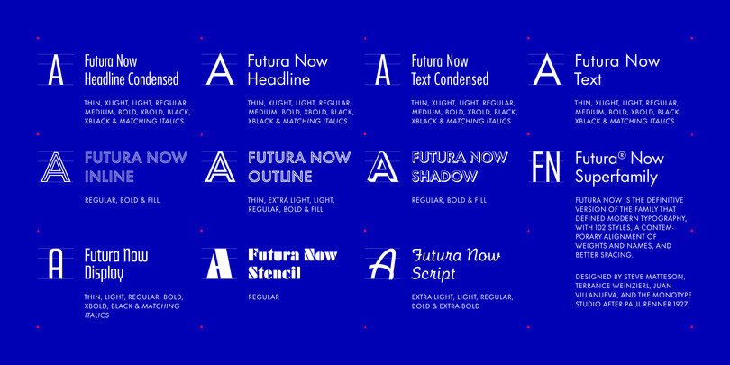
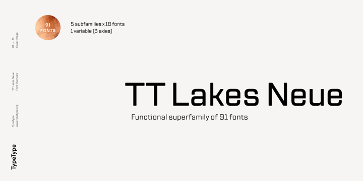
Condensed type styles are all about proportions. Not only do they shorten the overall line length and space required for the headline, they are often spaced tighter than a typical text style. Depending on the brand you are working with, the typeface used for headlines might play a powerful role in the overall aesthetic. Let’s take a look at some families that have great condensed options, hand-picked for good looks and utility.

