Variable fonts.

Curated by the Monotype Studio
Variable fonts, an exciting evolution in font formats, are here. They often contain a huge range of styles from a family, efficiently baked into one font file. Designers and developers are making new and exciting things with this new format and finding sweet spots for its implementation including animations and responsive digital design. You can install or sync these just like you would with any font file, but the application you’re using must be able to read it properly. If you have recent versions of the Adobe suite, like Illustrator and InDesign, you can take them for a test drive.
Along with a typical user interface of slider bars to select the style, called an axis, the fonts also have pre-selected styles in the style menu. So while you still can select the Regular or Bold for example, you may be able to slide and select a weight instance between those two points. Give Variable fonts a trial run with one of the classics like Helvetica Now, Avenir Next, or Futura Now. Try something fresh from the boards like Macklin or Wakerobin and see where it takes you.
Fresh cuts.
Macklin Variable
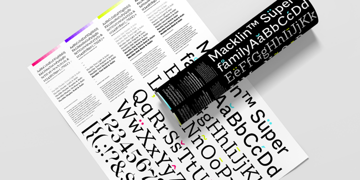
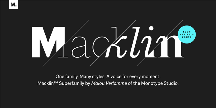
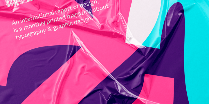
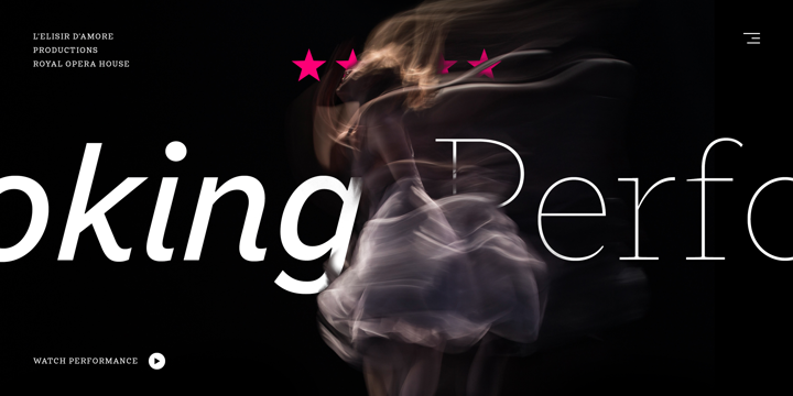
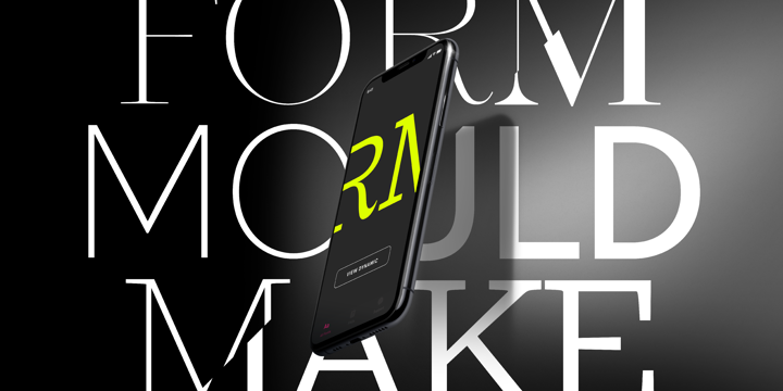
A sparkling superfamily with sans and serif components. The serif can go from a chunky Clarendon style to a delicate Modern serif style, while the sans keeps pace. The excellent italics are waiting in the wings. Pair these two together for a rich, harmonious, and versatile palette of type, right out of the box.
Kairos Sans Variable

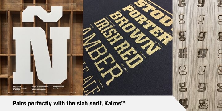
A square and octagonal superfamily that comes in a sans serif and slab serif form with a pan-european character set on a weight and width axis.
Elicit Script Variable

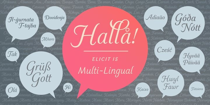

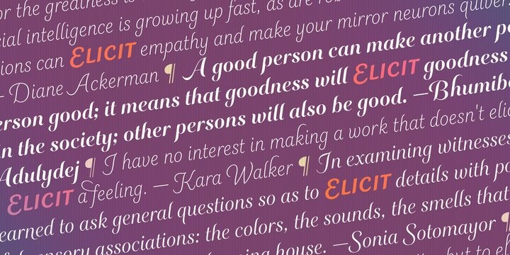
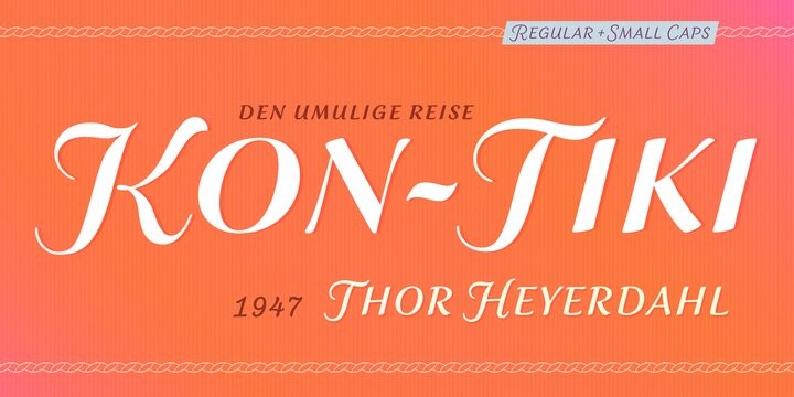
Besides your typical sans and serif workhorses, the Variable format can really bring a script typeface to life, while helping you tune it for size and reading comfort. Used large, you can get away with delicately thin weights and high stroke contrast, but try a heavier weight and lower contrast for small sizes. The beauty of Elicit Script is that the changing stroke contrast also helps deliver a casual or formal tone. It does it all.
Daytona Variable
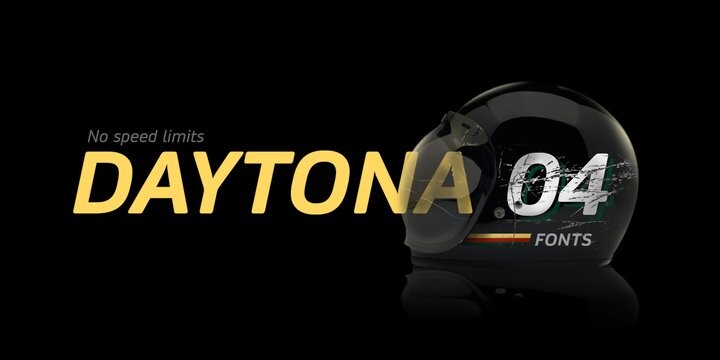
A soft and sporting typeface designed for screen with a weight and width axis. Tuned for maximum legibility, it excels at small sizes or large viewing distances.
FS Pele Variable
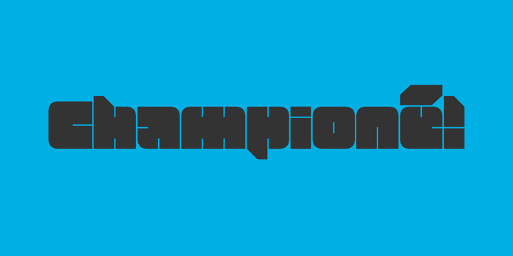


Equal parts fun and industrial, it’s a blockhead design with a slant and optical size axis. Perfect for games, sports, packaging, or posters. Try it in short words, or to call out single glyphs like a number, symbol, or punctuation.
FS Industrie Variable

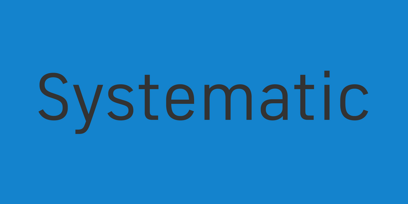
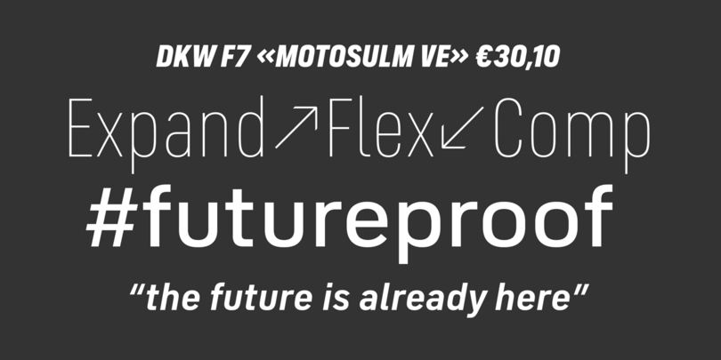

FS Industrie is a systematic Grotesque sans, direct and simple, without being overly rigid. If you like any of the flat-sided DIN typefaces, you will love this contemporary approach to the style. The weight and width axis adds quite a lot of flexibility.
Madera Variable

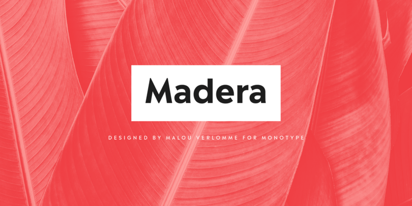

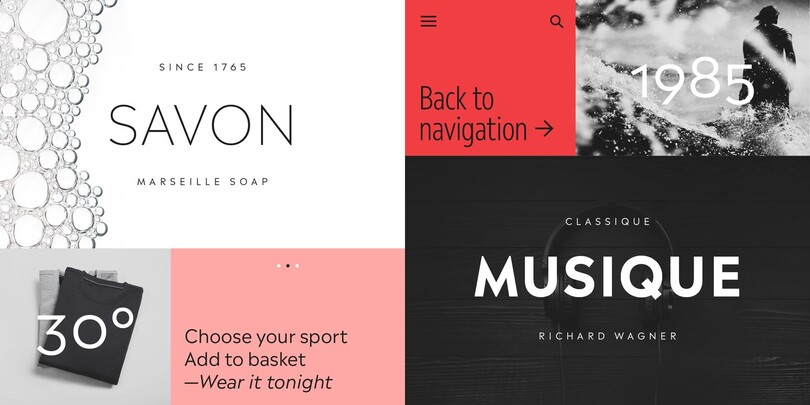
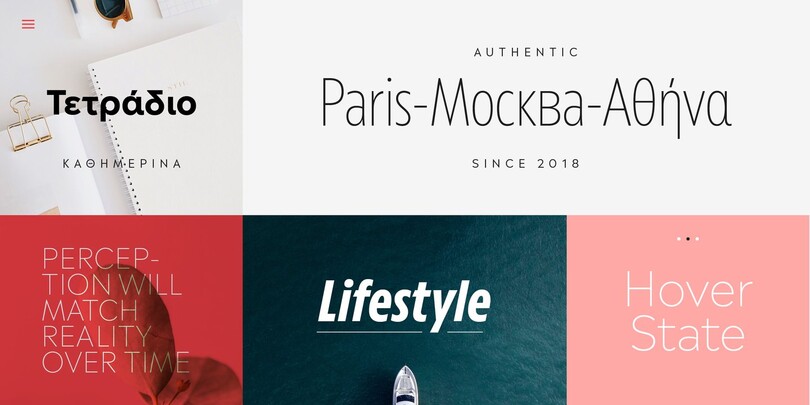
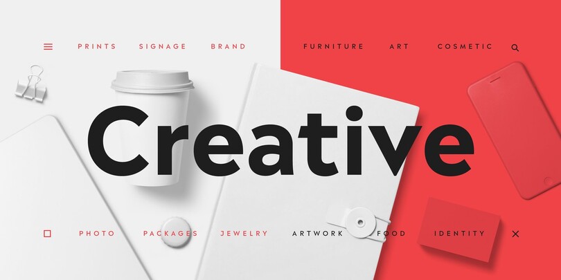
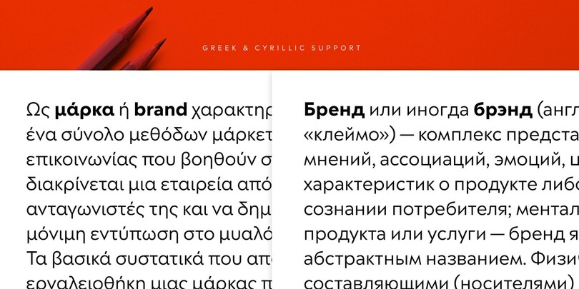
A Geometric sans that you can use as a workhorse for daily typographic duties, with a few sharp details that add some elegance and charm. Explore the alternate glyphs for a unique touch in branding or packaging work.
Wakerobin Variable
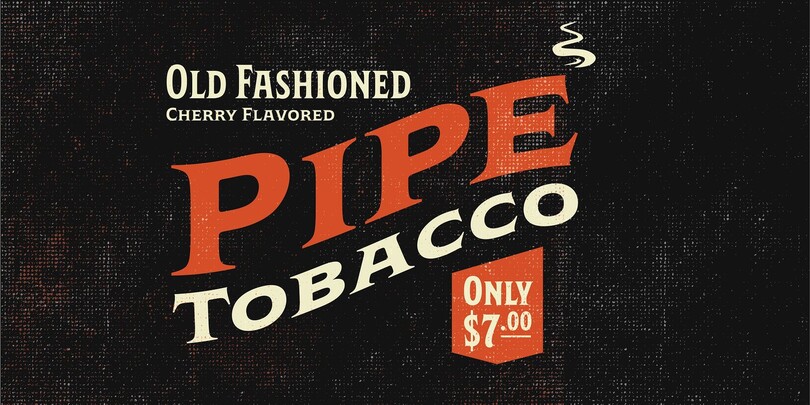

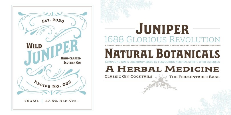
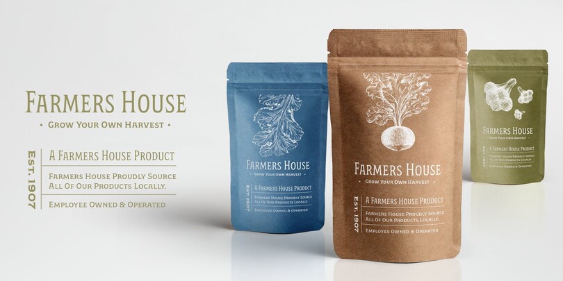
Based on lettering and painted signage from the 19th Century, Wakerobin is a heavy-hitter. The lowercase is a small cap style, so reserve it for punchy headlines and subheads. The range of widths will help you fit it precisely into layouts or physical spaces. Your local brewery, distillery, or coffee shop wants this typeface, trust me.
Hefring Slab Variable
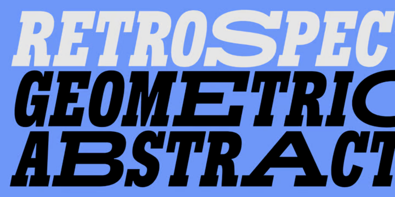
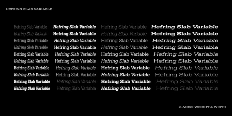
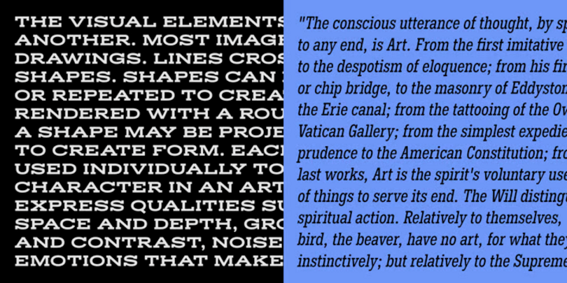
A modern Slab Serif, Hefring Slab Variable from the Northern Block is based on simple geometry, it has minimal stroke contrast, solid serif presence and a uniform thickness of strokes. Inspired by the work of the renowned Margaret Vivienne Calvert, the font is robust, clear and functional. It supports Latin-based languages, is available in Regular and Italic and allows you to create custom weights within the versatile width and weight parameters.
Sofia Pro Variable
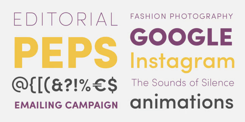
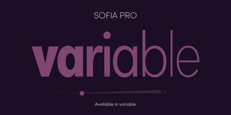
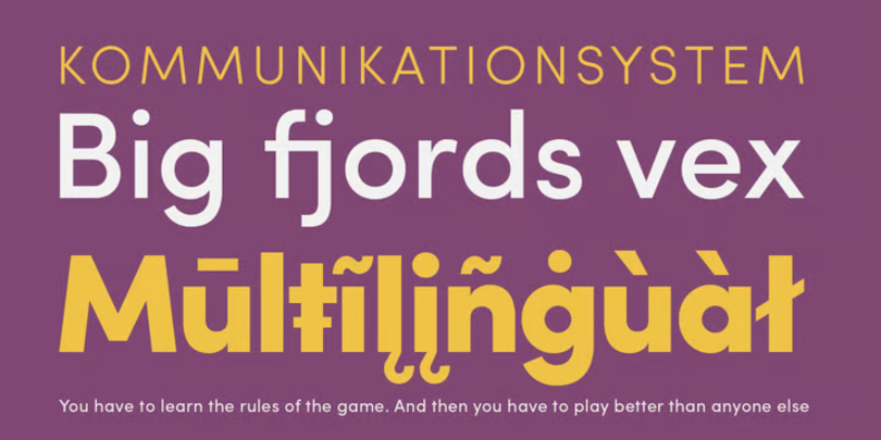
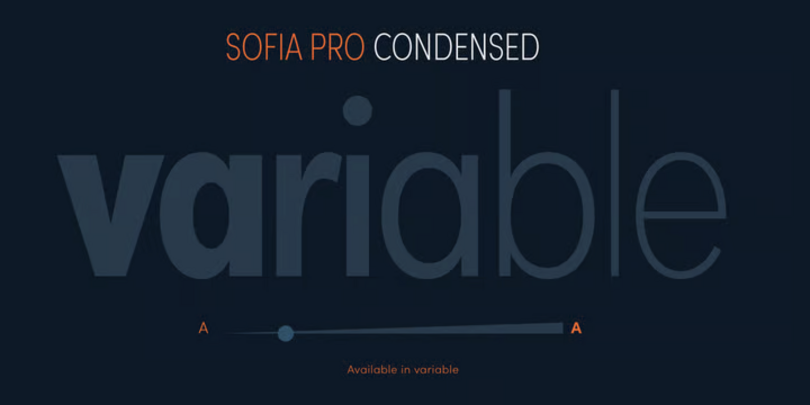
Sofia Pro from Mostardesign is a geometric sans font family embellished with modernism and the harmony of curves. With extremely rounded curves and very open terminals, this font family is elegant, friendly, and contemporary. The typeface was designed with a higher x-height than other fonts in its class to maximize tiny readability, ideal for business cards or mobile applications. For those who wish to use the font family in a variable version, Sofia Pro Variable comes in 2 files (Sofia Pro Variable Regular and Sofia Pro Variable Condensed) with 2 axes of variation (weight and italic), enabling a multitude of possibilities for any project.
Simple. Just Weight.
Touvlo Variable
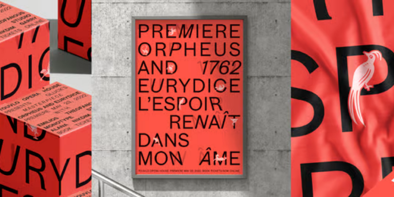
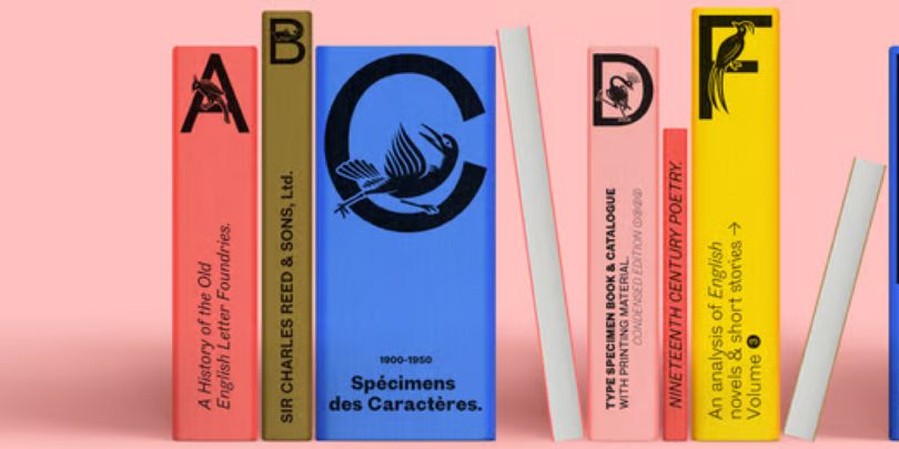
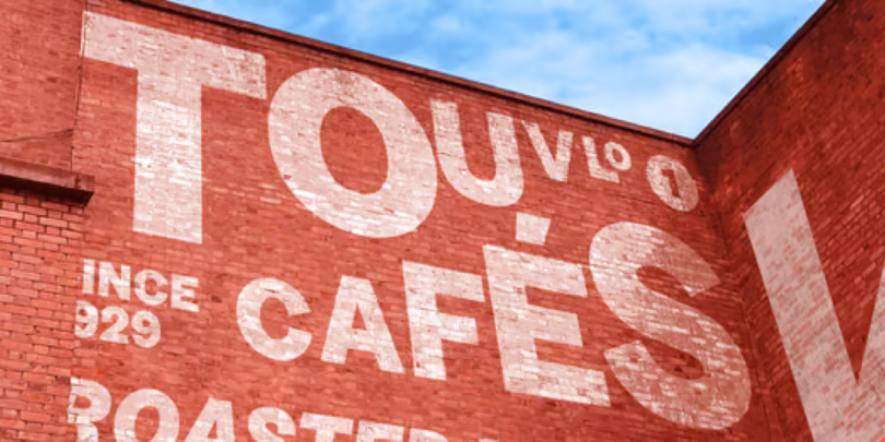
A zestful, modern interpretation of a classic genre, Touvlo skillfully captures the spirit of early British grotesque typefaces through playful terminals and lively curves. Touvlo offers an array of styles, from clean uprights to characterful Italics, and exuberant Backslants.
Neue Plak Variable
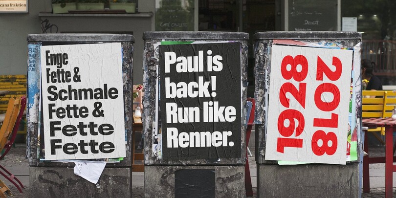
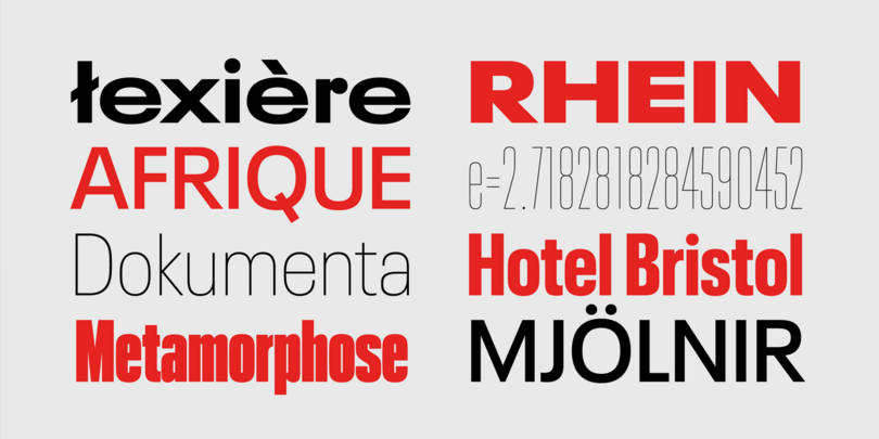
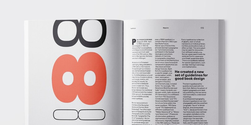
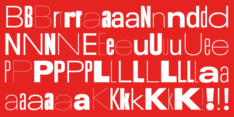
Neue Plak has a few details that make it more cheerful than it’s stylistic neighbors, like the lowercase r. For all you Futura fans out there, Paul Renner also designed Plak.
Vary Variable

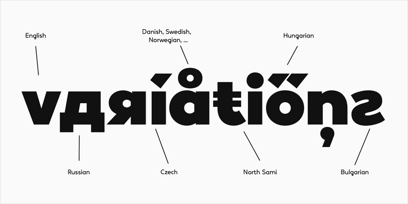
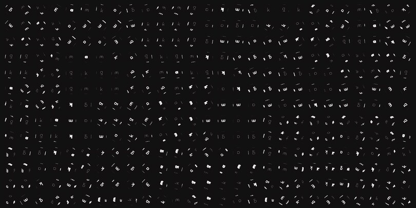
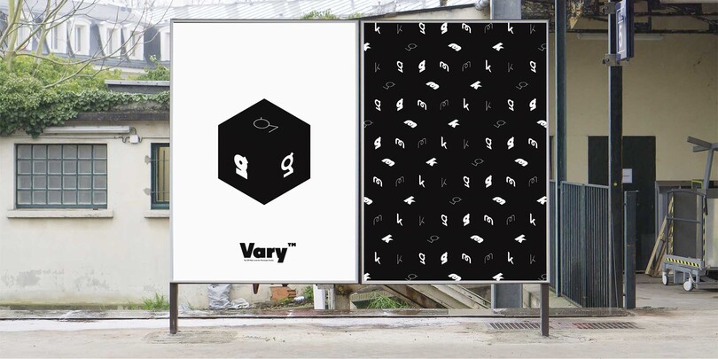
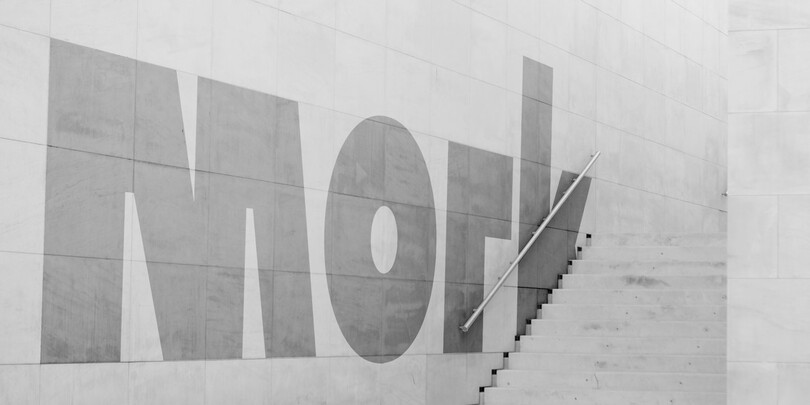
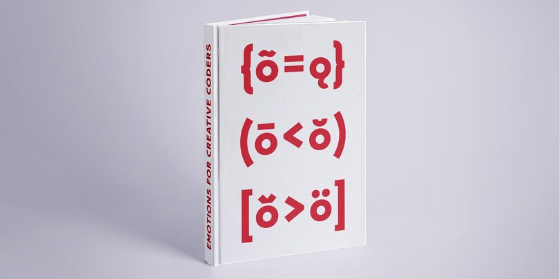
A geometric sans with a playful set of alternate glyphs. Clear and pure forms, with a twist.
FS Koopman Variable
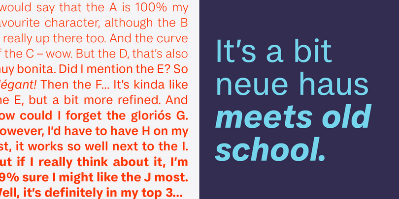

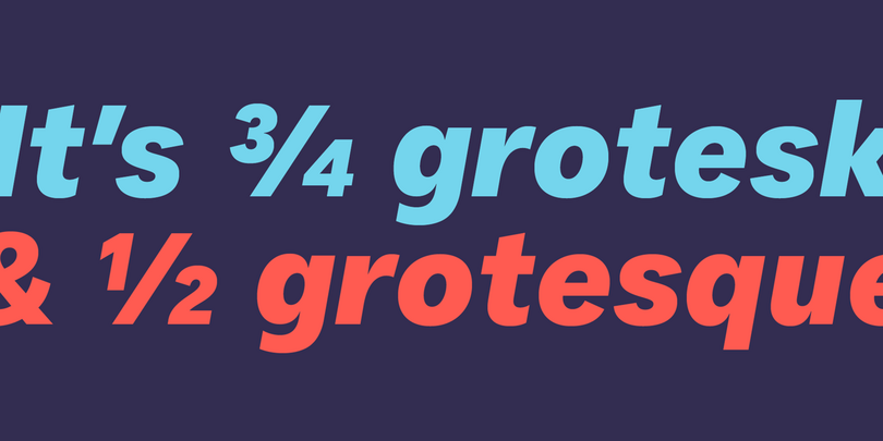
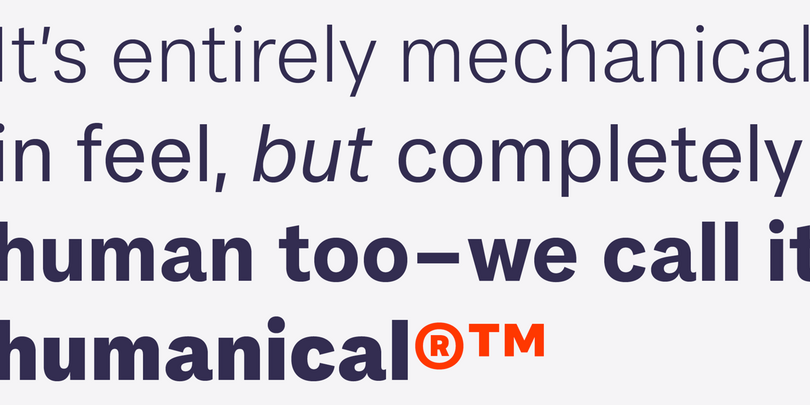
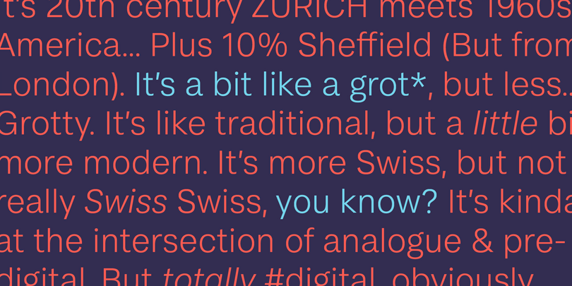
It’s a cross breed of plain-spoken and naturally narrow American Gothic sans serifs, with the more funky early British grotesques, sharply and tidily rendered like a Swiss grotesk. Unassuming at first, but it’s charisma builds on you as you use it and see it.
Carnero Variable

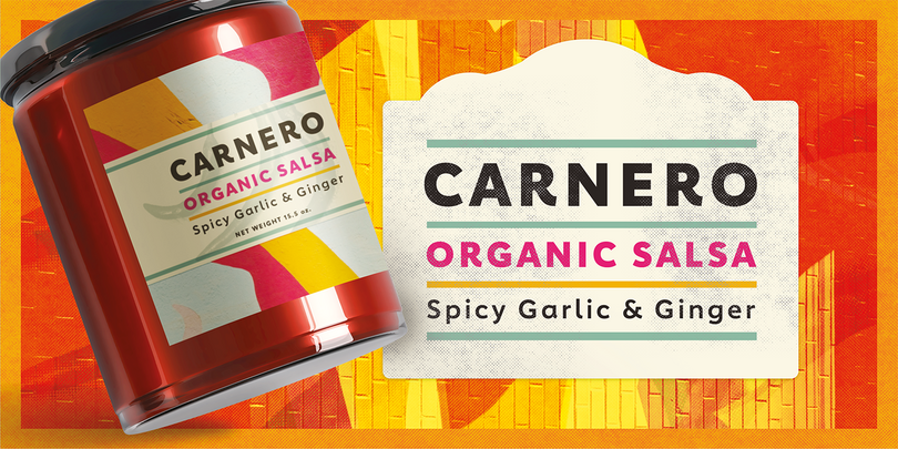
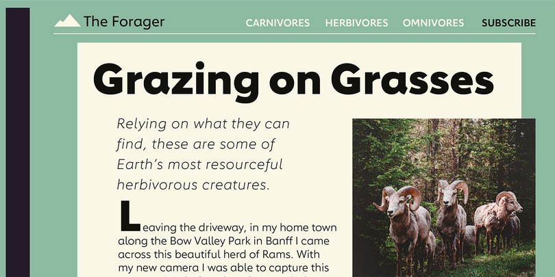

The fluid and calligraphic-like features make this Geometric Humanist sans serif stand out.
Unitext Variable

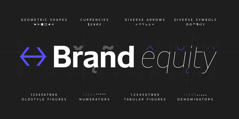

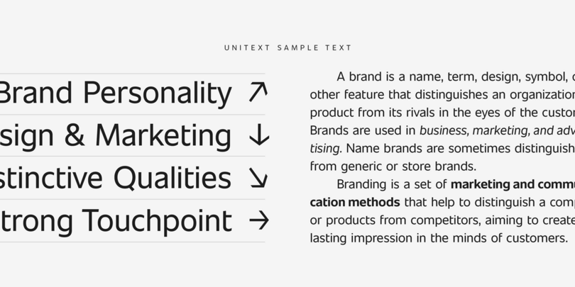

A clear and compact design, Unitext is an adaptable and efficient sans serif that lives somewhere between grotesque and humanist styles. Compared to its stylistic neighbors, it has more retro flavor, especially in the lowercase a.
FS Untitled Variable


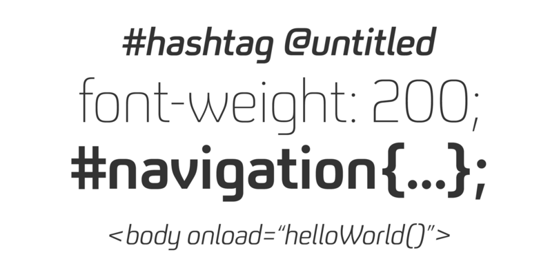
FS Untitled is an interactive typeface. It has been developed with screens firmly in mind. It’s technical and scientific looking, while being friendly about it.
Classics.
Helvetica Now Variable
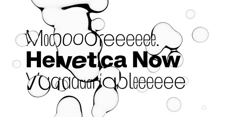
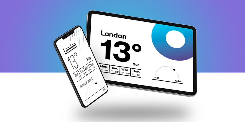
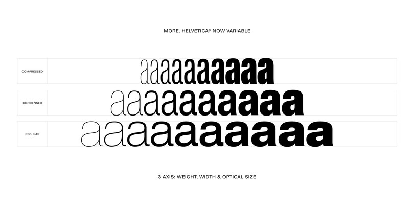
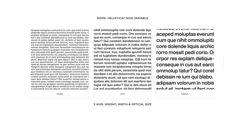
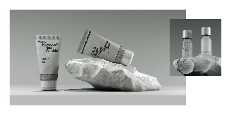
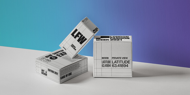
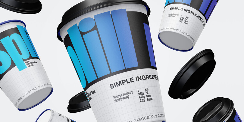
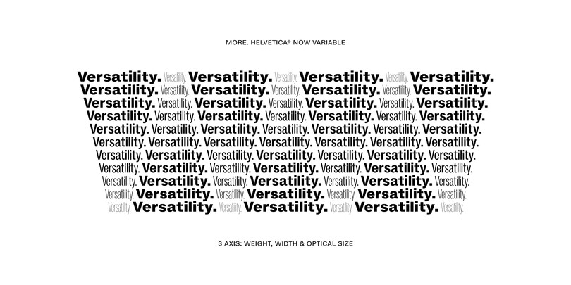
There are a lot of colas in the world, but only one Coke. Helvetica needs no introduction. The most famous and popular typeface in the world, now in a Variable font.
Avenir Next Variable
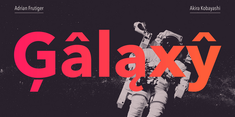
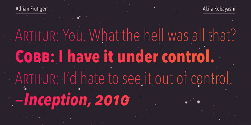
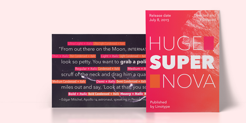

The Variable format upgrades Avenir Next to the next level. Overall, the family’s design is clean, straightforward and works brilliantly for blocks of copy and headlines alike. It pairs nicely with many contemporary script and serif typefaces. It’s popular for a reason—it works everywhere.
Futura Now Variable
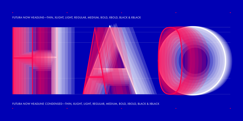
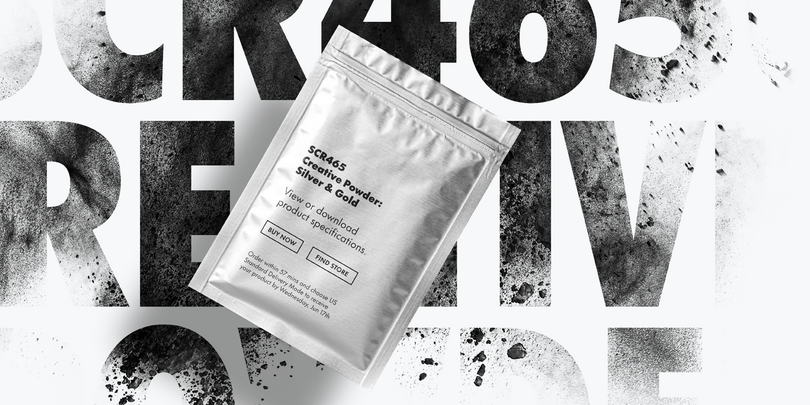
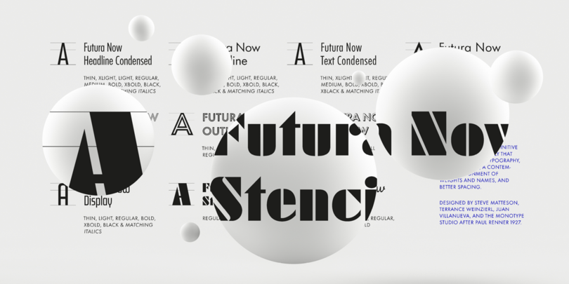
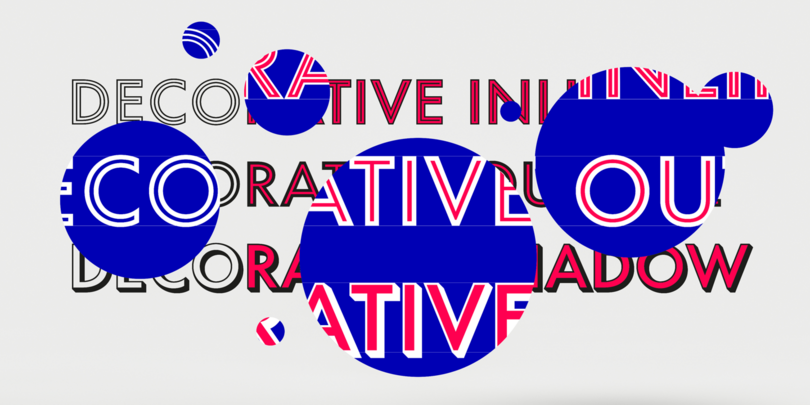
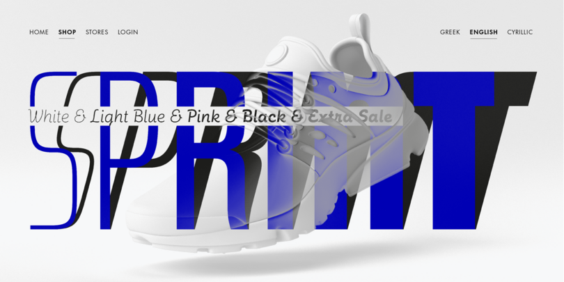
Futura is a typographic icon. The recent upgrades and digital polish in Futura Now give it more flexibility and ease-of-use. Stylistically, it bridges the gap between strict geometry and humanist forms, which makes it easy to read and adds warmth. It can be stunningly elegant or an everyday tool, depending on what you pair it with.
Neue Frutiger Variable


The super legible and readable Frutiger typeface is a benchmark which all other Humanist sans serifs are measured against. A branding favorite for decades, and excels at looking modern and precise, honest and trustworthy, without being overly mechanical or rigid.
Univers Next Variable


Univers Next is one of the original Neo-Grotesque sans that you know and love—one of the masterpiece designs by Adrian Frutiger. It has a refinement and sophistication that some lack.
FF Meta Variable
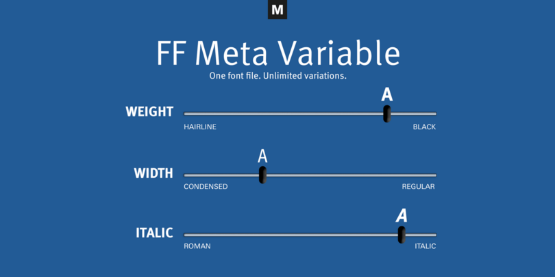
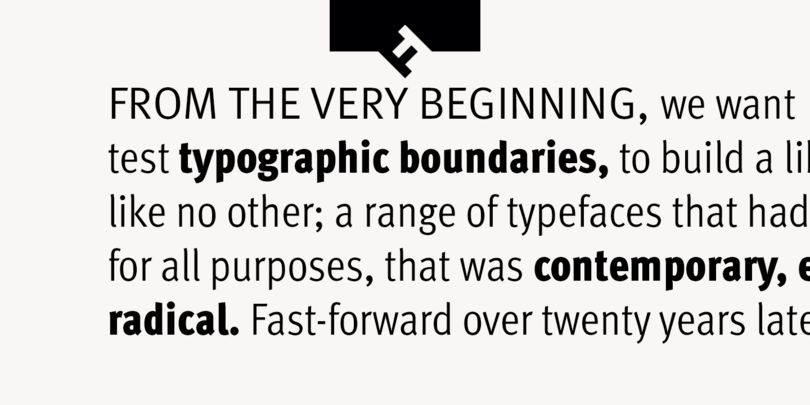
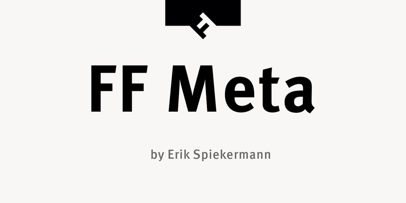
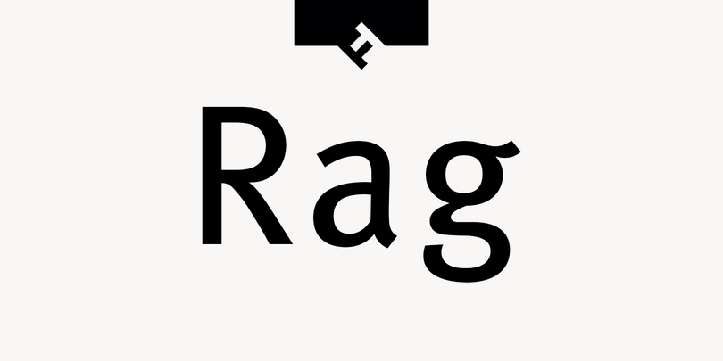
One of the most popular Humanist sans serifs of the 90s still enjoys its popularity and followers. FF Meta grew from a custom project into the mighty family it is today.
Century Gothic Variable
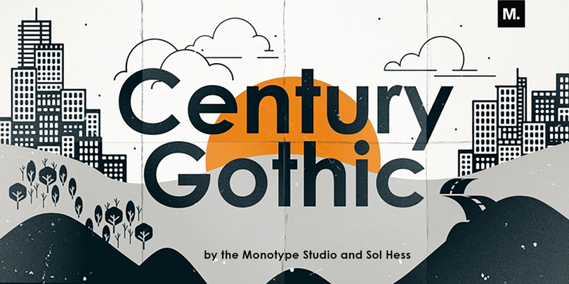
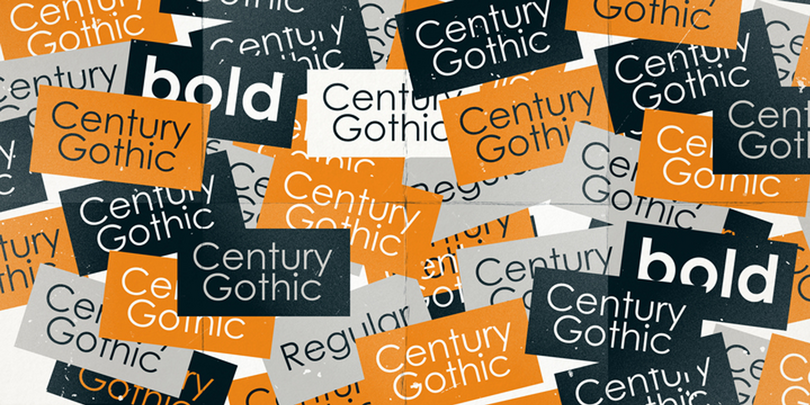
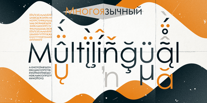
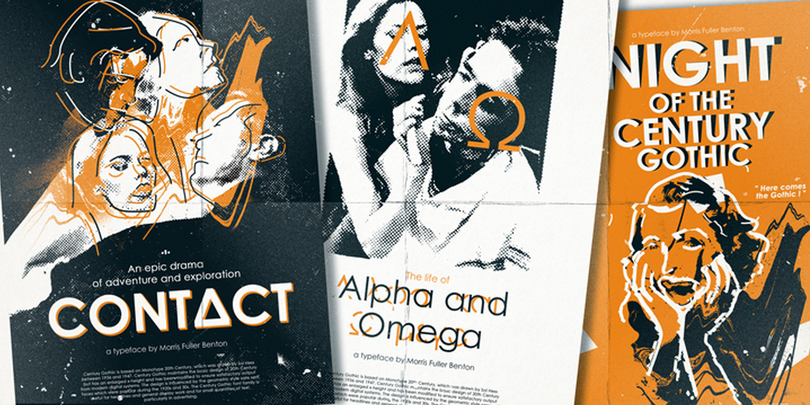
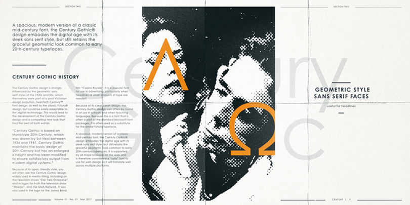
A stalwart of office documents everywhere and often favored for its availability and accessibility, Century Gothic is a crowd pleaser and a brand favorite of the Geometric sans world. This paneuropean character set and Variable format maintain its contender status in the 21st century.
VAG Rounded Next Variable
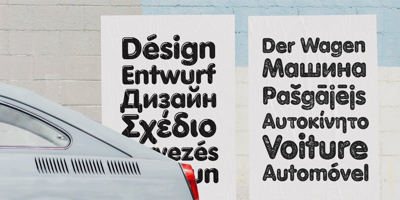


Originally created for Volkswagen AG in the late 70’s, you may have seen this typeface in an advertisement for a VW Beetle or printed on an old Apple keyboard. It has a familiar grotesque structure, with very rounded terminals that make it quite friendly and safe looking, but it’s tidy enough to hold confidence in technical or architectural settings.
CJK Variable
M XiangHe Hei Variable

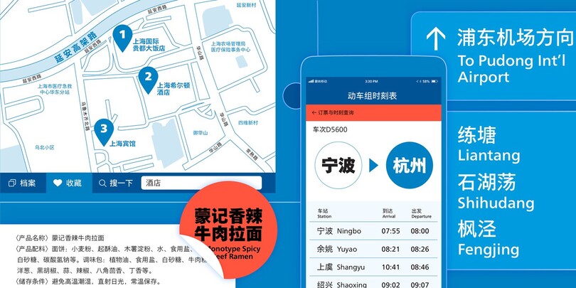

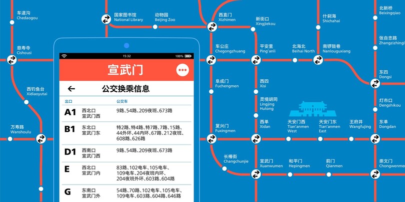

The M XiangHe Hei Simplified Chinese typeface merges traditional brush strokes with modern letterforms to carefully balance traditional calligraphy with humanist design. XiangHe Hei is a great choice for global brands using sans serif Latin typefaces looking to maintain their visual identity. The Chinese, XiangHe Hei, comes in Traditional or Simplified forms, make sure to check out and experiment with the M XiangHe Hei Pro Variable and traditional M XiangHe Hei TC Variable.
Seol Sans Variable
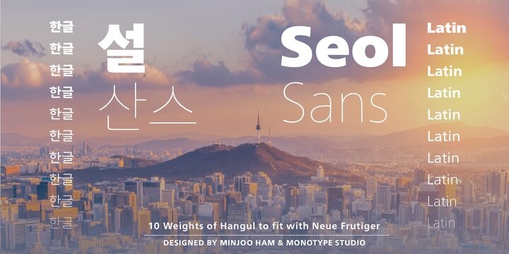

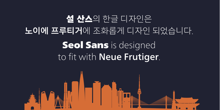
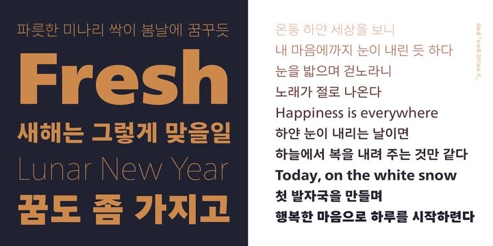
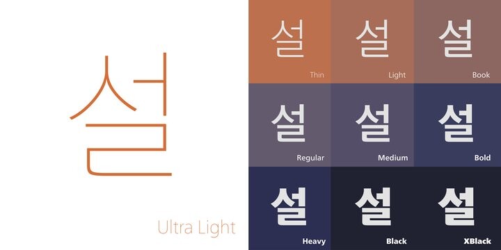

The Seol Sans design more closely resembles the natural curve of hand-written characters. Seol Sans features Neue Frutiger for its Latin glyphs, and works harmoniously with Neue Frutiger World and Monotype’s CJK typefaces Tazugane Info (Japanese) and M XiangHe Hei (Chinese).
Tazugane Gothic Variable
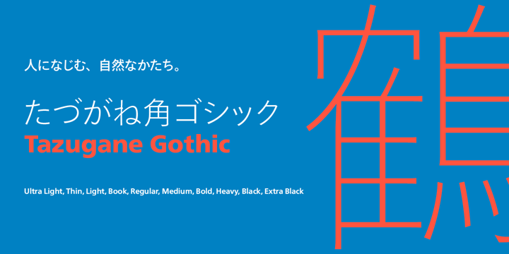
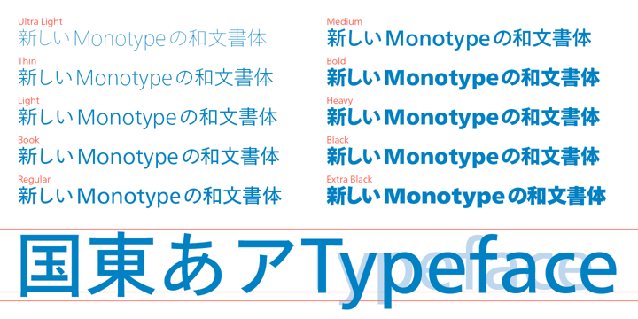
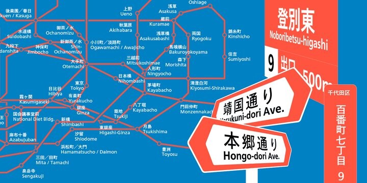
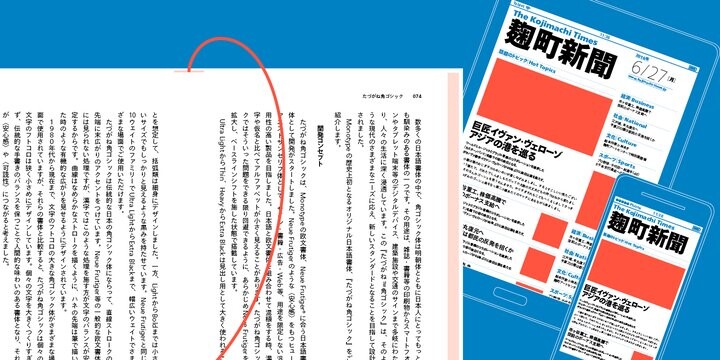

The combination of the Tazugane Gothic typefaces’ traditional and humanistic elements, along with its intended ability to complement popular Latin typefaces, makes it one of the most uniquely flexible designs for applications where Japanese and Latin texts can be used together. The typeface family was created to have wide appeal, with a pleasing and consistent experience for readers, for use on screen, in print, in signage, packaging and advertising. You can also view the Tazugane Info typeface is a clean-cut counterpart to Tazugane Gothic, designed for the demands of on-screen use.