How fonts give voice to a destination.

When exploring your next destination, take note of the typography you see guiding you through the place. How are the fonts connected to your perception of the city and its identity? Do they add to your experience? What story does the city’s typography tell?
This story can be key traits the place embodies, a desired perception in the eyes of the place’s citizens and tourists, or a vision for the future. Widespread usage of a font, in tourism and transportation for example, helps build that identity quickly and strongly.
Vying for tourists, students, investors and residents, destinations see the need to brand themselves in ways that capture as well as sell their story in the increasingly crowded marketplace. The UN’s World Tourism Organization predicts international tourism will increase to 1.8 billion people by 2030 as cheap air travel increases travel to lesser-known places, expanding tourism options beyond the expected landmarks. Fonts need to work harder than ever to push a place’s image and aspirations forward.
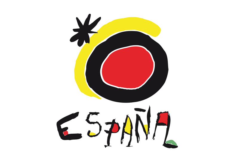
For example, Joan Miró’s logo for Spain conveyed the country as a creative, expressive and passionate place. The letters of “ESPAÑA,” hand-written and truly individual, embodied Spain’s colorful and vibrant personality. Though part of a logo and not intended for utilitarian application, the character design reinforced and exemplified the perception of Spain.

Joan Miró’s famous logo for Spain.
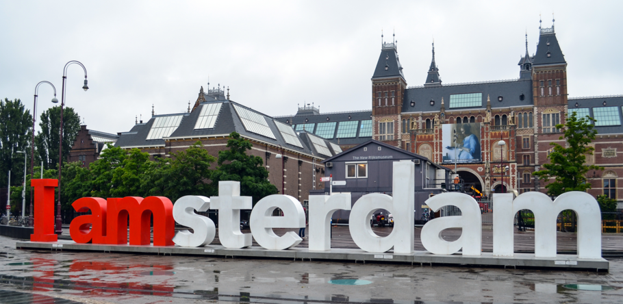
Other times, places use fonts to reshape their perception. The logo for New York’s Meatpacking District blends contrasting serif and sans serif typefaces of different weights to reflect its evolution from an industrial area to an upscale cultural center. When Amsterdam introduced its “I Amsterdam” campaign, the goal was to shift the city’s perception as a weed-café-and-sex-shop-filled city to a diverse and dynamic place for people to come together. The iconic lettering is now an attraction itself and a popular spot for photos and social media posts.
Examples like these help a place reset people’s perceptions, and set the tone for the destination going forward. Rooted in a conceptual vision, these type choices convey an image of what a place aspires to become, tying in heritage and key qualities to reflect the experience and impression of the city.
Monotype Senior Type Designer, Malou Verlomme summarizes, “When designing a typeface for a [place], one should look to its typographical heritage. Each [place] carries a rich vernacular visual background, through [the place’s] role in arts and cultural history, which can be the starting point of a typeface. But one should also focus on the present. The vibe and energy of a city are to be experienced, not researched. It’s about how people live. This is perhaps a more difficult aspect to capture, but it is nonetheless crucial.”
A forward-looking font for future-focused city
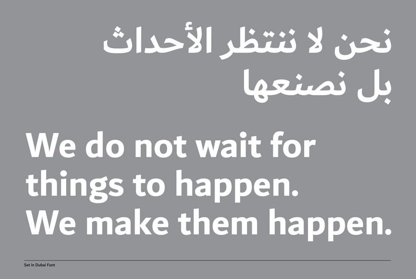
Dubai Font, developed by Monotype, was designed based on those ideas and was intended to become an all-encompassing voice of the city. The goal was twofold: design a Latin and Arabic alphabet simultaneously, blending traditional Arabic style with a modern and accessible look, and develop a harmonious design between the two that embodied the city’s energetic, innovative and pluralistic character.

Dubai’s font speaks both to its Arab heritage and forward-looking attitude.
To reference the city’s Arabic heritage, designers drew inspiration from two historically and culturally iconic calligraphic styles. They also leaned on contemporary simplicity, without much ornamentation, to make it accessible as a functional utilitarian font. Ultimately, the designers created a font family that spoke to Dubai’s Arab heritage and international future, functioned well across many forms of media, and reflected the city’s personality.
Former Monotype Type Director and Lead Designer, Nadine Chahine commented, “It’s about having one hand to the past and one hand to the future. You build on what you have, but you’re also looking forward.”
Going above and beyond use in tourism and government, the bespoke characters were released for public use and made available in Microsoft Office 365. Dubai citizens, corporations and anyone worldwide could use the Latin and Arabic font family. The font’s popularity exploded with immediate government adoption, public sculptural installations and corporate rebrands—it became a symbol of patriotism, of devotion and pride for the city. In many ways, the Dubai Font both reflects the city’s identity and shapes its perception for the future, and is on its way to become a cultural stronghold.
Thoughtful modernization of a London icon
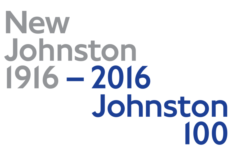
Transport for London’s Johnston font—from Johnston to New Johnston to, most recently, Monotype’s re-mastered Johnston100—has become an international icon for the city over its 100+ years of use.
“Johnston is not just our typeface,” says Mike Ashworth, London Underground’s Design and Heritage Manager, “It is the very typeface of London. You will find no Londoner who does not recognize it, nor the simplicity and authority Johnston brings to this city.”

Johnston 100 captures the essence of London while updating the font for modern use.
A permanent fixture on London’s buses and stations, Johnston’s development in the early 1900s stemmed from the need for a unified typeface throughout the London Underground system, and the understanding that design plays a crucial role in the way passengers navigate spaces and take in information. The type’s bold clarity and simplicity, during a time when serifs reigned and sans serifs were scorned, set Johnston apart as a strong and unmistakable design.
Historically, in addition to transit signage, Johnston was used on Transport for London (TfL) posters. These posters told the story of where the trains could take passengers and the excitement of new experiences. Johnston conveyed qualities such as freedom, space and joy. And through the decades, Johnston became integrated as a defining visual character to the entire London Underground experience. It became a quintessential part of its identity.
In 2016 Monotype was commissioned to bring Johnston back to its roots, following decades of updates and adjustments that diminished some of the font’s original personality. Monotype designers restored Johnston’s original quirky idiosyncrasies and width, and added extra-thin and hairline weights for effective use on mobile devices, apps, web and social media. The product was Johnston100, which preserved the font’s integrity and brought back its core qualities, while making it relevant and versatile for the digital age.
Verlomme sees the success of Johnston as “the voice of London” built on a strong partnership between the font and the city. “The relationship between type and a city goes two ways: the type should reflect the city’s heritage and culture, and through the font’s extensive use, the relationship will bind,” Verlomme says.
“Every new use of the typeface adds a layer of connotation back into its perceived qualities. When this dialogue operates, a typeface and a city can blend in a beautiful and memorable way.”