Malou Verlomme.
Senior Type Designer.
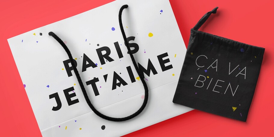
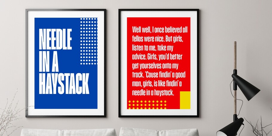

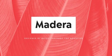
Madera ®’s sharp apexes add some flavour to the design, which offers an honest, trustworthy tone of voice – but with a twist.
Based on a Monotype 1930s condensed poster typeface, Placard Next is bursting with personality.
Ariata™ is three typefaces in one. Like phases of the moon, they gracefully meld from one to the other.
In his words.
Malou Verlomme is Senior Type Designer for Monotype, and has been with the company since 2016. His Camille typeface has the honor of being part of the collection at France’s Centre National des Arts Plastiques (CNAP).
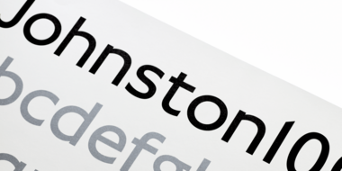
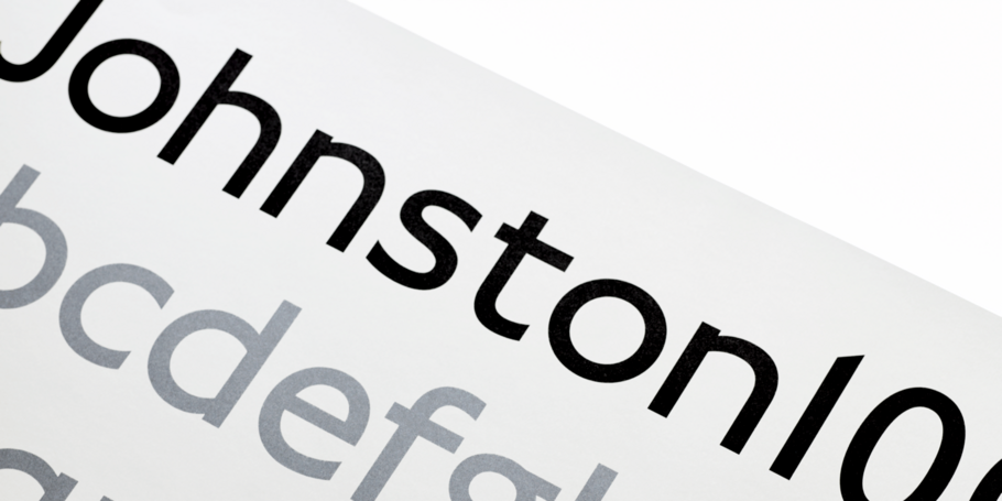
His typefaces include Madera, Placard Next, as well as Ecam and Totem published with the foundry LongType, which he co-founded in 2012. In 2016 he designed the Johnston100 typeface for TfL for extensive use throughout the London Underground. He has a Graphic Design degree from l’École Duperré in Paris, and an MA in Typeface Design from the University of Reading.
Studio releases.
Macklin
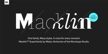
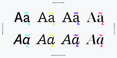
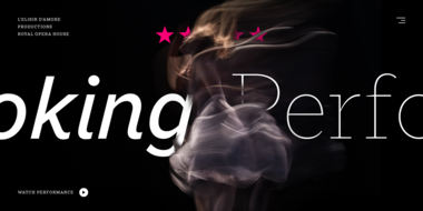
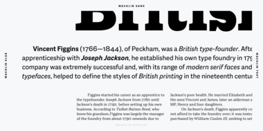
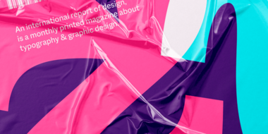
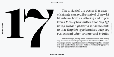
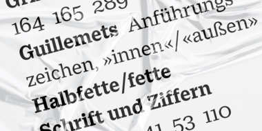
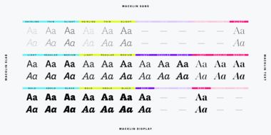
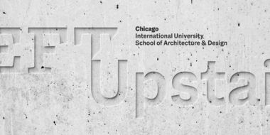
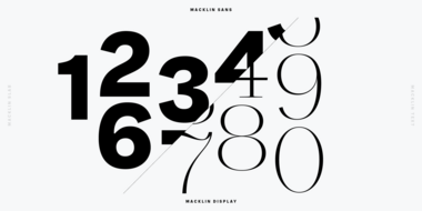
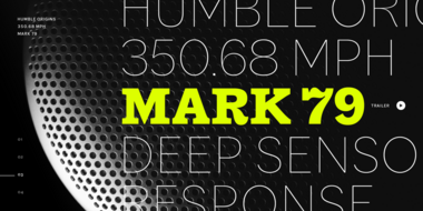
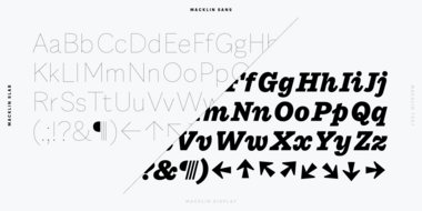
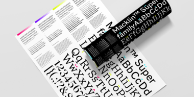
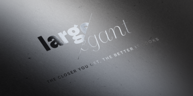
Macklin is inspired by the era when type leapt off the pages of books and onto large-scale posters and advertisements. With a distinct twist on its typographic predecessor, Macklin’s sharp yet elegant forms push the superfamily to a place that’s more suited to contemporary use and modern design.
Madera
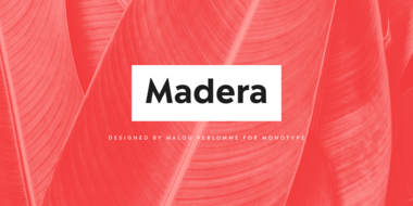
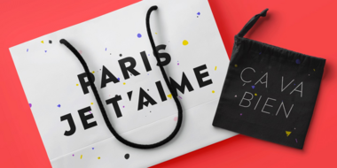
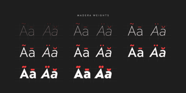
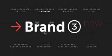
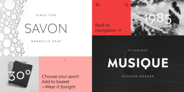
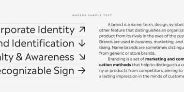
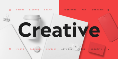
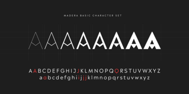
Introducing Madera by Malou Verlomme – a straight-talking typeface that’s created with graphic designers in mind. Efficient and adaptable, Madera works across print and online, and has pleasingly crisp apexes that add some extra bite to the design.
Placard Next®
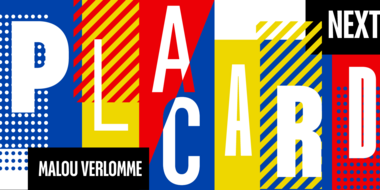
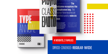
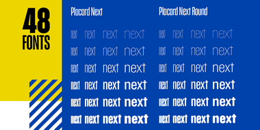
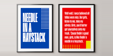
Placard Next is a juggernaut of condensed styles, purpose-built to serve every corner of ones condensed type needs. It varies from extreme thins in Hairline styles to the juiced Compressed Bold. Add in the Rounded versions and you double the palette. It’s a perfect poster typeface for theatrical impact.
Ariata
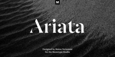
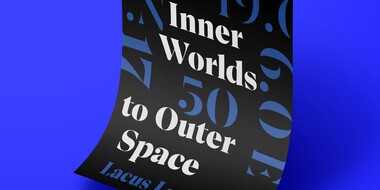
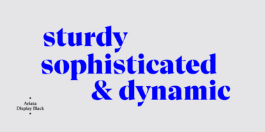
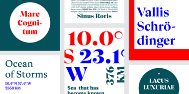

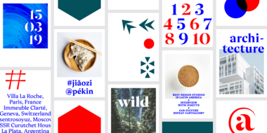
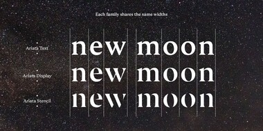
Ariata™ is three typefaces in one. Like phases of the moon, they gracefully meld from one to the other. The “Text” weights are sturdy designs that perform as well in blocks of copy as they do in the occasional headline. The “Display” versions of Ariata are delicate but confident designs that shine in large sizes, while the “Stencil” typefaces are eye-catching and provocative.

Related content.
Meet Madera.
Malou Verlomme’s Madera is a fresh addition to the popular geometric sans serif font genre, intended as a go-to typeface for branding and visual communication.
