Dubai Font: a future-facing typeface for the city and its people
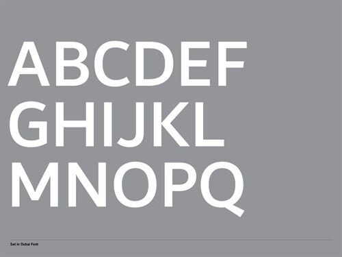
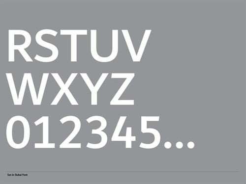
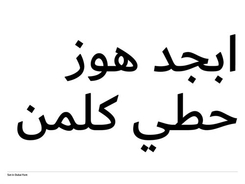
The Executive Council of Dubai partnered with Microsoft and Monotype to create a typeface family that reflects Dubai’s energetic and dynamic nature. Not just a government typeface, the family – which has been freely released for public use and available in Microsoft Office 365 – was designed to be a voice of harmony in both the Latin and Arabic scripts.
While several cities have invested in their own bespoke typefaces, what sets Dubai Font apart is its partnership with Microsoft and its free distribution for both public and government use. While many city typefaces have tourism or a utilitarian function at their heart, Dubai Font goes above and beyond this. It also becomes a typographic voice for the city’s population.
For Nadine Chahine, then the UK Type Director at Monotype, the project also came with a personal angle. The lead designer previously lived and taught in Dubai, has been visiting regularly since 2005, and has witnessed the city’s growth and development firsthand. Creating a bespoke typeface family was a chance to express some of the city’s character and heritage, as well as design its two components – Latin and Arabic – hand-in-hand with one another. More often the two scripts are developed in isolation, giving Dubai Font the honor of being the first typeface included with Microsoft Office that had Latin and Arabic scripts created at the same time.
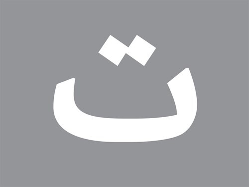
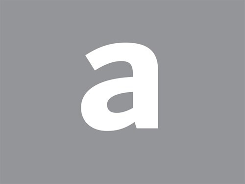
The harmony between Latin and Arabic was key to the design, and was a reflection of the harmony with which so many different nationalities in Dubai have come to live together.
Managing this process meant regular check-ins with the designers on the team exchanging files to ensure the different scripts were fitting together, and working in harmony to develop the overall design. This called for subtle tweaks to the design that would create compatibility between the two scripts without sacrificing the authenticity of either. Luckily, some features in Arabic can be nicely matched in certain styles of Latin design.
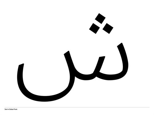
“In Arabic we have a lot of shallow curves with sudden changes in direction, so that kind of design feature was essential,” says Chahine. “We also needed to maintain a reference to the pen movement, but keep it subtle because it’s a sans serif, and it’s not too calligraphic.”
The typeface needed to reference Arabic heritage without being too traditional, so it could embody Dubai’s future-facing philosophy, and it was also essential it avoided being too ornamental, in order to function as “a good workhorse”, as Chahine characterizes it. “It’s about having one hand to the past and one hand to the future. You build on what you have, but you’re also looking forward.”
“There’s a calmness in the design, in both the Latin and even more so in the Arabic. It needed that peacefulness,” she adds.
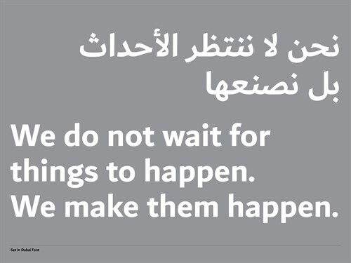
Its restrained voice additionally makes it highly adaptable, capable of functioning across the wide range of uses it will eventually have – both in the hands of The Executive Council, and the public. Chahine especially hopes it will find a role in the world of education, with its calm nature offering a potentially persuasive and welcoming route into learning.
Above and beyond that, Chahine sees Dubai Font as fulfilling a higher cultural purpose, addressing the decreasing number of people reading and using Arabic.
“This shows that Arabic can be contemporary,” she explains. “People sometimes see it as old-fashioned and outdated, and if we have typefaces that show the language can be portrayed in a modern way, then this could be one way to invite people to read in Arabic again.”
“It’s a great example of what a contemporary Arab city is doing for an Arabic form of communication,” she adds. “This looks forward to what modern Arabic can be for people, and shows the wider implications for type and culture.”
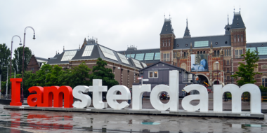
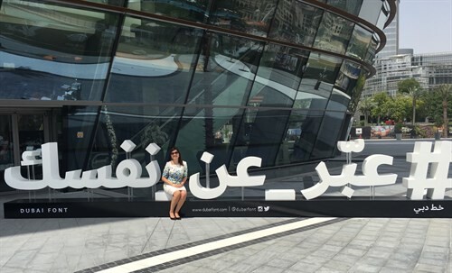
To promote its release the city installed giant sculptural letterforms, taken from the typeface, around the city – encouraging people to stop, take pictures, and engage with type in a completely different way. Dubai’s population has embraced the typeface enthusiastically, with brands and companies scrambling to be the first to adopt the city’s official font – also lending it an element of patriotism.
Nadine Chahine.
Dubai Font reflects the changing perception of type, and an appreciation of the possibilities it offers both culturally, and from a communications standpoint.
“It’s great to see government support for typography, and for supporting the role of type innovation,” adds Chahine. “To see type as part of communication and expression, and to see it embraced by the public and not just graphic designers, is my favorite part of this.”
“It’s great to see regular people just talking about fonts.”
