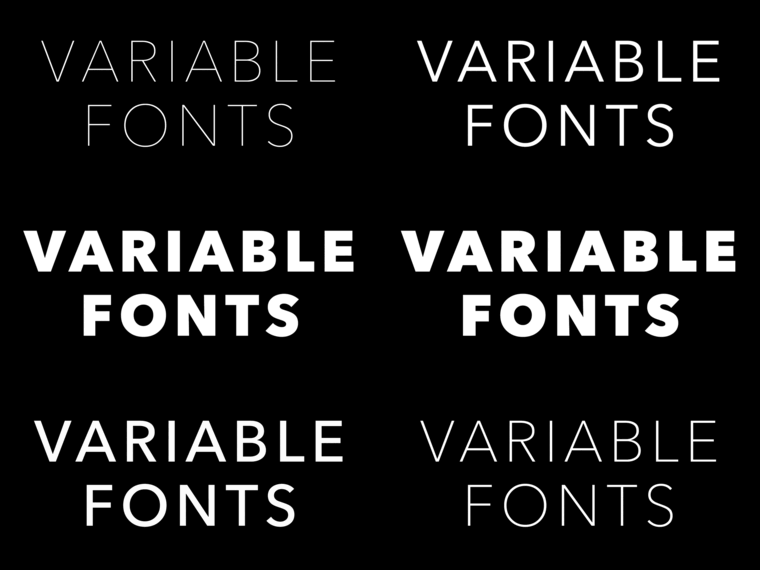
Variable Fonts: making the promise a reality.
Bob Taylor, Monotype’s Font Technologies Director, offers his views on the promise of Variable Fonts and shares how Monotype and the tech industry are bringing this promise to reality. He shares a few Variable Font tests gone wrong, what we are learning, and introduces the newest Variable Font from Monotype.
When I tell people that I work on fonts, more often than not I get a confused look. To most people, fonts are a drop-down menu in Word or Google Docs. It’s a common misconception that fonts just fall out of the sky. However, fonts are surprisingly complex when you look under the hood. Creating fonts blends artistic design with knowledge about writing systems. Then add a dash of math and computer science. This mixture forms a visual playground full of room for creativity, innovation, and intellectual challenge.
The recent resurgence of variable fonts is one of the most exciting developments involving fonts. Imagine the design freedom to work naturally and creatively with full font families (Avenir Next) instead of individual fonts (Avenir Next Bold). A variable font encapsulates the entire font family, not just one style or instance.
The glyph outlines in a variable font morph between various family shapes using interpolation techniques defined in the OpenType 1.8.1 specification. This specification was the result of a remarkable working collaboration between Adobe, Apple, Google, and Microsoft. For more on that story see the references at the end.
My colleagues at Monotype also contributed to the development of the specification. Tom Rickner and Dave Opstad were initially involved in the development of the forerunner to the current spec, namely TrueType GX and Apple’s Advanced Typography technology. They helped create this technology while they worked at Apple many years ago (see Tom’s blog post) and actively contribute to this new standard.
Today when you buy a font or a font family each member of the family is a separate file. If you want to use that family in your design you have to include all of the family member fonts and you are restricted to using only those members. If you need an intermediate weight or width, you are out of luck. Variable fonts essentially represent the entire family in one file and let you access a continuum of designs throughout the family.
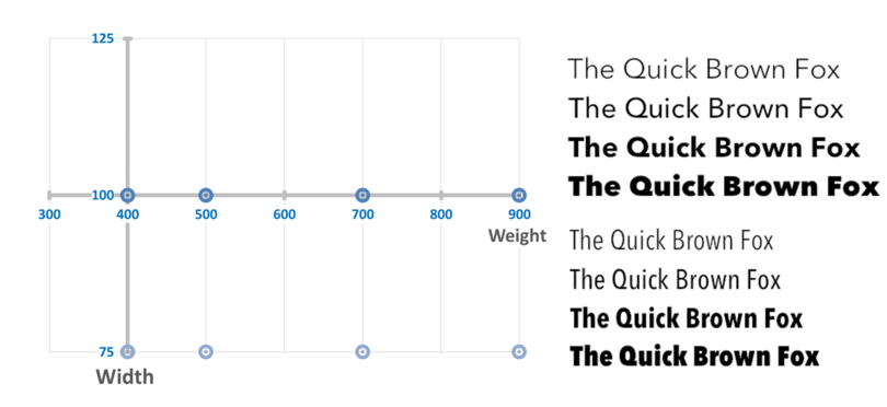
This is the intriguing aspect about variable fonts, they expose a typographic design space consisting of one or more design axes. For example, a variable font can contain both weight and width variations. These variations are controlled by coordinates in a two-dimensional space with each coordinate in that space presenting a different typographic experience. This is illustrated below where four regular weights and four condensed weights are shown. Each line of type results from a different coordinate on the design space graph.
The true promise of variable fonts lies in being able to select other points in the design space in creative ways. For example, you may want to vary the weight but adjust the width in a way that preserves line lengths. This is shown below where each line of text corresponds to an intermediate point in design space.
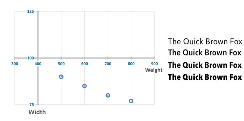
Note that some of these weights, such as 600 and 800, were not in the original font family. These weights are generated through interpolation. In fact any weight between 300 and 900 combined with any width between 75 and 125 is available. Access to this entire design space is yours to play with using variable fonts.
This freedom of choice unlocks a number of use cases, some currently envisioned and some yet to be discovered. The familiar ones we know about today are:
- Font family compression
- Responsive design
- Font tuning
But once variable fonts become widely available and supported in operating systems and web standards like CSS, it is inevitable that others will find new ways to create new user experiences. That is the art of visual communication. But for the moment let’s focus on some of the currently envisioned use cases.
Font family compression
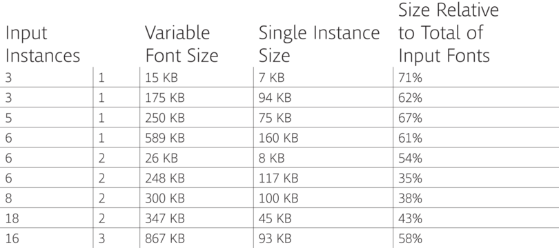
By encoding an entire font family in one file it turns out that there is a lot of potential for overall file size savings. The amount of savings depends on the number of input fonts that went into creating the variable font and how many design axes it has. This size savings is relative to the total size of all the input fonts. The savings can vary considerably but the table below shows some representative numbers.
Two paradigms
Speaking of sliders, the use cases above highlight that two paradigms are starting to emerge for the control of variable fonts. You can think of these as the “pull-down” vs. “slider” views, and already members of the typographic community are taking sides. The pull-down point of view says that you should only use named instances within a variable font. These were the instances that the font designer approved. This is signified by the use of a pull-down list of instances.

This is the preference of Team Pull Down
You can have intermediate named instances. They do not have to be restricted to those that went into making the variable font. But at some point a type designer has looked at that instance and approved it. There is a lot to recommend that point of view since you can rely on the font manufacturer to assure quality.

Team Slider
The slider point of view sees each design axis as a continuum and you should be able to select any point along that continuum. This view is typically represented as a set of slider controls.
You can interactively or programmatically pick any value within the range of each axis. The intermediate glyph shapes are created through interpolation. The type designer may not have looked at that particular combination of axis values and may not have approved of it. It is up to the font manufacturer to ensure that glyph shapes interpolate properly and are typographically consistent and useable.
A little harmony

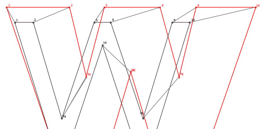
In order to produce a variable font that uses interpolation, the glyph outlines must have a one-to-one relation between each point in the outline. This is called point compatibility. In the following diagram you can see that every point in the default outline shown in black corresponds to a point associated with the variation outline in red.
Monotype is working on advanced font tools to harmonize a font family and produce point-compatible sets of fonts that can be converted to a variable font. In our terminology we harmonize a font family to make the glyph outlines point compatible in a way that minimizes the number of points and produces good intermediate interpolations (i.e. no kinks or discontinuities that were not present in the design and no twists in the outlines).

This process often involves reflowing the outline to make the points match up while preserving the outline shape to a high degree of fidelity. This reflowing process is complex. The first step is to make sure the contours within all the outlines match up. If not, they have to be reordered. Then the outline is broken up into sections and the sections have to match up. There is no hard and fast rule for what a section should be so the algorithms involved do the best they can. Then once the sections are matched we refit the curves within each section to match while having the same number of control points.
When it all works the result is a thing of beauty. Consider how the control points seem to dance around the outline of the ‘S’ character in this example.
So what could go wrong?

Well, it turns out a lot can go wrong when you try to convert an existing family that was never intended to be interpolated. This complex set of algorithms works remarkably well but occasionally problems do occur. One type of problem involves introducing a kink in the outline where there was not one before. For example, see how the outline for the character ‘6’ changes between instances. The outline is point compatible and the endpoint instances are correct, but there is a kink in the interpolated instances.

This is a flaw in the identification of sections and would be corrected before the font was released. Detecting such flaws is a challenge for a quality assurance program and we are developing automated tools to help with the identification. The ‘Q’ offers an even more dramatic example.
While these examples are fun to look at, we would never ship a font product like this. Our goal is to make sure that every named instance in every font and every interpolated intermediate instance in every font is perfect and consistent with the original design.
Summary
The OpenType 1.8.1 spec for variable fonts is new and we are just learning how to create these fonts from existing families. Our hope is to have lots of font families converted to variable fonts. Some may only have one weight axis, some two or three axes. Perhaps we will have different combinations with different design space ranges available so customers can choose what best meets their needs. There is a lot of promise provided by variables fonts and a lot of work ahead. We are only at the beginning.
There still needs to be changes made to operating systems and applications to expose access to variable font capabilities. Web browsers and web standards such as HTML/CSS need to be updated to recognize and control variable fonts. Font renderers and text layout engines need to incorporate support for the OpenType 1.8.1 standard. All of these activities are moving forward.
At Monotype we want to be sure that we can produce variable fonts from all sorts of existing families and any new families we produce. We continue to work with other foundries and industry partners to advance this area of font technology.
In the end designers, brand owners, and manufacturers will all benefit from having this technology widely available. Designers and brand owners will benefit from additional flexibility to create wonderful looking page layouts. Device manufacturers will benefit from being able to use the exact weight and width for their user interfaces on limited hardware with limited displays. Even if the font rasterizer in their device cannot render variable fonts, the precise intermediate instance can be saved out and used in the traditional way. Designers no longer have to settle for pre-defined weights. They can have any weight in the family design space. And in the end it is all about creating the precisely perfect user experience.
Introducing Avenir Next as a variable font
To get the ball rolling, we are releasing sample fonts for you to use and experiment with, to gauge interest and usefulness. The first of these fonts is a prototype of Terrance Weinzierl’s Kairos Sans family, available on GitHub.
A second variable font prototype based on the Avenir Next family is now available on GitHub as well. Avenir Next is a timeless sans serif design by Adrian Frutiger with expanded rework by Monotype Type Director Akira Kobayashi. This humanist design is one of our best sellers. The clean, classic design lends itself well to implementation as a variable font.
One challenge with this family involved the dollar sign which changed style in going from the bold to heavy weights. For this demo font we chose to redesign the dollar and the cent sign for the heavy weights so that interpolation could be used across the entire weight axis. Alternatively we could have used a contextual substitution defined in the GSUB table. Since not all systems have implemented this feature yet, we wanted to show how a minor design change can be used to achieve harmony between the various weights.
Interested in testing?
We look forward to your feedback, as this will help shape the development of other variable fonts we have in the works. If you are interested in testing next steps in the evolution of digital type and typography, let us know @TrueTyper #VariableFonts
References
If you add additional interpolated named instances, the relative size goes down even more. But clearly the size of a variable font will be considerably bigger than any single instance. So variable fonts only make sense from a compression point of view if you need to use most of the instances represented in the font. This is ideal for general purpose systems such as operating systems that will make use of all the named instances in the font and more.
Responsive design
A major challenge for web designers and brand owners is conveying a unified design across all sorts of devices and screen sizes. Ideally the look and feel of your message is the same regardless of whether it is seen on a desktop display or a small phone screen. The details differ but the design changes coherently.
Responsive design is one approach to meeting that challenge. The design of a page is formed around element grids that move and resize depending on the screen space. All of the important elements are there, just in a different form factor. In his blog posting Tom Rickner talked about how variable fonts can help with responsive design. And also how optical scaling can be used to enhance display output at various screen sizes. Standards for CSS control over variable font rendering are still in progress, but eventually a bit of JavaScript and CSS should bring the power of variable fonts to work.
Font tuning
Font tuning is another example of how variable fonts can really help out. When creating a text layout there are plenty of times when you wish a particular block of text could be just a bit bolder or just a bit narrower. In the past you had to pick between fixed weights and there was often a large change in width if you went to a condensed width. Font tuning is about making micro-changes to the text rendering to tweak your user interface or screen design. It can also be about about making the text fit in small places on small screens.
With variable fonts you have control over the exact weight of the text and the exact width. Want the text bolder but not so bold, adjust the design using variable fonts. Want a block of text to be narrower on the page, don’t adjust the point size. Adjust the width.
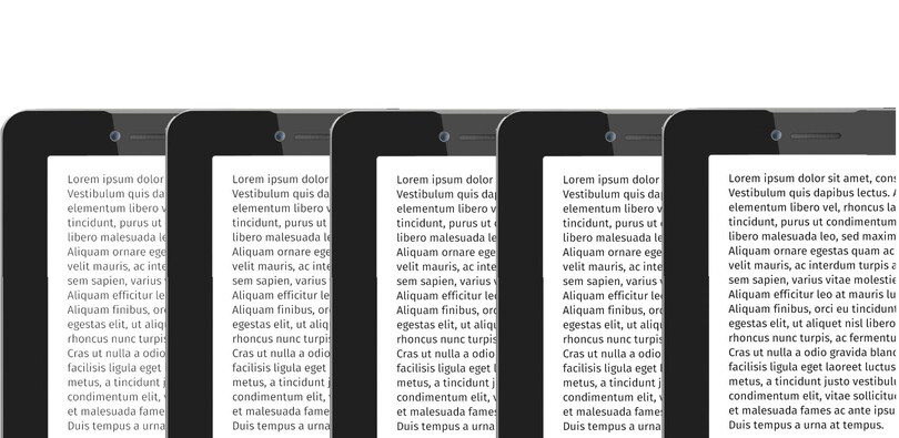
The following illustration shows how a slight change in weight with no corresponding change in width can change the reading experience on a tablet. Such control can be presented as a set of options along with text size and font choice. Or you can even let the user continuously modify the text using a slider control.
