Why brands love to use sans serifs (and how you can choose one, too).

When sans serifs hit the typography scene in the early 1900s, they weren’t just a fad, they came to stay. Here’s how to choose the right one for your brand.
A Brief History
In 1816, William Caslon IV designed the first sans serif typeface, Caslon, though at the time it was not widely accepted nor popularized. However, when modernism emerged at the turn of the century, ushering in the design concept of form following function, the sans serif exploded.
Taking inspiration from modern machinery and mass production, modernism built on concepts of efficiency, structure, and simplicity. Before modernism, graphic design was elaborate and ornate. Modernism shifted the focus to uniformity, geometry, and whitespace. Clean, sleek lines gained favor over decorative elements that existed solely for embellishment as designers explored the use of negative space and polished type forms. Design served to be practical and useful.
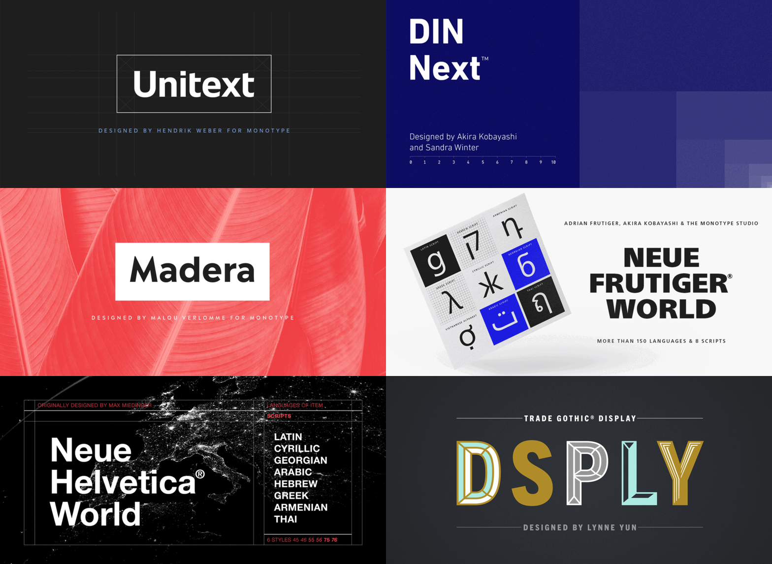
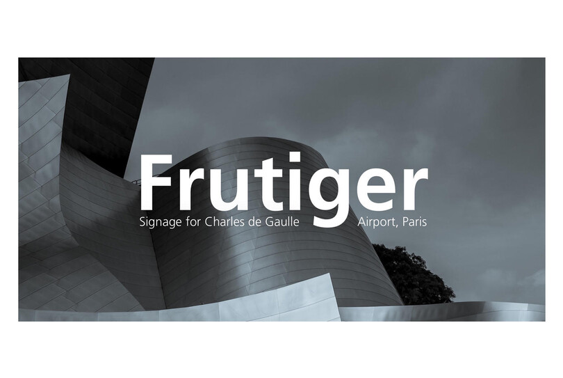
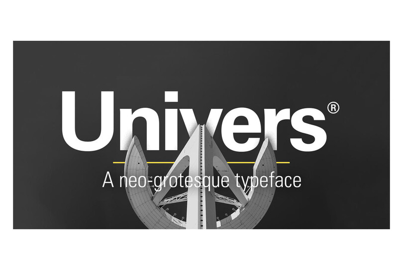
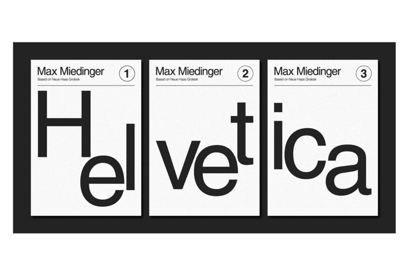
During the height of modernism (1920s-1970s), some of the most popular and recognizable sans serifs were created: Futura, a geometric sans; Helvetica and Univers, neo-grotesque sans; and Frutiger, a humanist sans. (Learn more about the classifications of typefaces here.)

It’s no surprise, then, that industries experiencing breakthroughs leaned heavily on this new sleek look. Sans serifs connoted progress and emphasized the future, which is why aerospace, technology, medicine, and biotech companies adopted sans serifs early on. And with the rise and proliferation of tech companies now, sans fonts continue to dominate for the same reason.
In the early days of small digital screens, sans serifs were preferred to improve legibility. Resolution was middling and legibility necessitated dropping serifs for a character to render clearly. However, today’s high-resolution screens no longer require a sans serif for users to read clearly, though most brands still prefer a sans serif as their primary display font.
Sans Today
Modern brands have less time than ever to connect with their audiences and in doing so, try to make their messages as appealing, accessible, and digestible as possible. With an inundation of marketing messages, people screen for what they find engaging, and ignore brands unless they are personally invested in the message. It’s obvious why the central modernist ideals of simplicity and efficiency prevail, and that sans serifs are ubiquitous as ever.

Many contemporary brands also desire to be seen as forward thinking, edgy, current, and even youthful. The sans serif connotations of modernity and innovation help reinforce these perceptions, and as audiences, media, and the marketplace constantly evolve, brands do not want to be left behind.
“We’re still seeing the effects of how the Internet and social media have not only changed our global economy, but also the ideals and attitudes of brands,” says Monotype Senior Type Designer, Terrance Weinzierl. The culture has undeniably shifted, which has brands rethinking who they are and how they present themselves.
Within this shift, sans serifs are a practical design choice. The clean lines and whitespace work well with many design styles and approaches, making them highly adaptable across many forms of media—large and small, print and digital, static and animated.
“Take Helvetica for example,” Weinzierl says. “[The font is] used by Target, Gap, and American Apparel. Can you tell the difference between headlines written for these companies? Maybe you’d recognize their copywriting. How about the photography? Absolutely. Color? Of course. How a brand uses a font with other design elements greatly impacts the mood and message. Very different brands can use the same typeface in very different ways and have very different results.”

Some examples of well-suited sans serif brand evolutions include Remax and Nobel Prize. Remax updated from one geometric sans to another, and Nobel Prize selected a new font and brand colors that emphasize the organization’s intellectuality, poise, and seriousness.
Weinzierl continues, “It’s how type works with the whole brand, on all applications, in different contexts. These sans serif rebrands are not always about chasing fashion, but can often signal a shift in the organization, leadership, or product design. Especially with consumer products, the face is ever changing and always under a microscope,” he says.
Choosing a Sans Serif
As popular as sans serif fonts are, they aren’t the right fit for every brand. “Brands might think, ‘We’re going to this typeface because everyone is, so you can use it on anything,’” says Weinzierl. “Or maybe, ‘Our competitors are using this clean and modern look—we should as well.’”
Instead, it is imperative to complete a full brand audit before selecting a sans serif, or any font. Weinzierl urges brands to get specific about their identity and find a sans serif that supports it. There are many options that allow brands to communicate who they are, so they should resist the temptation to choose the trendiest look. Brands should also consider custom fonts, as the design process and ownership can be more valuable than finding and using the right font.
With so many new and veteran brands implementing sans serif fonts, it’s important to define what sets your brand apart. Adopting what’s popular can often make a brand feel lost in the marketplace and even within its own identity. So, while sans might mean a cultural shift within a brand, brands that choose to make this move must find a font that fits their personality and balances design trends with authenticity.
What’s next for sans serifs?
Should we anticipate another major design movement? It’s hard to say. However, the rapid pace of technological evolution means sans serifs will continue changing as well. Weinzierl foresees the following decades increasing focus on the flexibility and adaptability of a sans serif typeface in font software.
He concludes, “We’ll see variable fonts with optical sizes—one typeface that truly works everywhere a brand demands. Maybe we will see fonts respond to viewing distance in VR or animations that match movements and acceleration, or fonts that adapt automatically for use in different sizes.”