Type with heart for Southwest Airlines.
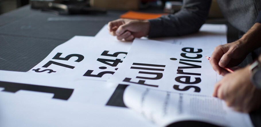
Monotype and Lippincott worked closely with Southwest Airlines to craft an authentic typographic voice that formed the center of a fresh new identity for the beloved airline brand.
For nearly half a century Southwest Airlines has been refining its business philosophy, which puts authentic and emotional connections with its consumers at the absolute heart of the brand experience. In 2014, the time had come to bring Southwest’s human values to the forefront, and the airline announced a full brand refresh which covered livery, airports, digital channels and a fresh new visual identity. From planes to peanut packaging, the new branding put a contemporary spin on Southwest’s confident and authentic personality.
“Our collective heartbeat is stronger and healthier than ever, and that’s because of the warmth, the compassion, and the smiles of our people,” commented Gary Kelly, Southwest Airlines Chairman, President and Chief Executive Officer. “The Heart emblazoned on our aircraft, and within our new look, symbolizes our commitment that we’ll remain true to our core values as we set our sights on the future.”
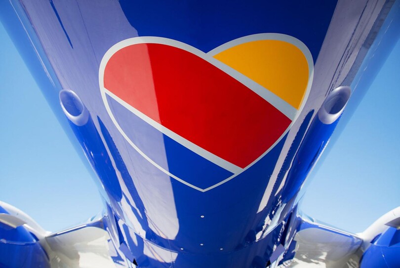
Southwest’s full brand refresh covered livery, airports, digital channels and a fresh new visual identity.
A key part of the new identity was to emphasize the hallmarks of Southwest Airline’s internal culture – which focuses on humanity and a personal touch – and express these in ways that would resonate on a clear visual level, particularly in a market that’s both increasingly crowded, and increasingly jaded. To do so, Southwest Airlines partnered with Lippincott to create an identity that drew on the brand consultancy’s Human Era Branding philosophy, which embraces simple, honest communication between brands and consumers.
“Human Era Brands appeal emotionally to a consumer; sometimes these appeals are vulnerable, sometimes they are strong, silly or serious. Whatever the case, emotional appeals are authentic and ring true to a company’s DNA and its purpose,” explains Rodney Abbott, Senior Partner at Lippincott.
Of course, the written word is one of the most powerful ways to communicate. Type complements the art of storytelling and can embody a brand’s personality. With this in mind, Lippincott and Southwest Airlines worked closely with Monotype to commission bespoke typeface Southwest Sans – an original design created specifically for the brand. Crafted by Dan Rhatigan, and Monotype Type Designer, Jim Ford, the letterforms have been designed to embody Southwest’s personality, as well as give new and diverse expression to its voice. With the brand needing to present itself in a way that would create authentic connections with its consumers, type needed to play a significant role in conveying Southwest’s unique tone of voice, in whatever environment it was being deployed.
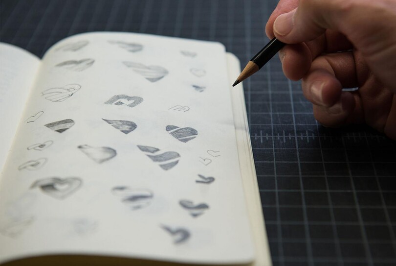
Southwest Sans typeface was inspired by the core symbol of Southwest’s identity- the heart.
Beginning with the absolute core symbol of Southwest’s identity – the heart – the logotype was redrawn to complement the motif, and its design characteristics used to lead the overall look of Southwest Sans. Directional change is reflected by a simple sharp point, with the line gently arcing into a full round curve; while stems lend structure to some letterforms that help eyes scan across lines of copy. Large circles introduce friendliness and a youthful feeling, while along the baseline blunted spurs and accentuated bowls enhance the playful character of the letterforms. Balancing this out, the typeface employs geometric proportions with minimal contrast between thicks and thins, to give the typeface a modern and approachable appearance.
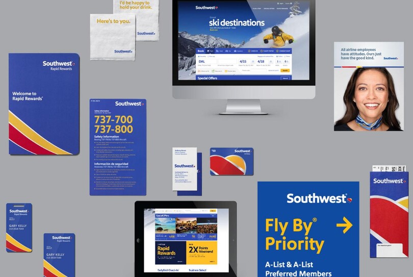
The Southwest Sans typeface can be seen on everything from planes to peanut packaging.
As you’d expect, type has played a central role in Southwest’s identity refresh and now appears across a vast multitude of branding materials – everything from livery, airport signage and websites, to peanut packaging, drinks coupons and cocktail napkins. The brand voice of Southwest is embodied in Southwest Sans at all point sizes, whether miniscule or massive, to ensure that every single word counts and carries meaning. “Our bold new look displays the heart of our employees and our brand promise to our customers,” elaborates Kevin Krone, Southwest Airlines Chief Marketing Officer. “Working in partnership with Lippincott and Monotype on the custom typeface allowed us the ability to form every character in a way that conveyed our unique personality, voice and visual identity.”
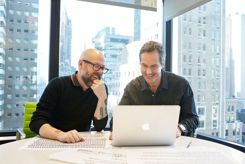
Dan Rhatigan (left) and Rodney Abbott (right) reviewing the Southwest Sans typeface.
It turns out, the company is the financial world’s top pick as well, profitable for 41 years in a row and recently named airline of the year and top investment pick of 2014. However despite its business success, Southwest has stayed true to its philosophy by showing the world that a little heart goes a long way. As travelers are increasingly bombarded with new brands and possibilities, being able to speak to consumers in a relatable and human tone of voice, using type, plays an ever-more important role in defining a brand.
