Paulo Goode foundry highlights.
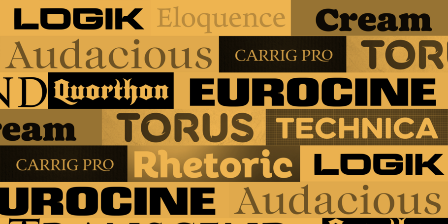
Curated by the Monotype Studio.
Paulo Goode.
Paulo Goode is an independent designer based in Ireland who transitioned to type design after a 30-year career in illustration, graphic design, and website development. Launched in 2016, his foundry has already released several popular designs, and his typefaces have been used in packaging, corporate advertisements, book cover designs, and even video games. Paulo’s designs primarily consist of display type with a branding focus - exactly the kind of typography he sought out as a graphic designer. He specializes in creating versatile, feature-packed typefaces that deliver exceptional value to their users.
Cream
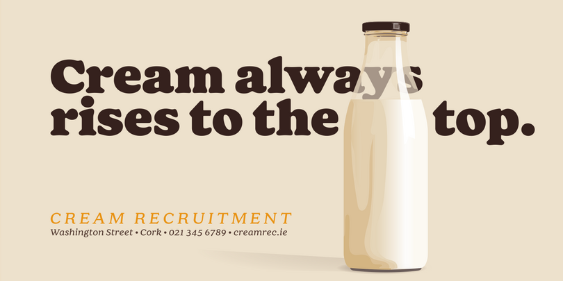
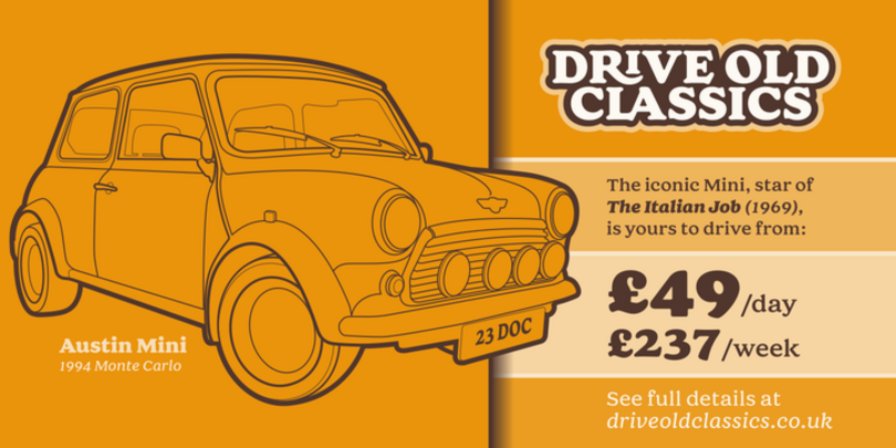
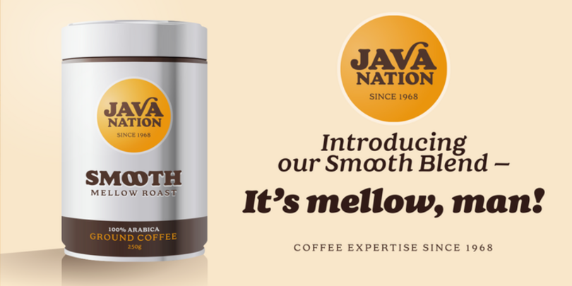
Cream is a retro soft serif typeface with many decorative alternates and ligatures that will add distinctive flourishes to your typographic compositions. When used subtly, these swashes and glyph combinations will add flair and personality to your creations. While Cream is perfect for titling and branding, the font family can handle most typographic applications from branding to body copy with its range of weights and inherent legibility. The family includes 12 fonts and an extensive character set that covers all Latin European languages.
Logik
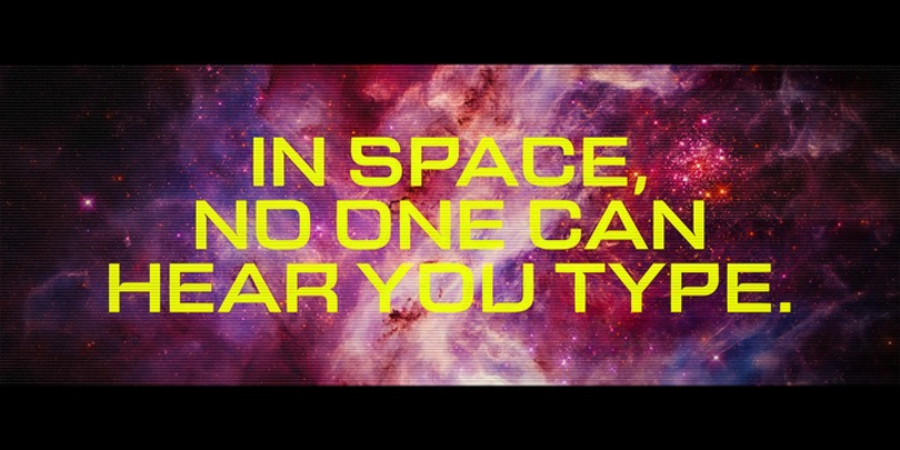
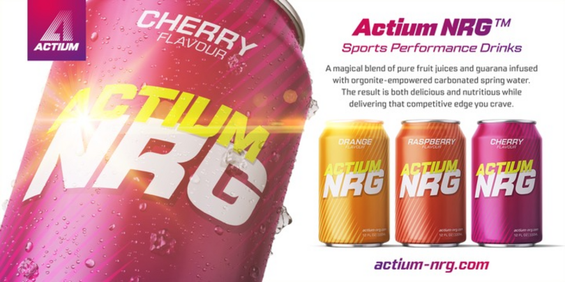
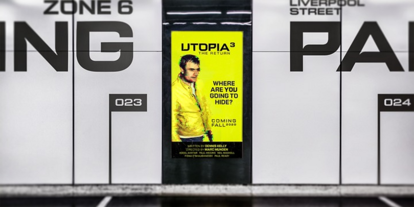
Logik is a futuristic square sans serif typeface. Its personality is defined by squared-off corners that one would normally expect to be rounded, a sharpness that gives the glyphs a certain eccentricity. Sharp, incised/stylized ink traps along with slightly tapered/curved horizontals and verticals add to the character of each letterform. These subtleties combine to give Logik a distinctively futuristic aura. Logik’s main use is for headlines, short runs of text, branding, and display purposes – ideally suited for film and book titles, but also an excellent option for sports, media, and recreational typography projects.
Carrig Pro
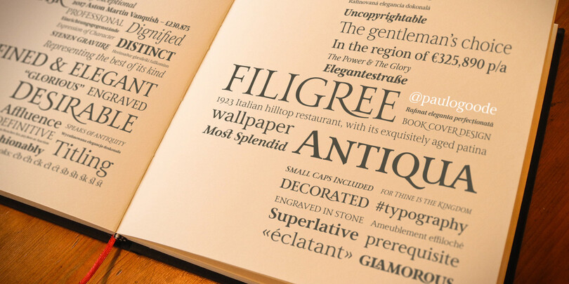
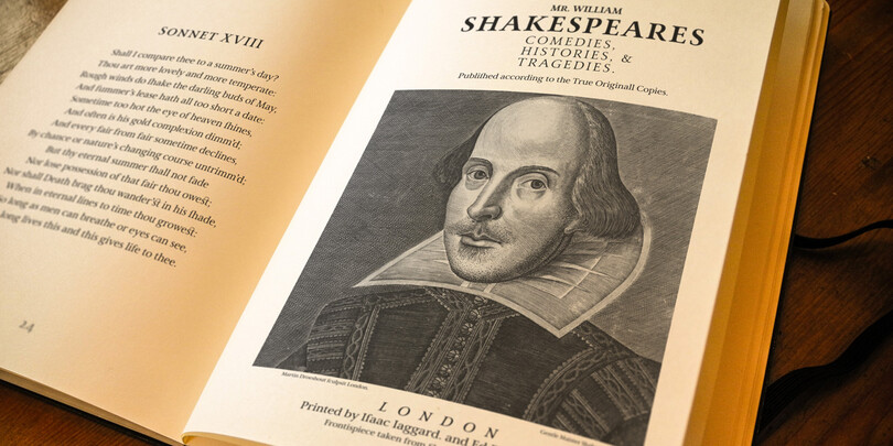
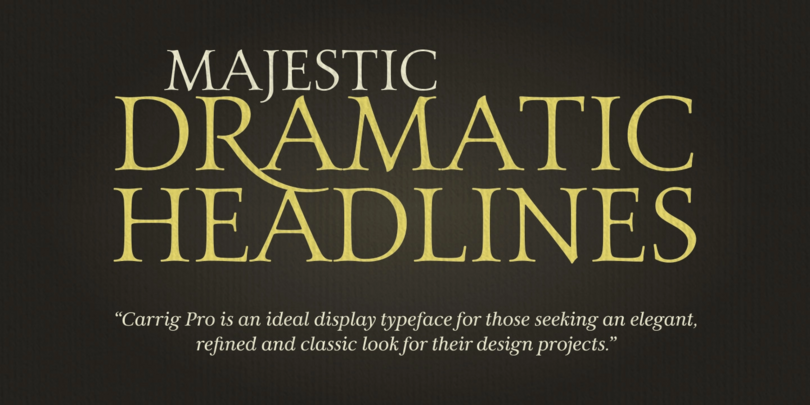
Carrig Pro is a refined and elegant serif. Classed as an Antiqua, Carrig Pro is born from a hybrid of influences ranging from early Roman inscriptions to Pre-Modern era type, giving the font its own distinctive character. Carrig Pro is the perfect typeface for designers seeking to convey a message with a distinctive and prestigious air. Carrig Pro is an extended version of the original Carrig, and has many useful features for typographers to exploit, such as easily accessible small caps, discretionary ligatures, gadzooks, and stylistic alternates, as well as a number of ornamental glyphs.
Eponymous
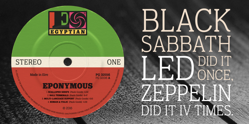
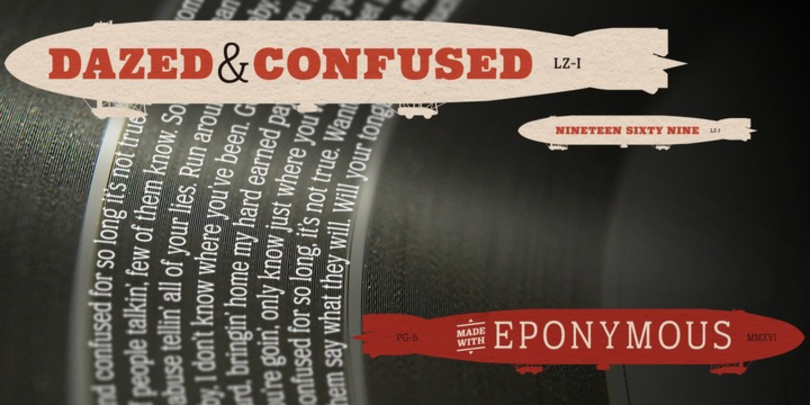
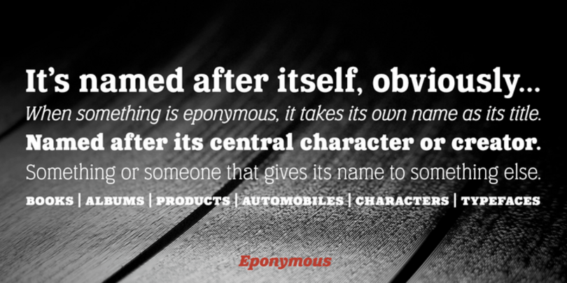
An Egyptian-style typeface with chunky, scalloped serifs, Eponymous is a versatile, stylish, and contemporary slab face that is intended for use in creating logos and distinctive branding typography. Eponymous is packed with ball terminals and oozes retro vibes, and offers many OpenType features such as stylistic alternates, as well as a full set of small caps with diacritics and figures.
Transcend
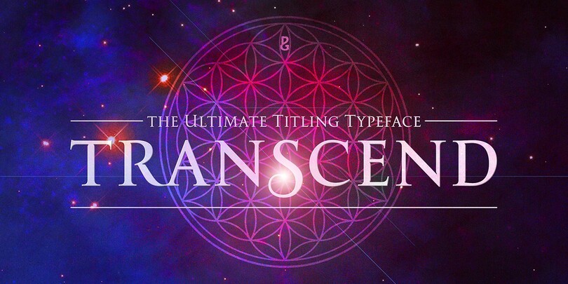
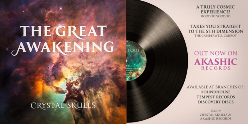
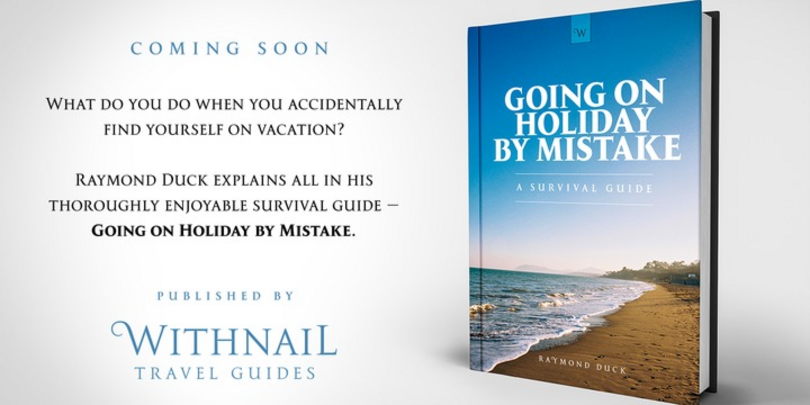
Transcend has been designed specifically for titling and branding purposes. This 8-font, all caps typeface is packed with OpenType features including discretionary ligatures and alternates that – when used subtly – create distinctive headline typography. The typeface is an exploration of the designer’s original Carrig font, embellished with crisp, sharp lines and serifs, stylised ink traps/notches, and carefully considered swashes, flourishes, and ligatures that add a touch of class and refinement to every word.
Quorthon
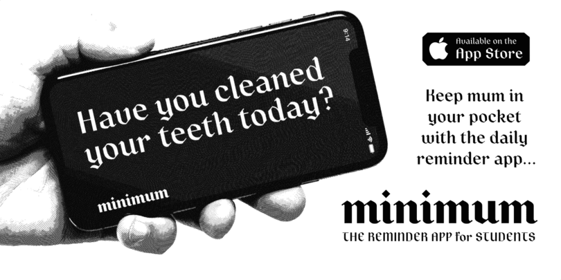
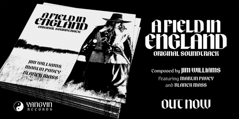
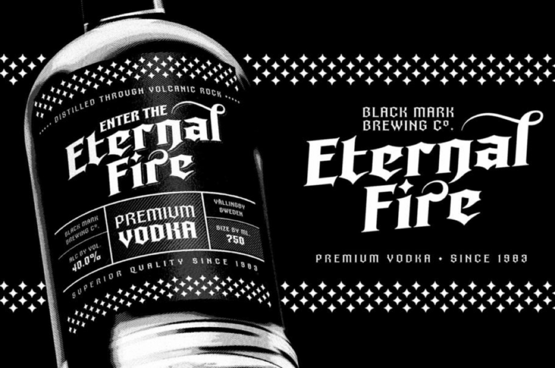
Quorthon is a collection of blackletter style fonts in 3 distinct voices, all with a more contemporary feel and greater legibility than the centuries-old blackletter standard. BLACK, the most severe of the three styles, has aggressive barbs and spurs, creating an imposing stature that is ideal for branding, advertising, and logotype where a forceful message is required. DARK is more subtle; it retains a barbed style but adds more contemporary serifs and highly-contrasted, calligraphic glyphs full of character and subtle nuances. GREY, the softest of all the Quorthon styles, has a minimal design and clean, straight lines, ideal for creating stunning titles and headlines.
Technica
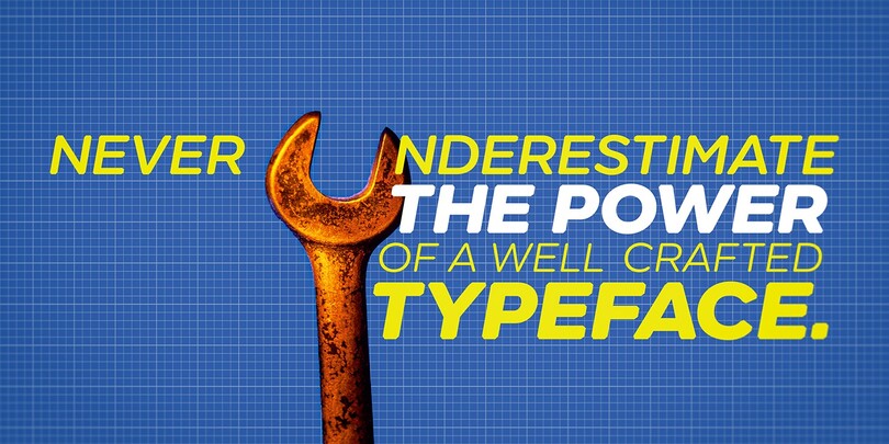
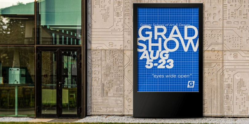
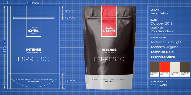
A refined, geometric sans serif, Technica is a more conservative version of the previous Meccanica font family. Technica retains the structure of the older typeface, but tones down the hexagonal elements, sharpens the chamfered terminals, and instills a more technical approach by fine-tuning each glyph for optimal performance and aesthetics.
Eurocine
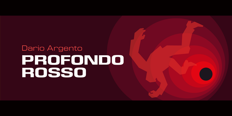
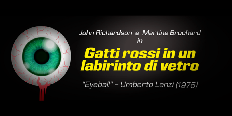
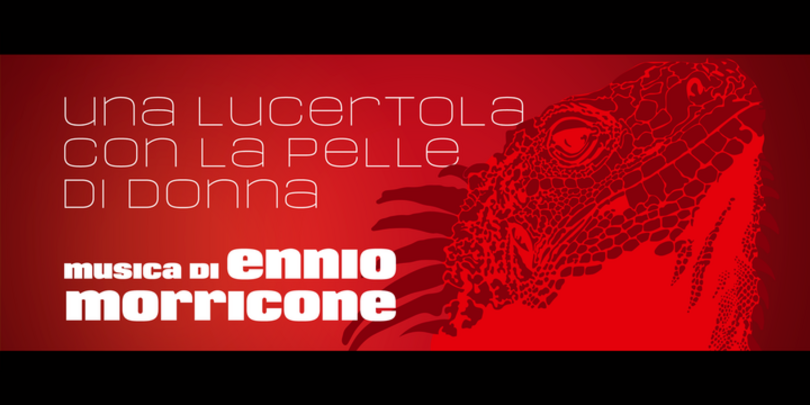
Eurocine is an expansive display typeface – a square sans serif perfect for titling, headlines, logotype, and branding. This typeface attempts to capture the mood of movie credits from European Cinema in the 1970s, with a focus on Giallo films. Stylistically, Eurocine sits between Walter Baum and Konrad Friedrich Bauer’s Folio and Aldo Novarese’s Eurostile, but is a more versatile option with small caps and additional stylistic sets that include extended caps, extended small caps, petite caps, and upper/lowercase unicase.
Rhetoric
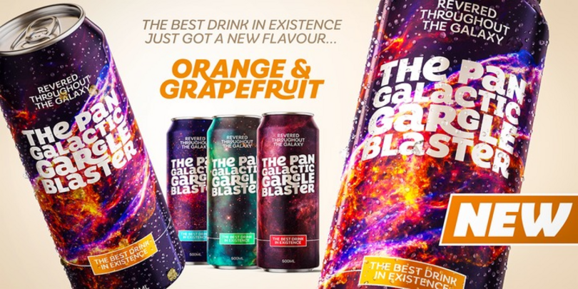
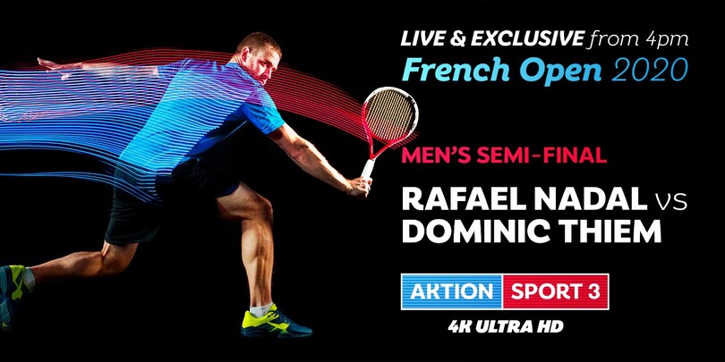
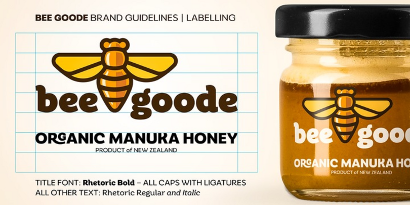
Rhetoric is a friendly humanist display typeface that is full of personality and designed for branding purposes, headlines, and short runs of text. The fonts are defined by their Roman characters which could be described as “upright italic” – the style traditionally associated with a cursive character set has been applied to the roman glyphs. Rhetoric embraces its curves – exemplified by the voluptuous caps for A, M, U, V, W, X, and Y, further enhancing this typeface’s quirky nature.
Eloquence
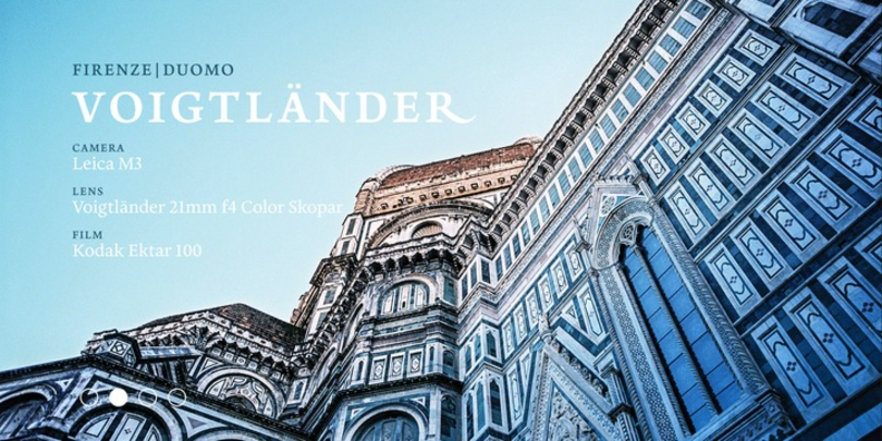
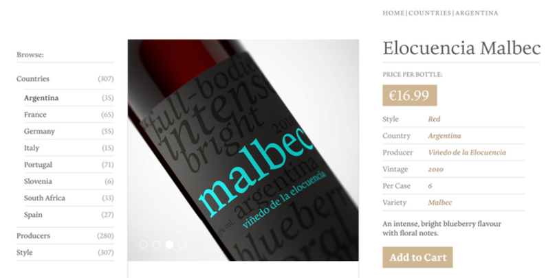
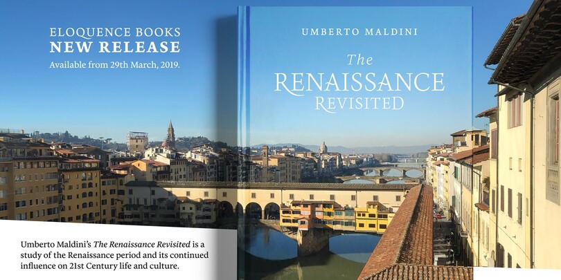
Eloquence was created for the purpose of long-form reading, designed to be easy on the eye when reading long passages of text. Inspired by the first printed letterforms of the Renaissance period, this typeface delivers a modern aesthetic with a strong classical influence, using contemporary features such as a high x-height, open bowls and counters, and razor-sharp serifs and terminals. With a comprehensive Latin character set, Eloquence can comfortably handle printed documents such as novels, magazines, and annual reports, along with their equivalent digital formats.