The Northern Block foundry highlights.
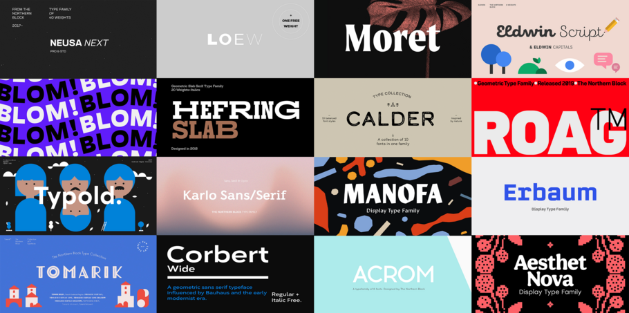
Curated by the Monotype Studio.
The Northern Block.
Founded in 2006 by Jonathan Hill, The Northern Block is a collaborative type foundry internationally recognized for producing modernist fonts for brands, creatives, and makers. The Northern Block’s highly skilled and enthusiastic global team designs and develops award-winning retail and custom typefaces and is pushing forward the design of non-Latin scripts, including Arabic, Cyrillic, Greek, and Hebrew.
Neusa Next
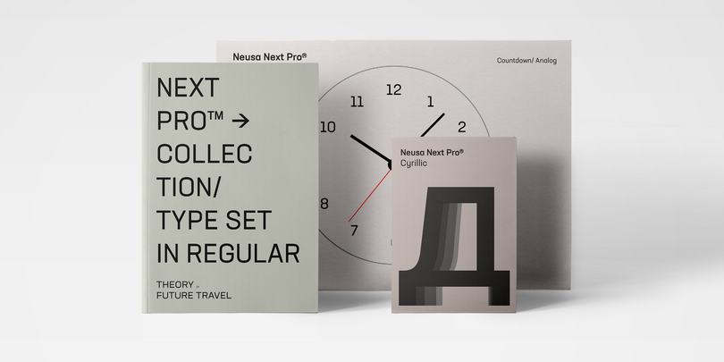
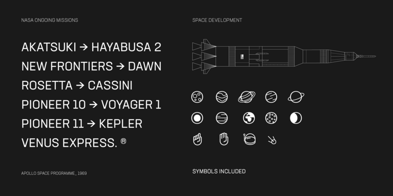
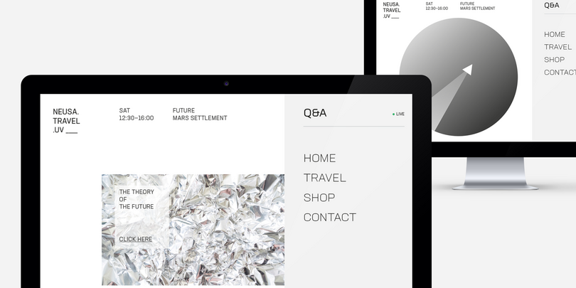
Neusa Next is a geometric sans serif type family designed by Maria V. Pigoulevskaya. The design draws inspiration from the works of Swiss design and from early space explorations, including the iconic “Life” magazine coverage of the 1969 Apollo program. Its wide range of weights, widths, and matching italics provides the designer with a complex and rich typographic palette. Designed and released as Neusa in 2012, it was initially conceived as a type family with condensed proportions. Suitable for text, it was equipped with distinctive characteristics that stood out in display settings.
Today, Neusa Next builds on the original idea, expanding its character set to extended Cyrillic and introducing three more widths: Compact, Regular, and Wide, each one with its own personality.
Moret
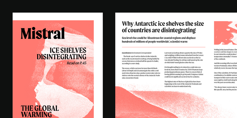
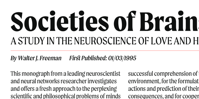
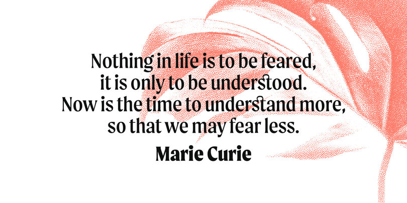
Moret is a serif display type family inspired by 20th-century European sign painting. It blends several calligraphic concepts to create a unique, dynamic, and emphatic typeface. Available in 5 weights and 2 styles (upright and oblique), Moret is well equipped to provide clear solutions for a variety of situations and settings such as editorials and headlines. With 466 glyphs per font, Moret supports 94 different languages. Opentype features include inferiors, superiors, fractions, tabular figures, and ligatures.
Blom
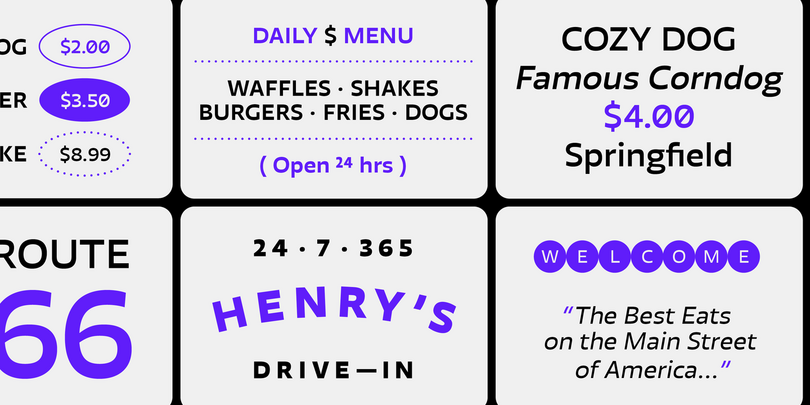
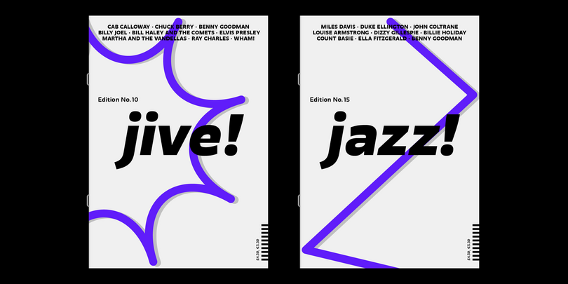
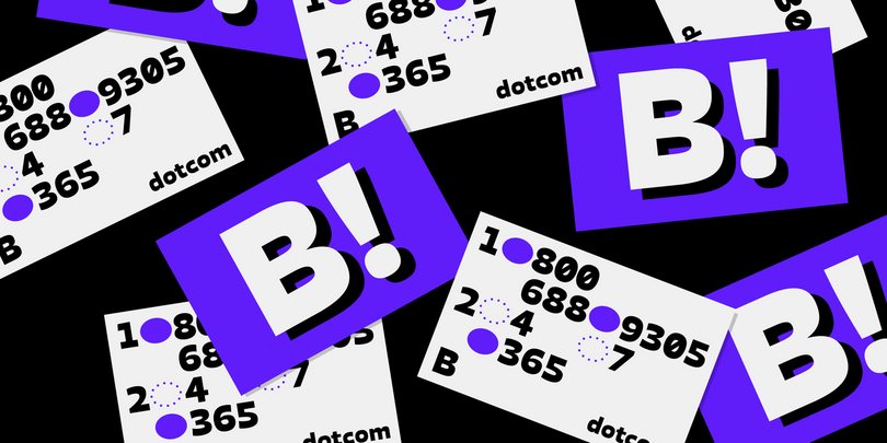
Blom is a humanist sans with subtle squarish character in reverse contrast. The combination of heavy horizontals and modern geometry give the typeface a unique visual aesthetic while making small text perfectly readable. Blom bucks the trend of conventional letterforms in favor of a versatile typeface with bags of originality; the font is both inventive in style yet completely functional in a wide range of intended uses.
Details include 463 characters, six weights with matching italics, and five variations of numerals. Opentype features include inferiors, superiors, fractions, slashed zeros, case-sensitive forms, ligatures, and language support covering Western, South, and Central Europe.
Tomarik
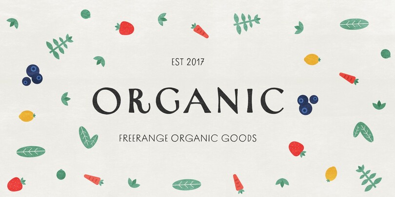
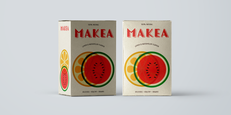
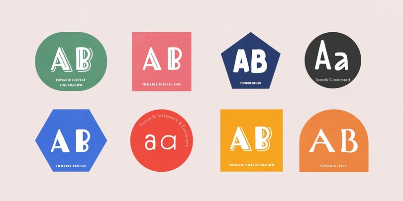
Tomarik is a vibrant hand-drawn type collection and a playful addition to any creative depository. Assembled with the “pick-and-mix” idea in mind, it offers a great variety of flavor and zest. Tomarik features nine distinctive weights and includes OpenType features such as fractions, inferiors, and superiors.
Calder
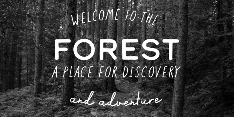
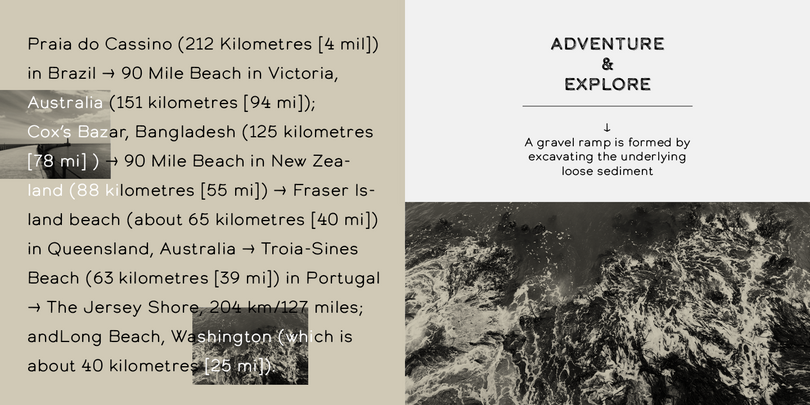
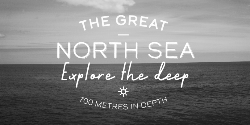
Inspired by the pursuit of the outdoors, Calder began as a personal experience and an endeavor to express and share the spirit of adventure connected with this renewed, growing movement. It includes 10 styles and offers two distinctive voices: a playful semi-connected script and a selection of subtle yet authentic sans serifs. Designed as a toolkit of styles that complement each other, the family is a unique and engaging visual tool.
Typold
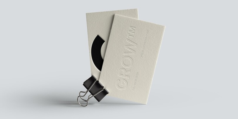
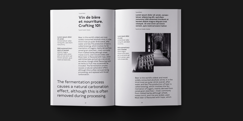
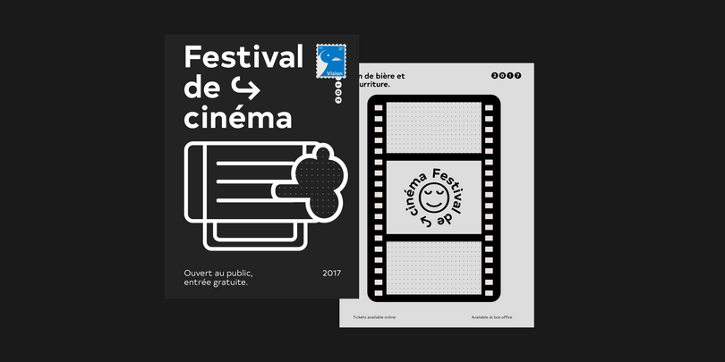
Typold originated from the desire to improve geometric forms and push beyond previous achievements through collaborative working methods and knowledge sharing. The result is a finely balanced modern sans serif constructed from mathematical inputs, typographers’ needs, and the natural hand and eye of an artisan.
Details include eight weights and matching italics, three separate widths, 1,000 characters with an alternative lowercase a and y, small-caps, 12 variations of numerals, and Opentype features such as inferiors, superiors, fractions, case-sensitive punctuation, extended symbols including emojis and language support covering Western, South, and Central Europe.
Karlo
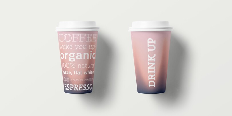
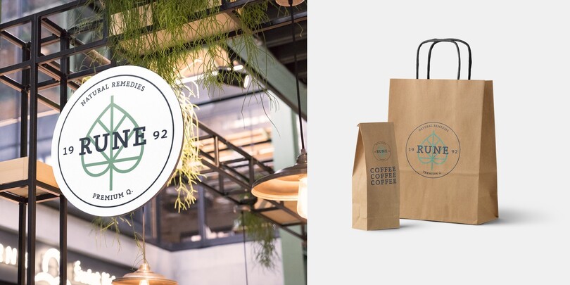
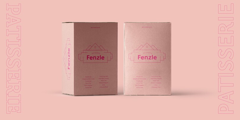
Inspired by the writings of calligrapher Edward Johnston, who demonstrated that the broad nib pen can produce different writing styles, Karlo moves in two directions in the heavier weights. One heavy weight has a humanistic low stroke contrast (KarloSerifBold and KarloSansBold), while another has a high stroke contrast of vertical axis with references to the 19th-century jobbing typefaces (KarloOpen). The latter is inspired by Johnston’s demonstration of the broad nib pen, where he suggested fastening two pencils together. With each pencil representing an edge of the pen, it becomes more evident how the pen works in writing.
Roag
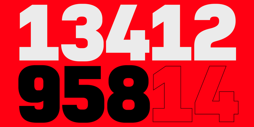
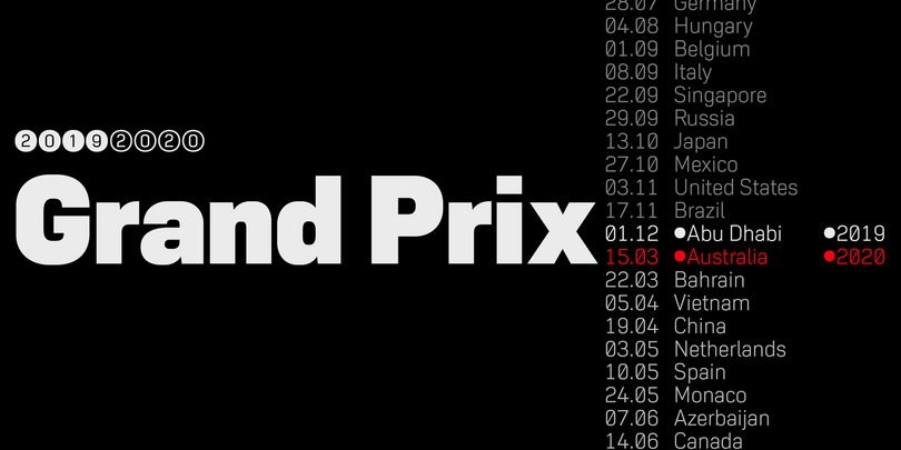
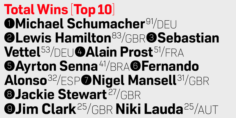
Roag is an industrial geometric sans paying homage to the mechanical designs of the 1930s. A precise balance of modern geometrics, with a functional yet sparing style that effectively communicates without distraction, Roag is a straightforward, unadorned type family with efficient construction.
Details include seven weights with matching italics and over 950 characters per style. OpenType features consist of eight variations of numerals, including inferiors, superiors, fractions, case figures, and circled figures. Additional features include small caps, case-sensitive forms, stylistic alternates, ligatures, game symbols, arrows, and language support covering Western, South, Central Europe and Vietnamese.
Loew
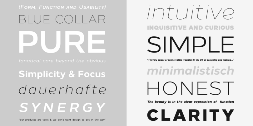
Loew is a geometric sans serif font influenced by the methods of the early industrial designers. Pure mechanical shapes are carefully adjusted to give the characters the right form, function, and usability. These subtle human touches combined with the technical detail provide great readability at both large and small point sizes. Loew is a versatile sans serif font with simple and honest geometry aimed at a wide range of modern applications.
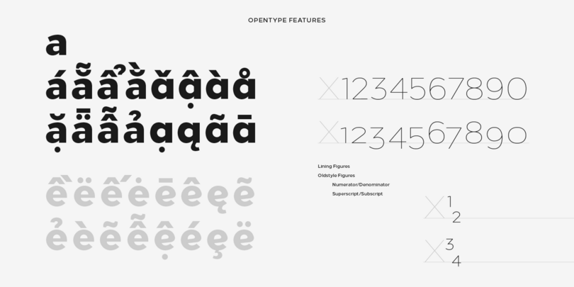
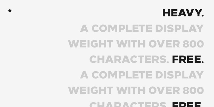
Details include over 800 characters with alternative lowercase a, e and g, seven variations of numerals, true small caps with accents, manually edited kerning, and Opentype features. For additional non-Latin language support in Cyrillic, Greek, and Arabic, see Loew Next and Loew Next Arabic.
Eldwin
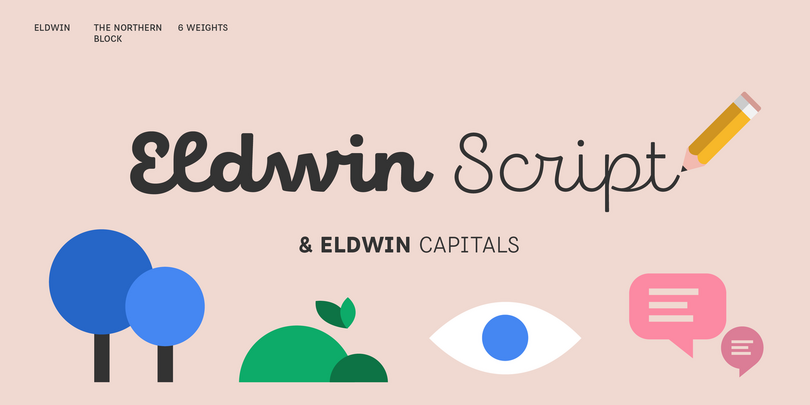
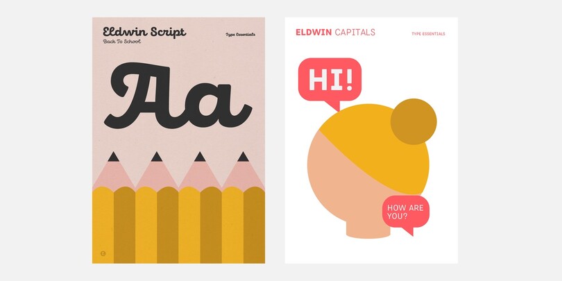
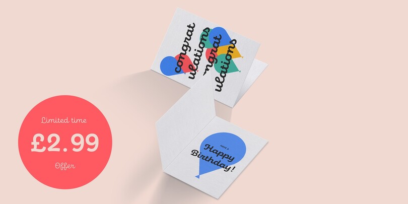
The inspiration for Eldwin was drawn from traditional Italian and American sign paintings and began with drawing on paper before being developed into digital media. Details include 6 weights in two styles, featuring alternatives, ligatures, and support for both Latin and Cyrillic scripts.
Eldwin is a spirited connected script type family with a friendly demeanor. With two styles of script and capitals designed to complement the other, the family combines playfulness with functionality which allows it to perform best in display and headline situations such as menus and packaging, as well as in editorial and advertising.
Manofa
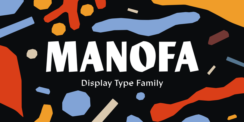
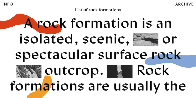
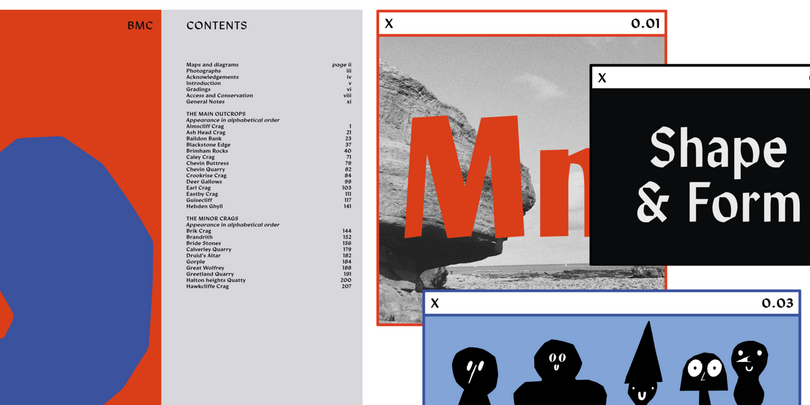
Manofa is a calligraphic sans-serif typeface. It is inspired by Warren Chappell’s Lydian and originated from experiments with the shape and form of the letter “O”. The result is a contemporary, sharp, and sculptural display. Details include four weights, matching italics, two widths, alternative characters, and the OpenType features.