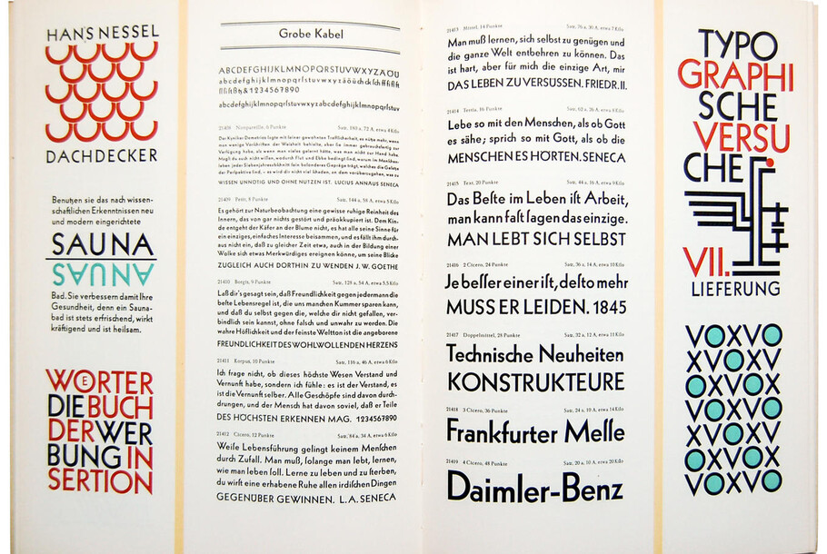
Neue Kabel: reshaping a lost classic.
A new version of Kabel finally brings the classic 1920s geometric sans serif up to date, delving back into archive drawings to pay homage to the original intentions of its designer Rudolf Koch, and re-shaping the typeface for contemporary use. Neue Kabel brings back the liveliness of the original’s strikingly quirky characters, while adding in the long-lost italics and missing glyphs needed for it to address a wide range of editorial and branding purposes.
Planning a revival of the Kabel typeface is no small task. Where do you begin, with a design that’s gone through so many different incarnations as a result of changing technology and needs? For his Neue Kabel typeface, Marc Schütz travelled back through 90 years of history, drawing not just on the first design but each of its successive versions, to rediscover the very heart of the design.
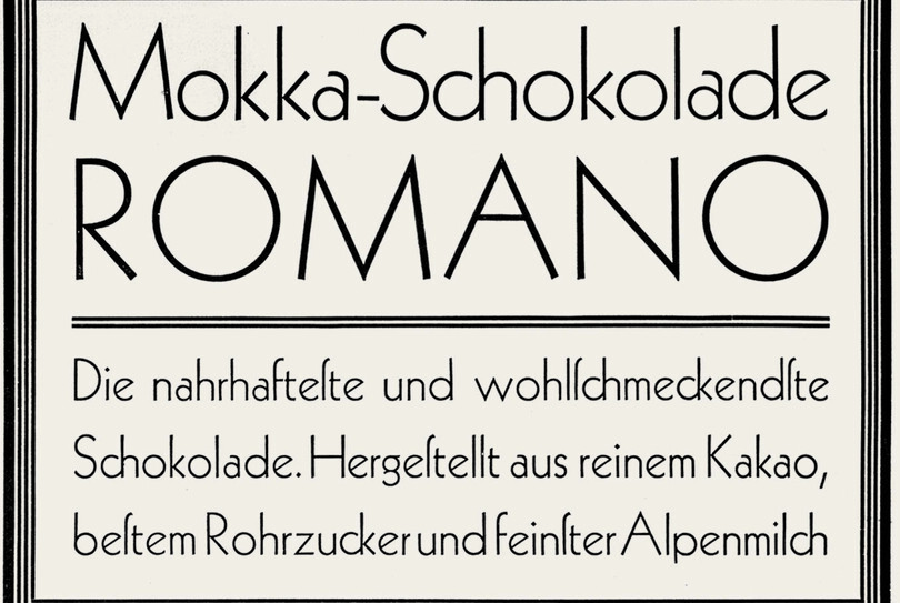
The original Kabel appeared in 1927 from the Klingspor brothers’ foundry. One characteristic feature of the Kabel typeface is the short head on the lowercase ‘a’ (Klimschs Jahrbuch, vol. 21, Frankfurt / Main 1928, collection Erik Spiekermann)
The original Kabel – created by Rudolf Koch in 1927 for the Gebrüder Klingspor Type Foundry – is an unusual design. Koch’s own portfolio of work was dominated by blackletter faces, mostly rotunda and fraktur-style, but also serif faces. Until 1927 the designer had never created a sans serif, although in a journal dedicated to the designer, published shortly after his death, Koch is quoted as saying, “The task of creating a typeface with compass and ruler was very tempting.” (1)
Kabel is clearly a typeface of its time, with many more geometric sans serifs published in the late 1920s and early 1930s. However it undoubtedly bears Koch’s trademark – most prominently in the A, E and G characters. Note how the head of the A is cut off unusually close to the stem.
Other striking characteristics that set it apart include its diagonal terminals and chamfered horizontal strokes, as well as the diagonally cut-off legs of the K and R. Contrary to almost all other geometric sans serifs of the time, these features equipped Kabel with an unusual liveliness. In some cases the design’s quirks even introduced visual oddities – perhaps particularly in the English language, which emphasizes the awkward wideness of the W alongside the H.
While many German type designers admired and studied Koch’s blackletter and serif faces, Kabel didn’t quite make it onto their radar (2). Ultimately, like many of its geometric contemporaries, Kabel vanished in the 1930s. Disaster befell the Klingspor foundry in 1944, when it was heavily damaged during air raids on Frankfurt and much of its archives were lost, and in 1956 most of its typefaces were acquired by fellow Frankfurt foundry D. Stempel AG, including the rights to Kabel. Enter the age of the phototype.
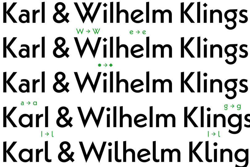
One of the coolest things about Neue Kabel is the abundance of OpenType features, allowing you to switch between the 1927 Kabel style and the contemporary Neue Kabel style.
This new technology allowed unlicensed copies of fonts to be made extremely easily, and Kabel inevitably fell victim to this act of piracy. Cable, Kabell and Kabello are just some of the copycats made by various phototypesetting companies (3). Often these imitations promised to improve on the original, while ultimately removing key characteristics from the design or adding useless new features.
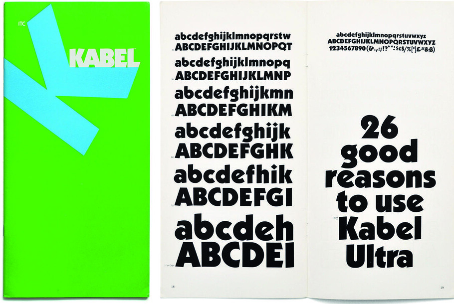
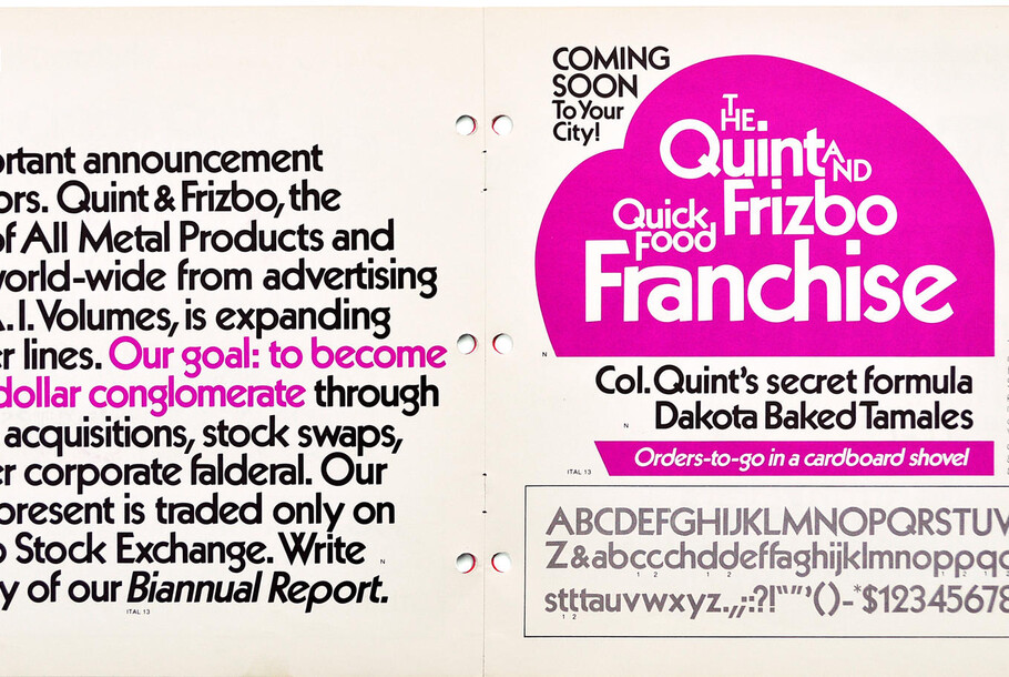
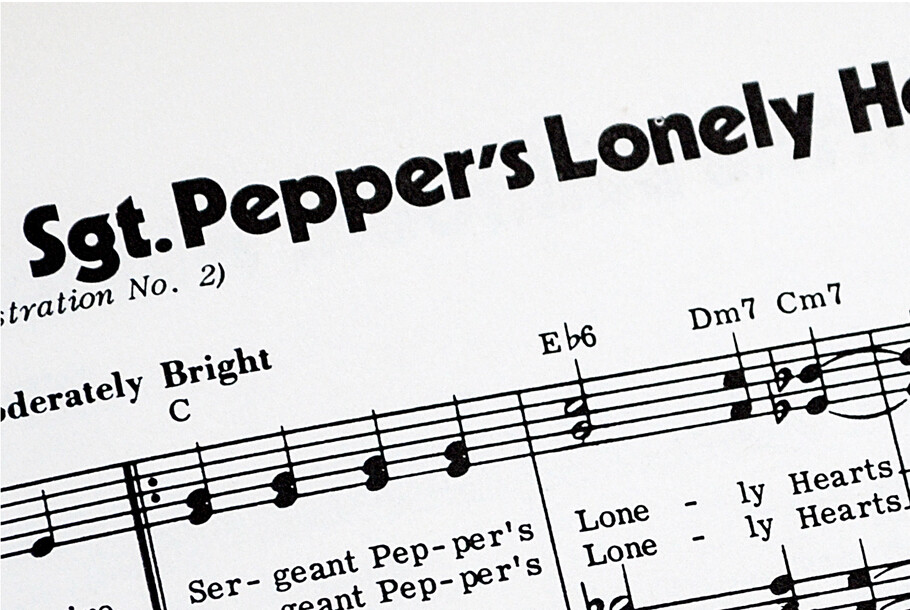
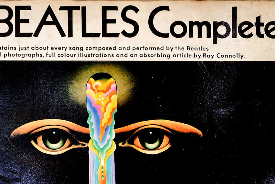
However the new technology also gave rise to a fresh interpretation of Kabel, licensed by Stempel and created by Victor Caruso for ITC in 1975. The design was described as a close translation of how Koch himself may have created the letterforms, if phototypesetting had existed in his time. This version included significant changes to the proportions and x height – which are best taken in context with the preferences of graphic design and advertising in the US in the 1970s.
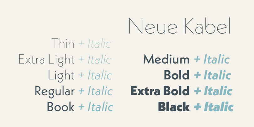
Designer, Marc Schütz restored the rhythm and the proportions of Koch’s original and extended the range of weights from thin to black (with italics). The Neue Kabel typeface allows Kabel to meet the requirements of the 21st century, from large billboards to small text and digital displays.
By 2013, the time was right for another, more comprehensive revival of Kabel – one that stayed true to the designer’s original intentions. Students from the Offenbach University of Art and Design needed a yearbook typeface that would embody the school’s rich history. Koch created Kabel while teaching at the school, making his design a fitting choice. Designer and former lecturer Marc Schütz stepped in to create two new weights: one to match book typography for long reads, and an italic. Although originally just drawing the characters needed for the publication, this early work became the catalyst for a full revival.
Schütz returned to the Klingspor archives to uncover why Kabel’s original italic weights had never made it into the phototype versions, and was surprised to find the original design in better condition than the available digital faces. This was a rich opportunity to restore key characteristics, preserving historic shapes while updating the design for contemporary use.
As Monotype’s Toshi Omagari, who restored Dwiggins’ ‘lost’ Metro typeface, claims: “Newer technology means that inconsistencies brought about by limitations in older type production methods can be fixed without losing any of a typeface’s idiosyncrasies”. (4)
“Personality is not something you try to express, it’s something you can’t suppress,” he adds.
Schütz not only studied the original drawings but also delved deep into the ITC version of Kabel and Caruso’s phototype revival, exploring the mark left behind by each designer.
Under his hand, he rebuilt Kabel with a coherent system of weights ranging from thin to black, each with the long-awaited italics and the previously non-existent small caps. He explored master drawings to find proportions that sit somewhere between ITC’s version and the original Kabel, to create better legibility and the glyph palette has been extended to include accents, and special characters for multiple languages. Neue Kabel has seven figure sets, among them tabular and old style for longer text.
As Schütz proudly says: “Neue Kabel has everything you need to typeset an encyclopedia. I like the idea that someone can set a PhD thesis with it.”
Users can also switch between Schütz’s round dots, or the diamond shapes of the original. All of the historical alternatives of the original Klingspor Kabel are preserved and included, allowing users to typographically propel themselves back to 1927.
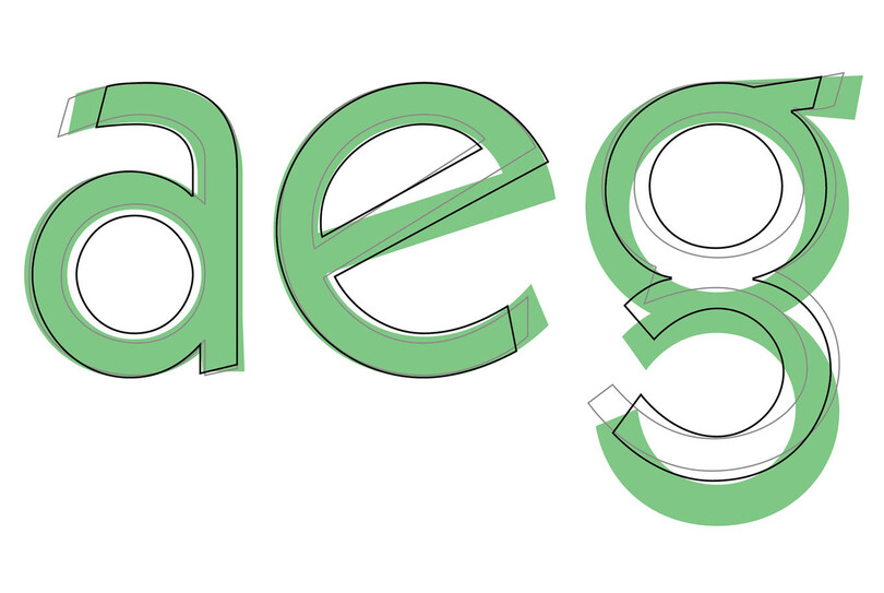
This illustrates the different character shapes between Linotype Kabel (black), ITC Kabel (gray) and Neue Kabel (green)
Rudolf Koch’s design is iconic, but until now its digital heirs had failed to fully inherit its qualities. Schütz has mixed the characteristics of the past into a new visual expression that fulfills the typographic needs and expectations of today’s typefaces, offering huge flexibility for both editorial design and branding applications.
Get the Neue Kabel fonts
You can buy the Neue Kabel typeface on MyFonts. The full family is also available through Monotype Fonts.
1 Julius Rodenberger: Der Schriftkünstler Rudolf Koch, in: Graphische Nachrichten, vol. 13, no. 6, Berlin 1934, p. 272 2 From a conversation with Gudrun Zapf-von Hesse in Darmstadt, 27 Sept. 2016 3 Alphabet Innovations Collection, vol. 7, Dallas 1972, p. 6 f. 4 Toshi Omagari: New from old. The why and how of reviving a typeface
