A stackable typeface for Domino’s Pizza.
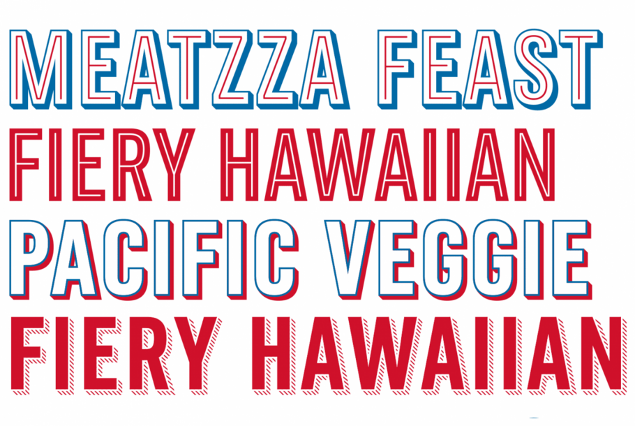
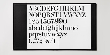
Monotype designer Terrance Weinzierl delivered a taste of modern Americana to Domino’s, with his modular, multi-weight Pizza Press typeface.
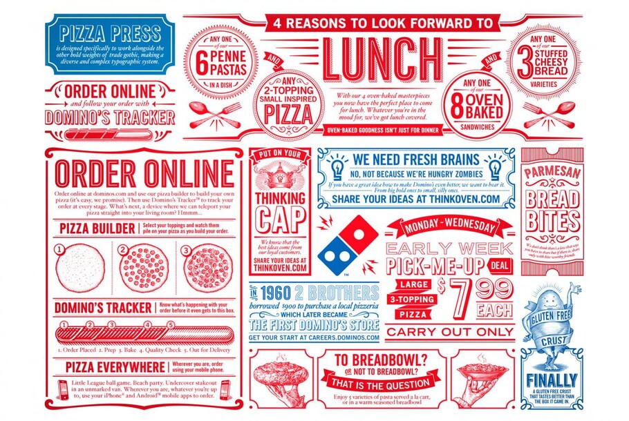
Created in response to a Crispin Porter + Bogusky brief for Domino’s, Weinzierl was tasked with creating a typeface that would introduce a ‘contemporary’ feel, while working alongside the Trade Gothic® design already in use. By producing a series of modular fonts that could be stacked in multiple ways, Weinzierl’s design eases the burden of branded typography, and allows designers and laymen to channel their inner typographer.
The Pizza Press typeface was based on 19th century models, in reference to the existing Trade Gothic® typeface. Other historic references helped inform the design, and Weinzierl studied finely detailed metal type specimens to see how the tiny, ray-like stripes had been created in the past. The Gill Sans® Shadow fonts were also a point of technical reference and Weinzierl explains, “a shadow design like that requires some unusual optical adjustments.” This meant that the angle and spacing of the stripes on every glyph of the shadow weights was adjusted by hand. Other detailed considerations include removing the spur from the G, to make sure the letterform could hold the Inline weight.
The design also includes built-in ink traps, with the Outline weight overlapping the Shadow weight by a hair, to ensure the background color shows through when rendered on screen. Weinzierl also made optical variants of the Antique striped weights – a regular and a display – to function across a range of sizes and printing environments.
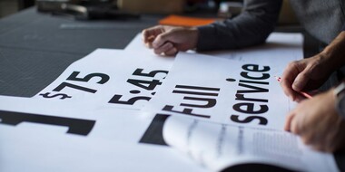
It was this level of understanding and attention to detail that drew Crispin Porter + Bogusky to a collaboration with Monotype, and Jake Harvey, digital asset manager at CP+B, says, “we felt confident Monotype’s long history of work in type design provided a level of understanding of the ‘subtleties’ so the final product preserved the character and spirit of the original design.” The typeface also offers simplification, changing, in the words of Harvey, “what was a very time and labor intensive process – manually copying and pasting outlined vector art to layout – into a task as simple as typing on a keyboard, literally!”
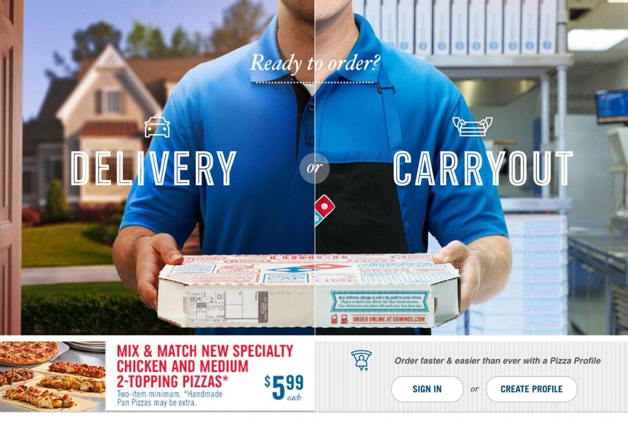
The typeface has already been used in packaging, signage and TV spots, and will continue to be deployed in any environment where Domino’s branding is being used. Pizza Press was also awarded the TDC Certificate of Excellence in typeface design, in 2014.
The Studio team.
Terrance Weinzierl.

As a Senior Type Designer in the Monotype Studio, Terrance Weinzierl has been creating and modifying typefaces for the Monotype Library and a wide range of brands since 2008. In addition to working on custom projects for Microsoft, Google, Barnes & Noble, Domino’s and SAP, he’s designed type for video games, professional sports teams and auto manufacturers.
