Meet Madera, a warm geometric sans serif font with a sharp edge.
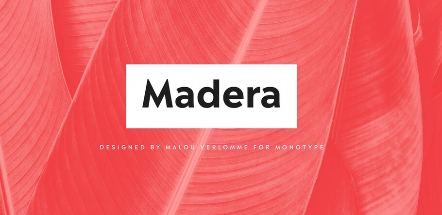
Malou Verlomme’s Madera is a fresh addition to the popular geometric sans serif genre, intended as a go-to typeface for branding and visual communication.
As a senior type designer at Monotype, Malou Verlomme has created quite a few custom typefaces for Monotype’s clients – giving him unique insight into what brands are looking for in a bespoke piece of type. This is what informed Madera, which is “a typographic synthesis” of Verlomme’s experience.
The design is aimed squarely at the specific needs of graphic designers, intended as an essential toolbox for communication. It is highly legible, versatile in its many weights, and has a very contemporary look and feel.
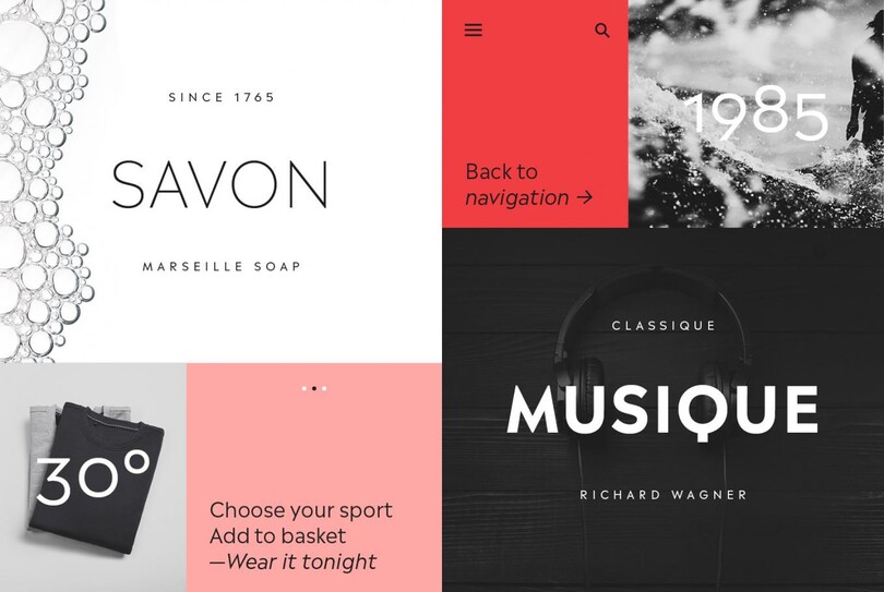
The Madera typeface is especially well suited for high-tech and publishing, with an emphasis on logos, signage and text.
“Before joining Monotype I collaborated very closely with graphic designers,” explains Verlomme. “and this always influenced my designs. With Madera, I kept the same approach and tried to design a typeface that is in touch with what graphic designers need.”
Madera taps into the current trend for geometric sans serifs, and it brings a rather distinctive flavour into the mix – featuring pointed apexes that contrast nicely with the geometry of its rounded forms.
These pointed forms were partly inspired by Verlomme’s research into the Monotype catalogue, which uncovered a dearth of contemporary sans serifs with similar features. These features were quite popular in posters of the 1930s and 40s and these served as a rich source of inspiration for the design.
“In the lowercase the sharp apexes are less noticeable, but in the uppercase they give a really nice flavour,” says the designer, who kept more contemporary proportions for Madera that help with setting a comfortable reading rhythm. “If you look at all caps settings, especially in the darker weights, the pointed triangles bring something extra that I really like.”
Madera also takes into account the needs of companies and designers that want a punchy typeface, but one that’s also prepared to play a supporting role to the branding message.
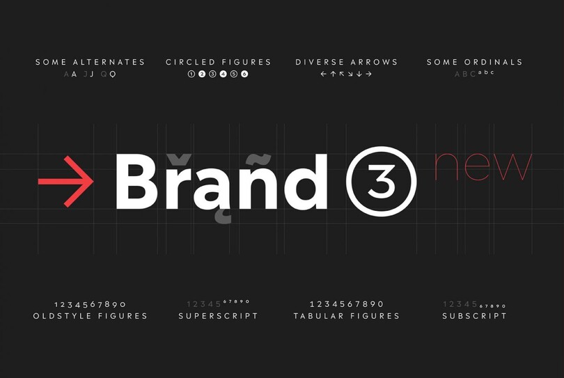
Madera is a geometric sans design with some humanistic traits, that’s marked by its pointy apexes. It
“The design is very solid but it doesn’t go out of its way to attract attention,” explains Verlomme. “It still has a fair amount of warmth and personality, in a very understated manner. If you’re a large corporation, with a typeface being used in many different environments, you want something that’s easy to use but can sustain such a large amount of visibility.”
With eight weights, including italics, and extensive Western, Central and Eastern European language support, Madera is supremely versatile. Its adaptability and high legibility means it’s as comfortable in print, for editorial use, as it is in advertising, online or other digital environments.
Get the Madera fonts
Madera by Malou Verlomme is included in the Monotype Fonts service and available for purchase on MyFonts.
The Studio team.
Malou Verlomme.

Malou Verlomme is Senior Type Designer for Monotype, and has been with the company since 2016. His Camille typeface has the honor of being part of the collection at France’s Centre National des Arts Plastiques (CNAP).
