From Neue to Now: How Helvetica evolved for the 21st century.
It’s been six decades since Helvetica® was released, and in that time the typeface has remained the go-to choice for clarity and neutrality. However, as with many typefaces, the demands on it have increased. Helvetica’s famous Swiss simplicity is now expected to perform in a growing range of environments and at a wider spectrum of sizes than ever before.
Designers and studios might be deeply familiar with Neue Helvetica®—which was released in 1983—but it’s the product of a pre-digital era.
Enter Helvetica® Now, which mindfully reimagines this classic font to solve modern-day branding challenges while staying true to its ethos of simplicity, clarity, and global appeal. Here are four reasons current Neue users may want to switch.
The sizing
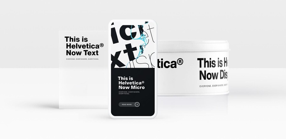
Helvetica Now offers Micro, Text and Display sizes, each of which is tailored to a particular environment—unlike Neue Helvetica which was drawn and spaced for use in text type. Designers working on posters will find Helvetica’s clear shapes emphasized in the larger Display versions, which have been spaced with headlines in mind. It’s Helvetica, but with more aplomb and assuredness and more potential for users to experiment with and express themselves. For those concerned with legibility on the printed page and in running copy, Helvetica Now’s Text sizes are a workhorse, offering robust strokes and comfortably loose spacing.
The Micro version is a standout feature of Helvetica Now, and addresses an issue Helvetica has long faced—that of being micro-type challenged. While Neue Helvetica struggles at tiny sizes—for example on tablets and smartwatches—Helvetica Now’s Micro designs are simplified and exaggerated. They retain the impression of Helvetica at small sizes and their spacing is loose, which means legibility is maintained at microscopic sizes and across low-res environments.
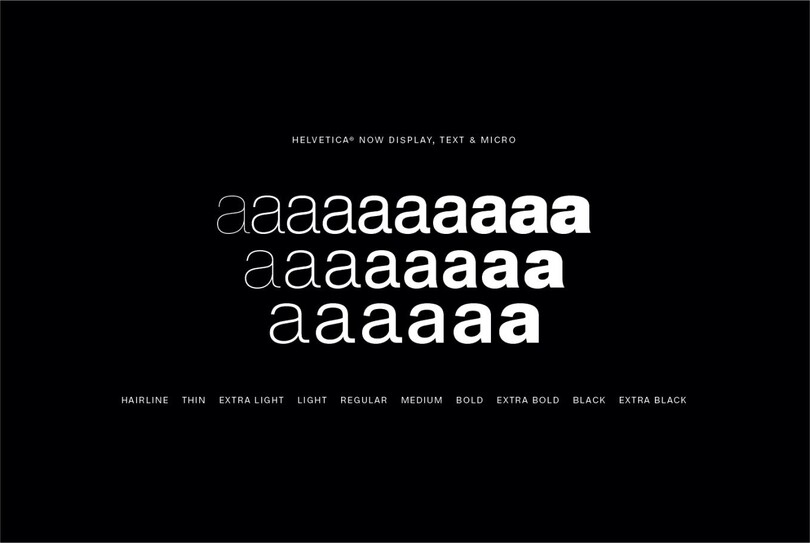
Helvetica Now offers Micro, Text and Display sizes, each of which is tailored to a particular environment—unlike Neue Helvetica, which was drawn and spaced for use in text type.
The three sizes have been designed with their end environment in mind and minutely adjusted to fit the requirements of each. This means that, unlike Neue Helvetica, designers can use the typeface straight out of the box—no need for extra kerning or typographic trickery.
The palette
Helvetica Now has been designed as a complete toolbox, allowing the typeface’s more expressive side to emerge. The family offers a full set of alternates to choose from, maintaining the design’s famous clarity but allowing it to adopt subtly different voices as required.
Designers can now work with Helvetica Now’s circled figures, as well as the Helvetica-style arrow—elements they previously had to borrow from other typefaces or create separately. These extra features are included in every weight and style across the family, giving Helvetica Now greater potential for use in information graphics as well as signage.
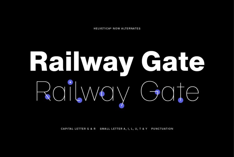
Alternate forms of key glyphs—like a single-story a—have been added across the entire range.
The details
Helvetica Now is more than a refresh or an update. Monotype’s team of designers returned to the original design, then reassessed and redrew every glyph in the family, adding popular modifications that have been made to the typeface over the years. Recurring issues, such as the easily confused capital I and lowercase l have been addressed, with a hooked version that increases legibility at smaller sizes. Other new additions include an updated @, rounded punctuation, a rounded G, a straight-legged R, a single-story a, and a lowercase u without a trailing serif.
While each of these gives Helvetica Now greater utility than its predecessors, it’s also a return to the original ethos and spirit of the design. Monotype’s design team worked to a strict philosophy while designing Helvetica Now, setting themselves the challenge of minutely refining each letter to adhere ever more closely to the typeface’s mantra of clarity, simplicity and neutrality.
“When you go back to the original source, it’s so much more readable and that doesn’t have to do with the forms themselves but the spacing,” says Monotype Type Director Charles Nix. “It was about studying the spaces between the letters and figuring out what the methodology was early on, how it made the type so much easier to read, and then restoring that and improving upon it.”
It’s not what you expect
Helvetica is, perhaps, the best-known typeface around, and as such the design evokes strong feelings from both designers and end users. However, Helvetica Now challenges our perceptions. It embraces the original spirit of the design but opens up a new chapter of its story.
Designers familiar with Neue Helvetica will find that Helvetica Now is an entirely new prospect—larger, more expressive, and with greater potential for users to experiment with. It retains the original’s much-loved neutrality, but also offers the chance for it to find and adopt a new tone of voice.
“I think we’ve introduced a new chapter to the Helvetica canon—one which will allow it to become something completely novel in the hands of 21st-century designers. We’ve carefully expanded a strict heritage that could have prevented its evolution,” says Nix.
To explore Helvetica Now and download a free weight, visit the specimen page.
The Studio team.
Charles Nix.

Charles Nix is a Creative Type Director, designer, typographer and educator. He designed a number of popular typefaces in the Monotype Library, including Walbaum and Hope Sans, which received a Certificate of Typographic Excellence in the 22nd Annual Type Directors Club Typeface Design Competition. He’s also designed custom typefaces for Google Noto, Progressive Insurance and the Philadelphia Museum of Art.


