
Tag: Fonts
23 articles
How do you choose a typeface when you’re the world’s biggest font foundry?
Monotype’s brand refresh needed to achieve the same consistency of communication that it champions for its customers. But what’s the answer when you’re a type foundry with literally tens of thousands of fonts to choose from, and multiple products and services to design for?
Behind the font: The challenges of going it alone.
Typeface design is a mysterious business. While most people are acquainted with the dropdown menu in Word or a website like MyFonts, not everyone realizes there’s a host of independent designers and foundries all quietly making their contribution to visual culture.

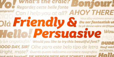
Meet Placard Next.
Placard Next is a reimagined version of a 1930s poster design, that takes all the original quirky details and refines them for digital use. Its condensed versions pack an instant typographic punch when used at large sizes, introducing some unusual flavor to posters, headlines and anywhere else designers need to make a statement.

A digital-ready Chinese sans-serif is born.
Many Chinese typefaces have a reputation for looking dated and not reading easily on small screens— not M Ying Hei. It checks all the boxes that it’s forefathers can’t.
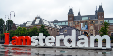
How fonts give voice to a destination.
How do fonts influence your perception of a city and its identity? See how the right choice can convey the image of a place is and what it aspires to become.