Toshi Omagari.
Senior Type Designer.
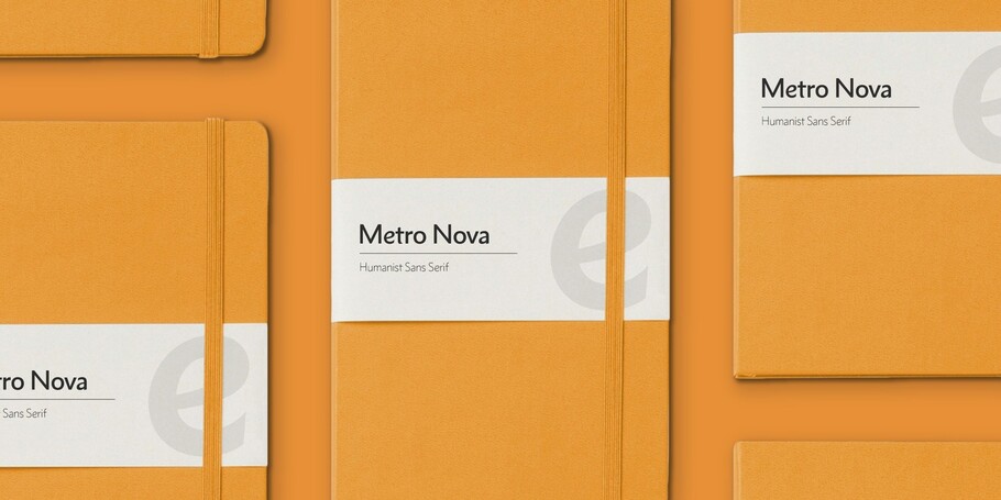
Metro Nova comprises seven weights, from ultra thin to extra black in regular proportions, and six weights as condensed designs.
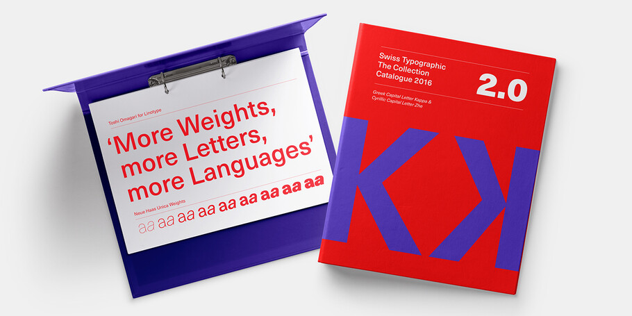
Available in 18 styles, the Neue Haas Unica family is remarkably appropriate for a wide range of applications, possessing a delicate gradation of weights and clear character shapes.
Neue Plak’s display weights are crying out to be used in editorial, on packaging or in logos, while its text weight works well in both print and digital environments.
In his words.
With a focus on multilingual typography, Senior Type Designer Toshi Omagari has created fonts for several major brands and worked on some of Monotype’s most recent major type releases. He is a regular speaker at events like ATypI, sharing his experience and insights on multilingual type design.
Toshi joined Monotype in 2012, after studying typography at Musashino Art University in Tokyo, and completing an MA in typeface design at the University of Reading. With a keen interest in font development, Omagari has worked on several major type projects for Monotype including resurrecting a ‘lost’ typeface to create Neue Haas Unica and updating the hand of WA Dwiggins to create Metro Nova. He’s also designed a fashion-led branding typeface for H&M, and created a font for Sir Quentin Blake that borrowed on the illustrator’s own idiosyncratic handwriting.
He also designed the Tibetan script for the Google Noto project, and spearheaded the design for The Wolpe Collection.
Metro Nova
Rescued from obscurity by Doug Wilson, and restored by designer Toshi Omagari, Metro Nova distills the idiosyncrasies of Dwiggins’ Metro No. 1 into a new family that retains Metro’s inimitable sense of character, while still appealing to current design sensibilities. With seven regular weights, from thin to extra black, and six condensed weights, Metro Nova offers a contemporary take on a classic piece of design, updating the hand of Dwiggins’ for a new generation of designers.
Neue Haas Unica


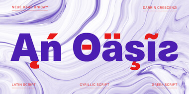
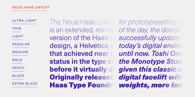
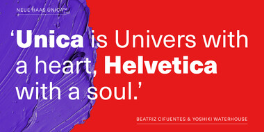
The Neue Haas Unica™ family is an extended, reimagined version of the Haas Unica® design, a Helvetica® alternative that achieved near mythical status in the type community before it virtually disappeared. Originally released in 1980 by the Haas Type Foundry, the design was never successfully updated for today’s digital environments – until now.
Neue Plak™


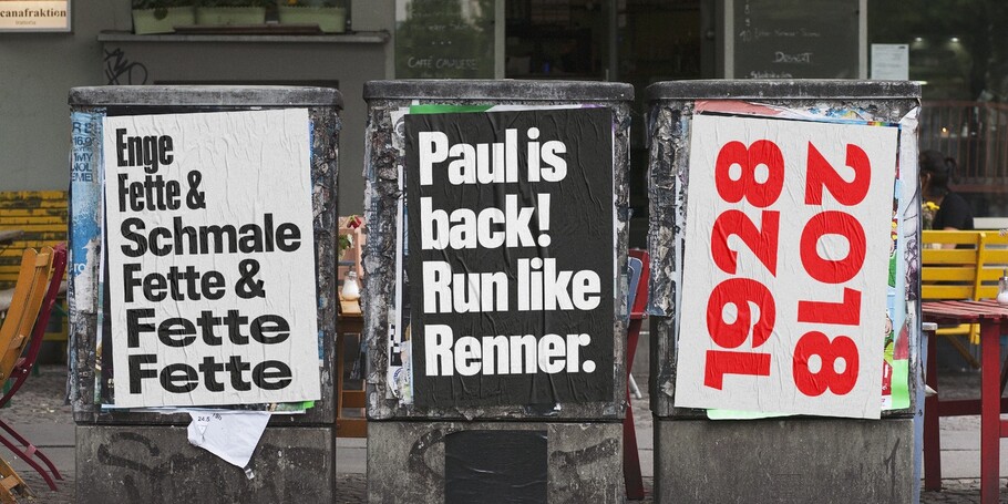
Originally designed in 1928, Plak is something of a lost gem in the type world. Despite being drawn by Futura creator Paul Renner, it never achieved the same popularity and spent decades lacking a much-needed digital revival. Monotype designers Linda Hintz and Toshi Omagari have taken its existing three weights and, after extensive research into the original wood type, extended them into the vast Neue Plak family.

Related content.
A bespoke handwriting typeface for Sir Quentin Blake.
Monotype worked with noted illustrator Sir Quentin Blake and his team to recreate his handwriting as a bespoke typeface.
Premier League: a brand identity that works hard, plays hard.
One of the best rebrands of 2016, the new Premier League identity features a typeface that performs confidently from screens and jerseys to TV and league tables.
